


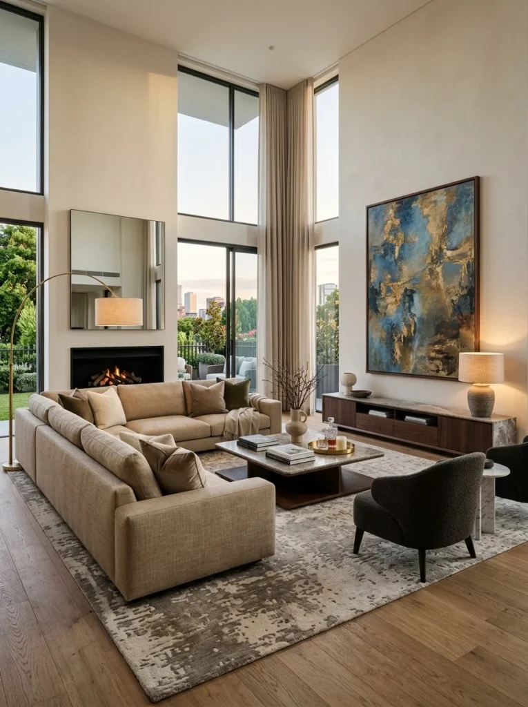
A living room that never feels finished isn’t missing more furniture — it’s missing a specific relationship between the elements already there. Here’s what that relationship looks like and how to create it.A room feels finished before the last piece of furniture arrives. Or it never feels finished after twenty pieces. The “finished” quality isn’t a quantity threshold — it isn’t achieved by accumulating enough furniture, enough artwork, enough cushions until the count crosses some invisible line. It’s a relationship between the elements present. And that relationship can be right or wrong regardless of how much or how little is in the room.
This is why buying more doesn’t fix it. Most people experiencing the “never feels finished” problem respond by adding — a new side table, another cushion, a piece of art for the blank wall. Sometimes this helps. More often it adds to a room that already has enough, in the wrong arrangement, with the wrong proportions, and the underlying relationship problem continues unresolved beneath the new layer of objects.
The specific problems that create the “unfinished” feeling in a living room are identifiable. They repeat across different rooms, different budgets, and different aesthetic directions with enough consistency that once you know what to look for, the diagnosis becomes almost immediate.
The Proportion Problem: When Furniture Doesn’t Match the Room
This is the most common and most invisible cause of a living room that never settles. Furniture is purchased in a showroom or online based on dimensions that seemed right but didn’t account for the specific proportions of the room, the ceiling height, or the relationship between pieces.
The result is a room where the furniture is the wrong scale for the space — or more precisely, where the pieces don’t share a consistent scale logic with each other or with the room they’re in.
A sofa too small for the wall it’s against leaves an awkward gap on one or both sides that reads as unresolved regardless of what’s placed in those gaps. The sofa looks like it’s waiting for a larger room.
A coffee table too small for the sofa creates a disconnected relationship between the two — they look like they arrived separately rather than belonging together. The rule of thumb most designers use: the coffee table should be approximately two-thirds the length of the sofa and close enough to reach from a seated position — typically fourteen to eighteen inches away.
Artwork too small for the wall is one of the most reliable sources of the “unfinished” feeling. A single piece of art sized for a small apartment hung on a large wall in a larger space floats without anchoring to anything. Art should cover at least half the width of the furniture beneath it, or else multiple pieces should be grouped to achieve that coverage collectively.
Rugs too small for the seating arrangement are one of the most documented sources of the “something’s off” feeling in living rooms. A rug that doesn’t reach under the front legs of the seating creates a visual island that floats rather than grounds. The minimum for a rug in a seating arrangement: all front legs of all major seating pieces should sit on the rug, creating a unified zone rather than a rug with furniture around it.
The Anchor Problem: Every Room Needs a Focal Point

A room without a clear focal point has no place for the eye to land and rest. The eye moves continuously, looking for a point of arrival, and not finding one produces the restless “something’s missing” quality that reads as unfinished regardless of what else the room contains.
A focal point is the element that draws the eye first and around which the rest of the room is organized. In many rooms it’s given by architecture — a fireplace, a large window with a view, an architectural feature. In rooms without these, it must be created.
The most effective created focal points in living rooms:
- A large piece of art or a gallery wall on the primary wall — the one the eye goes to when entering the room
- A statement sofa or upholstered piece in a color or texture that stands out from its surroundings
- A bookcase or shelving unit styled with enough intention to read as a composed element rather than storage
- A large-scale plant in a distinctive vessel
- A media unit with intentional styling around it rather than electronics left as the default focal point
What makes a focal point work is that everything else in the room responds to it — seating faces toward it, lighting emphasizes it, the room’s arrangement makes clear that this is the center. A room where several elements compete for focal-point status — where the television, the fireplace, and a gallery wall each demand attention without a clear hierarchy — reads as unresolved in the same way a room with no focal point does.
The Ground Problem: Floating Furniture and Missing Rugs
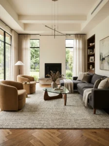
Living room furniture that floats — pulled away from all walls but not anchored by a rug beneath the seating arrangement — occupies the room without belonging to it. The pieces are present but they haven’t been told where they live.
A rug under the seating arrangement doesn’t just add texture and warmth (though it does both). It defines a zone — a specific area of the floor that reads as “this is the living area” — and grounds every piece of furniture sitting on or touching it. The furniture that was floating becomes furniture that belongs to a place.
The sizing error described above — a rug too small for the seating — produces the opposite effect: instead of grounding the furniture, a small rug becomes an object surrounded by furniture, which reads as more unresolved than no rug at all in many rooms.
For rooms where the right-sized rug has felt expensive or difficult to source, layering two smaller rugs — one standard size beneath a second that’s large enough to reach the furniture — achieves the visual coverage a single large rug would provide at a lower cost per piece.
The Height Problem: When Everything Is the Same Level
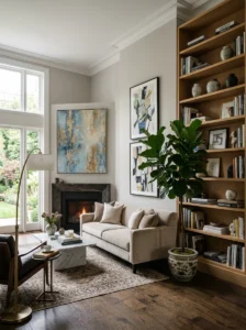
A living room where every horizontal surface sits at approximately the same height — sofas, chairs, coffee table, side tables — has only one visual plane and reads as flat regardless of how many pieces are present.
Rooms that read as finished and composed almost always have vertical variation — objects and elements at different heights that give the eye a path to follow. This is what distinguishes a styled room from one where things have simply been placed.
Creating height variation in a living room:
Floor lamps and table lamps at different heights — a tall floor lamp beside a chair and a shorter table lamp on a side table — give the room multiple light levels and multiple eye-levels simultaneously.
Tall plants — a large fiddle-leaf fig, a snake plant, a monstera — introduce height at a scale furniture rarely reaches and do so through organic, living material that reads differently from furniture.
Shelving or bookcases that fill vertical wall space, particularly in rooms with high ceilings, address the empty upper half of the room that underfurnished spaces often leave vacant.
Artwork hung at the right height — the center of the artwork at approximately 57-60 inches from the floor, which is the average eye level — versus artwork hung too high (a common mistake) that detaches from the furniture below it.
The Layering Problem: Materials That Don’t Work Together
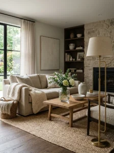
A room furnished entirely in one material family reads as flat — all smooth, all fabric, all wood — because the eye has nothing to contrast against and the room lacks the textural depth that makes spaces feel composed.
Layering in a living room is the deliberate mixing of materials and textures so that each element reads in contrast to what surrounds it. Smooth leather against a nubby linen cushion. A rough-textured jute rug under a glass coffee table. A matte plaster wall behind a polished brass lamp. Woven baskets beside a sleek media unit.
The specific texture families worth representing in a well-layered living room:
- Soft and draping — upholstered furniture, cushions, throws, curtains
- Natural and fibrous — jute or wool rugs, rattan or wicker, linen
- Wood — furniture, frames, flooring, objects
- Metal — lamp bases, frames, hardware, decorative objects
- Smooth and hard — glass, stone, ceramic, polished surfaces
A room doesn’t need all of these, but a room that has only one — only upholstered fabric, or only wood, or only smooth modern materials — will consistently read as unresolved. Three or four distinct texture families in a room produce the layered quality that reads as finished.
The Lighting Problem: The Invisible Reason Rooms Feel Wrong

This is the problem most people don’t diagnose because they don’t look at the lighting — they look at the furniture and assume the furniture is the issue.
A living room lit only by overhead lights reads as a room seen from above. Everything is illuminated from the same direction, shadows fall in the same way on every surface, and the room has the flat quality of a photograph taken from straight ahead. This overhead-only quality is one of the most reliable indicators of a room that was furnished but not designed.
Rooms that feel finished are almost always rooms with multiple light sources at different heights. A floor lamp in a corner. A table lamp on a side table. Lighting inside or above a bookcase. Candles on the coffee table for specific occasions. The combination of these sources creates different pools of light that give the room depth — shadows and highlights that make the space feel three-dimensional rather than uniformly exposed.
The specific additions that move a living room from flat overhead light to layered:
- A floor lamp positioned in a corner behind the sofa or beside a chair
- Table lamps on side tables at seating level
- Dimmer switches on the main overhead circuit so overhead light can be reduced rather than either on or off
- Directed light on a focal point — a picture light above art, a track light aimed at a specific element
No amount of furniture or styling correction makes a room feel finished under flat overhead-only lighting. The lighting must be addressed alongside or before the other elements.
The Personal Problem: Rooms That Look Decorated Rather Than Lived In
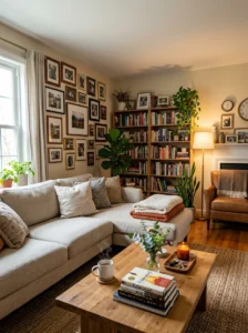
A room can be correctly proportioned, properly anchored, well-layered, and beautifully lit and still feel unfinished in a specific way — like a showroom rather than a home. This quality is the absence of personal elements: things that belong specifically to the people who live in the room rather than to the idea of a well-decorated living room.
Books that are actually read, not arranged by color for visual effect. Photographs with real subjects rather than abstract prints. An object brought back from somewhere that has a story. A plant that someone genuinely tends. A throw that gets used rather than folded precisely over the arm of the sofa.
These elements don’t need to be prominent or numerous. One or two specific personal items integrated into an otherwise composed room are what bridge the gap between “decorated” and “home.” Without them, the room looks correct but reads as belonging to no one in particular.
The Edit: Why Removing Often Solves What Adding Can’t
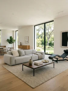
The “unfinished” feeling in a living room is sometimes not the absence of something but the presence of too many things competing without a clear hierarchy. In this case, adding more makes the room feel more unresolved rather than more complete.
The diagnostic question: if you removed one-third of what’s currently in the room, would what remained read as more composed or less? If the honest answer is “more composed” — if you can imagine a cleaner, clearer version of the room with less in it — the problem is not what’s missing. It’s what’s creating visual noise.
The edit process for a living room that has enough but doesn’t feel finished:
- Remove everything from the coffee table and horizontal surfaces and assess the room empty of objects
- Return only items that either serve a clear function or have a clear aesthetic reason for occupying that position
- Look for pieces of furniture that are present but not contributing — a chair nobody uses that interrupts the seating arrangement, a side table that’s too small to be functional
- Remove or relocate any item that the eye passes over without landing on it
A living room with seven deliberate elements reads as more finished than the same room with twenty elements of mixed intentionality.

Key Takeaways
- The “finished” quality in a living room is relational — it’s the correct relationship between elements, not the presence of enough elements
- Furniture scaled incorrectly to the room or to each other creates an unresolved quality that no amount of additions corrects
- Every room needs a focal point — a single element the eye goes to first — and everything else should respond to it
- Rugs must be large enough that front legs of all seating sit on them — a rug too small creates more visual disorder than no rug
- Height variation — floor lamps, tall plants, shelving, correctly hung art — gives the eye a path to follow through the room
- Layering three or four distinct texture families produces depth; rooms with only one texture consistently read as flat
- Lighting from multiple sources at different heights transforms a room’s quality more than any furniture change
- Personal elements — things that belong to the specific people who live there — bridge the gap between a decorated room and a home
- When a room has enough but still feels unfinished, removing often works better than adding
Frequently Asked Questions
How do I know if my living room needs more furniture or if it already has enough? Stand in the doorway and observe whether the eye has somewhere to land — a focal point — and whether the seating arrangement reads as a defined zone or as pieces scattered across the floor. A room that needs more furniture reads as sparse, with large areas of empty floor and no clear seating arrangement. A room that already has enough but doesn’t feel finished usually has furniture present but incorrectly scaled, arranged without a focal point, or poorly lit. The difference between “sparse” and “has enough but wrong” is usually clear once you’re looking for it.
Why does my living room look worse after I add new things to it? Usually because the new addition added to the visual noise without solving the underlying relationship problem. If the room’s proportion, focal point, lighting, or layering is off, each addition creates more competition rather than resolution. In this situation, an edit — removing rather than adding — is the intervention that produces improvement, followed by a reassessment of what genuinely belongs in the room before anything new is considered.
Is there a rule for how high to hang art in a living room? The most reliable guideline: the center of the artwork at 57 to 60 inches from the floor, which places it at average eye level when standing. Over a sofa, the bottom of the art should be eight to ten inches above the sofa back — close enough to read as related to the furniture below it rather than floating on the wall independently. Art hung much higher than this detaches from the furniture and makes ceilings feel lower rather than higher.
How many cushions are too many on a sofa? When they prevent comfortable use of the sofa, there are too many. The practical ceiling for most sofas is four to six cushions — enough to create layering and visual softness without requiring removal before sitting. Beyond this, the cushions stop contributing to the composition and start indicating that the sofa itself isn’t quite right. The styling principle: cushions should look like they belong on the sofa at rest, not like they were arranged specifically for a photograph.
Can a living room feel finished with a small budget, or does it require significant spending? It can feel finished with a very modest budget, but requires more deliberate decision-making than a large budget allows. The elements most responsible for the finished quality — correct rug sizing, appropriate art scale, layered lighting, focal point definition — are achievable at low cost if the specific requirements are understood before purchasing. A rug bought at the wrong size because the right size seemed expensive, or art bought small because large art seemed expensive, produces a more unfinished-looking result at any budget level than the correctly-sized choice at a reasonable price would. Scale and relationship matter more than cost.