

Bedroom color is usually chosen for how it looks in a photo, not for how it affects sleep. Here’s what the research and the practical evidence actually suggest
Bedroom color is typically chosen the way any other room’s color is chosen — by what looks appealing on a paint chip, what matches existing furniture, or what’s trending in design media at the time. This isn’t unreasonable for most rooms, but a bedroom has a job no other room in the house has: it needs to help the body wind down and stay asleep, and color plays a real, if modest, role in that specific function, separate from how the color looks in daylight photography.
This doesn’t mean bedroom color choice needs to be treated as clinical or joyless — a sleep-supportive bedroom can still be genuinely beautiful and personally expressive. It means the decision benefits from a slightly different set of priorities than a living room or kitchen color choice, where daytime visual appeal is the primary consideration without a competing functional goal.
Cooler, Muted Tones Generally Support Sleep Better Than Bright or Saturated Ones

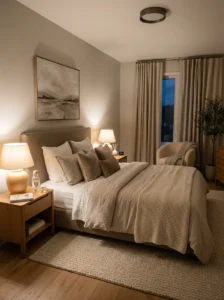
Research and consistent design practice both point toward muted, softer tones — whether warm or cool in temperature — as more conducive to a calm, sleep-ready bedroom than highly saturated, bright, or high-contrast colors. A saturated red, an intense orange, or a very bright, high-energy color reads as visually stimulating rather than calming, which works against the winding-down function a bedroom is specifically meant to support, even if that same color would work well and look striking in a living room or a more active-use space.
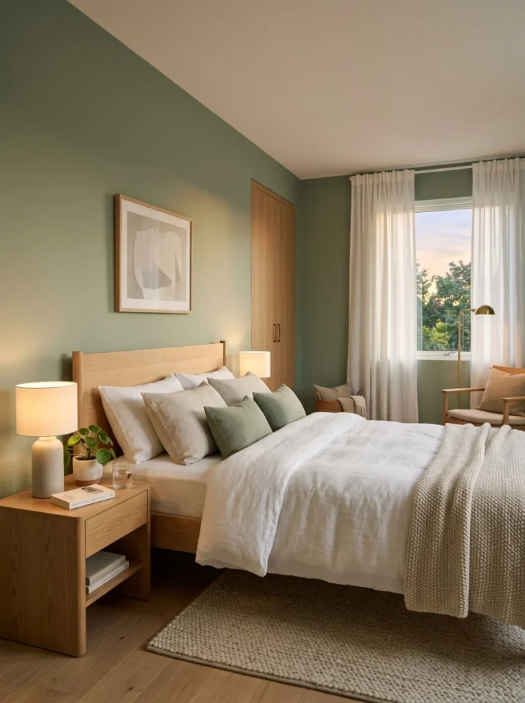
This doesn’t mean bedrooms need to be limited to pale neutrals. A deep, muted blue, a soft sage green, a dusty rose, or a rich but muted charcoal can all read as calming despite having real color depth and saturation, because the muting — rather than the specific hue — is what determines whether a color reads as stimulating or restful. A muted, dusty version of nearly any color tends to work better for a bedroom than a bright, highly saturated version of the same hue.
Blues and greens specifically have a consistent reputation, both in design practice and in some sleep-focused research, for supporting relaxation more reliably than warmer, more energetic colors like bright red, orange, or yellow. This isn’t an absolute rule — a well-chosen warm, muted tone can work just as well for a specific household — but it’s a reasonable starting point for a household without a strong existing preference.
The Color’s Effect at Night Matters More Than Its Effect During the Day
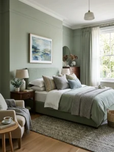
A bedroom color is usually evaluated in daylight, or under a paint store’s bright, even lighting, but the color’s actual functional job happens primarily in the evening and at night, under artificial light and in low-light conditions, which is a meaningfully different test than how most people evaluate a paint color.
Testing a paint sample in the bedroom’s actual evening lighting — under the room’s lamps, at the color temperature the room is actually lit with at night — is a more relevant test for a bedroom specifically than evaluating the same sample only in daylight, which is the opposite emphasis from how most other rooms’ colors are typically tested, given that living rooms and kitchens are more often evaluated for how they look during the day when they’re in heaviest use.
A color that reads as calm and muted under daylight can look surprisingly different under warm, low evening light, and the reverse is also true — this is worth checking directly for a bedroom, since the mismatch between a color’s daytime appeal and its evening function is a more consequential gap in a bedroom than it would be in a room used primarily during daylight hours.
Wall Color Interacts With the Room’s Overall Light Levels at Night
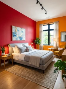
As covered in more detail elsewhere in this series regarding evening living room lighting, a room’s overall light level and color temperature at night affects mood and calm considerably, and a bedroom’s wall color interacts directly with whatever light source is actually used in the room during the wind-down period before sleep.
A cool-toned wall color under warm, low evening lamp light can look muddier or slightly off in a way that undermines the calm effect the color was chosen for, while the same cool tone might look perfectly crisp and clean under daytime light or cooler artificial light. This is the same undertone-matching principle covered elsewhere in this series regarding sofa color and lighting color temperature, applied here specifically to the bedroom’s evening use, which is when the wall color’s actual functional job is happening.
Dimmable, warm bedroom lighting in the evening — covered in more detail elsewhere in this series — pairs well with most muted wall colors, since warm, low light tends to be forgiving of a wide range of wall tones, whereas bright, cool lighting is more likely to expose an undertone mismatch that wasn’t apparent under daylight.
Very Bright White Is Not Automatically the Safest Choice
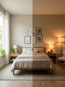
A common assumption is that a plain, bright white wall is the safest, most neutral choice for a bedroom, since it avoids any risk of choosing the “wrong” color. In practice, a stark, bright white can read as clinical and energizing rather than calming, particularly under cooler artificial light, which works against a bedroom’s specific functional goal in the same way an overly saturated color would, just through a different mechanism.
A warm, soft white or a very light, muted neutral — rather than a stark, cool-toned white — tends to support a calmer bedroom feeling while still functioning as a safe, broadly appealing neutral choice for a household uncertain about committing to a stronger color.
Personal Association Matters as Much as General Color Psychology
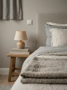
General color psychology research provides a reasonable starting framework, but personal association with a given color — positive or negative memories, cultural associations, simply a color someone has always found calming or agitating for reasons specific to them — can outweigh general research findings for any individual. A household genuinely calmed by a color that general guidance might flag as more energizing is better served trusting that personal response than following general advice against their own direct experience.
This is worth testing directly, the same way testing a fabric swatch or a paint sample in a room’s actual lighting is recommended elsewhere in this series — living with a sample of the intended color in the actual bedroom for a period of time, particularly experiencing it during the evening wind-down hours specifically, is a more reliable test of an individual’s actual response than general color psychology guidance alone.
Practical Application: Where Color Choice Matters Most in a Bedroom

The walls, given their scale, have the largest cumulative effect on the room’s overall calm, but bedding and window treatments are worth considering with the same priorities, since they occupy a large visual area and are, unlike walls, directly adjacent to the body during the sleep period itself. A calming wall color paired with a highly saturated, high-contrast bedding pattern partially undermines the wall color’s intended effect, given how much visual area bedding occupies in a typical bedroom.
Accent elements — art, a single accent chair, smaller decorative objects — have more flexibility to introduce brighter or more saturated color without working against the room’s overall calm, applying the same principle covered elsewhere in this series regarding accent color use: a small, contained dose of a stronger color reads differently than the same color applied at the scale of a wall or a full bedding set.
Key Takeaways

- Muted, softer tones generally support a calmer, more sleep-ready bedroom better than highly saturated or bright colors, regardless of whether the underlying hue is warm or cool
- Blues and greens have a consistent reputation for supporting relaxation, though a well-chosen muted version of nearly any hue can work for a household with a different preference
- A bedroom color’s actual functional job happens primarily in the evening under low, often warm light, which makes testing a paint sample under the room’s actual evening lighting more relevant than evaluating it only in daylight
- Stark, bright white is not automatically the safest bedroom choice — it can read as clinical and energizing rather than calming, particularly under cool artificial light
- Personal association with a given color can outweigh general color psychology guidance for an individual, and is worth testing directly by living with a sample in the room’s actual evening conditions
- Bedding and window treatments occupy significant visual area and are worth choosing with the same calming priorities as the walls, while smaller accent elements have more flexibility to introduce bolder color
Frequently Asked Questions
Is there real research behind blue and green being calming bedroom colors, or is that just a design convention? There’s some genuine research support alongside the strong design convention, though color’s effect on sleep and mood is influenced by many factors beyond hue alone, including saturation, personal association, and the room’s actual lighting conditions. Blue and green are a reasonable starting point for a household without a strong existing preference, but a well-chosen muted version of another color, tested directly in the room, can work just as well for a specific individual.
Should I test bedroom paint colors during the day or at night? Both, but night testing is more relevant to a bedroom’s specific function than it would be for most other rooms, since a bedroom’s calming job happens primarily in the evening under low, often warm artificial light. A color that looks appealing under daylight can read differently once the room’s actual evening lighting is applied, which is worth checking directly before committing.
Is white always a safe default for a bedroom? Not automatically — a stark, cool-toned white can read as clinical rather than calming, particularly under cooler artificial light, which works against a bedroom’s functional goal in a different way than an overly saturated color would. A warm, soft white or a light, muted neutral tends to be a safer default than a stark, bright white specifically for a bedroom.
Can bold or saturated colors ever work in a bedroom? Yes, particularly when confined to a smaller-scale application — an accent wall in a smaller room, art, an accent chair, decorative objects — rather than applied across the full wall area and bedding at once. The same accent-color principle covered elsewhere in this series, of introducing stronger color through smaller, contained elements rather than the room’s largest surfaces, applies well to balancing a desire for bold color with a bedroom’s calming function.
How much does personal preference matter compared to general color psychology guidance? Quite a lot — general guidance is a reasonable starting framework, but an individual’s personal association with a specific color, whether from memory, culture, or simple preference, can outweigh general research for that person’s actual experience of the room. Testing a color directly in the bedroom’s real evening conditions is a more reliable way to confirm a good fit than relying on general guidance alone.