

Color-shy dressing and color chaos are both common mistakes — and both come from missing the same handful of rules. Here’s how color actually gets worn well.
The Line Between Bold and Overwhelming, and How to Find It
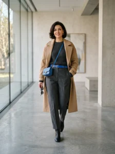
Most people fall into one of two camps with color: they stick almost entirely to black, gray, and navy because color feels risky, or they wear color enthusiastically and end up looking a little chaotic without quite knowing why. Both groups are usually missing the same underlying structure — not a rule about which colors to avoid, but a set of decisions about how much, where, and in what proportion.
I spent years in the first camp, defaulting to neutrals because every attempt at color felt like it read as costume-y rather than intentional. The shift happened once I stopped thinking about color as “brave versus safe” and started thinking about it the way a colorist or stylist actually does — as proportion, temperature, and placement. None of it requires being naturally bold. It requires a system.
Why All-Neutral and All-Color Fail for the Same Reason

It seems like these are opposite problems, but they actually come from the same root cause: no clear point of visual focus.
An all-neutral outfit with no color at all can read as flat, not because neutrals are boring, but because there’s nothing for the eye to land on first — everything competes equally for attention, which paradoxically makes the outfit feel like it has no clear idea.
An outfit with three or four unrelated bright colors has the same problem in reverse. Every color is asking to be the focal point simultaneously, so instead of one clear point of interest, the eye bounces between competing elements without settling anywhere.
The fix in both cases is the same: establish one clear point of visual focus, whether that’s a single color statement in an otherwise neutral outfit, or a dominant color with everything else acting as support. Neither extreme has this hierarchy; the outfits that read as intentional almost always do.
The 60-30-10 Structure, Applied to Getting Dressed
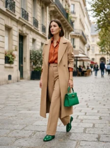
This ratio comes from interior design, where it’s used to balance a room’s color scheme, but it maps almost perfectly onto how well-styled color outfits are actually built.
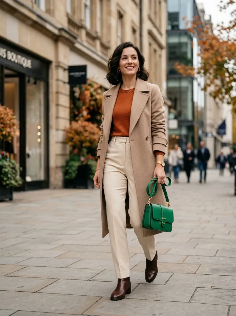
60% is the dominant tone — usually a neutral or a muted version of the main color, covering the largest surface area of the outfit: trousers, a coat, a larger portion of a dress.
30% is the secondary color — this is where genuine color can enter without overwhelming, often in a top, a cardigan, or a skirt, providing enough presence to register clearly without taking over the entire look.
10% is the accent — the smallest, most concentrated dose of color, usually in an accessory: a bag, shoes, a scarf, jewelry. This is where the boldest, most saturated color choices actually work best, because their small surface area keeps them from becoming overwhelming.
Applying this ratio explains why a single bright accessory looks intentional while a bright top and bright bag together often looks like too much — the accessory alone respects the 10% principle; two significant color elements at once usually breaks the ratio.
Color Temperature Matters More Than Most People Realize
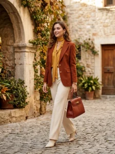
Beyond how much color to use, which specific colors sit together changes how “put together” an outfit reads, independent of the actual shades chosen.
Warm and cool versions of the same color family don’t automatically match. A warm coral and a cool, blue-based pink are both “pink-adjacent” but can visually clash in a way that’s hard to name but easy to notice — this is why two colors that seem like they should coordinate sometimes don’t, and it’s rarely about the specific hue so much as the underlying warm or cool base.
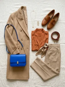
Sticking to one temperature family across an outfit creates cohesion even with multiple colors. A warm rust, warm mustard, and warm cream work together more easily than a technically “matching” but temperature-mixed palette, because the eye reads consistency in undertone even before it consciously registers the individual colors.
Neutrals have temperature too, and this affects what they pair well with. A warm beige sits more naturally with warm colors like rust or olive, while a cool gray pairs more naturally with cool colors like icy blue or true red — mismatching these undertones is a common, subtle reason an outfit feels slightly “off” without an obvious cause.
Color Blocking Versus Color Mixing: Two Different Skills
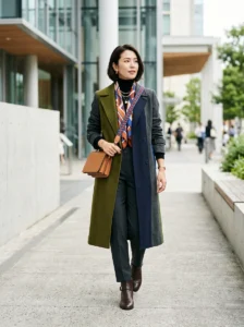
These get treated as the same thing, but they produce different results and suit different comfort levels with color.
Color Blocking
Color blocking uses two or three solid colors in distinct, separate sections — a colored top with colored trousers, for instance, each in its own solid block rather than mixed within a single garment. This tends to look cleaner and more graphic, and it’s generally the easier entry point for someone newer to wearing color, since the color decisions are contained to large, simple shapes.
High contrast between the blocked colors reads as more intentional than close, similar tones. Two colors of similar intensity and similar family can blur together visually, while two genuinely distinct colors — a saturated color against a muted one, or complementary tones — create the clear separation that makes color blocking work as a technique rather than looking accidental.
Color Mixing
Color mixing incorporates multiple colors within patterns, prints, or through layering smaller pieces, and it requires a slightly more developed sense of the 60-30-10 ratio, since the colors aren’t as neatly separated into large sections. A printed piece already does some of this work internally — the print’s dominant background color functions as the “60%,” with the printed elements as the “30% and 10%.”
Mixing works best when at least one element ties the multiple colors together, whether that’s a shared undertone across the palette or one color that repeats in two different places in the outfit (a print’s accent color echoed in a solid accessory, for instance) — without this connective element, mixed color easily tips into looking random rather than curated.
How Skin Tone Actually Factors In — More Simply Than People Assume
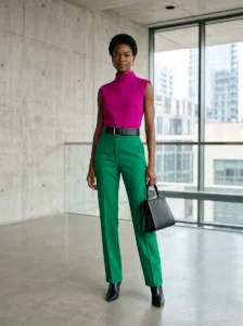
This gets treated as more complicated than it needs to be, and oversimplified in the opposite direction just as often.
The undertone-matching advice (warm skin wears warm colors, cool skin wears cool colors) is a helpful starting point, not an absolute rule. Almost any color can work near the face if the specific shade’s own undertone is adjusted — a warm-toned coral instead of a cool-toned coral, for someone with warm undertones, rather than avoiding coral as a color family entirely.
Placement relative to the face changes how much undertone matters. A color worn as trousers or shoes, far from the face, has much less impact on how skin tone reads than the same color worn as a top or scarf directly framing the face — this is why undertone rules matter far more for the 30% or 10% zones near the face than for the 60% zone that’s often lower on the body.
Testing a color near the face in natural light is more reliable than any general skin tone chart. Holding a garment or swatch up to the face and checking whether it makes skin look brighter or slightly gray and tired is a faster, more accurate check than trying to categorize skin tone into a fixed system first.
Key Takeaways
- All-neutral and all-color outfits fail for the same underlying reason: no clear point of visual focus, not because either extreme is inherently wrong
- The 60-30-10 ratio — dominant tone, secondary color, small accent — explains why a single bold accessory reads as intentional while multiple bold pieces often feel like too much
- Matching color temperature (warm-to-warm, cool-to-cool) creates cohesion even across multiple different colors, more reliably than matching exact hues
- Color blocking uses high-contrast solid sections and suits color beginners; color mixing needs a connective element, like a repeated undertone or echoed accent, to avoid looking random
- Skin tone undertone matters most for colors worn close to the face; the same color further from the face has much less visual impact on how skin tone reads

Frequently Asked Questions
I default to neutrals because color feels risky — where’s the easiest place to start? The 10% accent zone is the lowest-risk entry point, since a single colored accessory — a bag, a scarf, one piece of jewelry — adds genuine color without requiring commitment to a full colored garment. This lets the color show up against a familiar, comfortable neutral base, and it’s much easier to build confidence gradually from there than to jump straight into a fully colored outfit.
Can patterned or printed pieces make this whole system more complicated? They add a layer of consideration but don’t break the underlying logic — a print’s dominant background color generally functions as the outfit’s 60% or 30% depending on how much of the outfit it covers, while the printed elements within it act as the smaller accent percentages. The main thing to watch is not adding a second bold solid color on top of an already busy print, since that tends to compete with the print rather than support it.
Is it possible to wear two bold, saturated colors together successfully, or should one always be muted? It’s possible, but it generally requires either high contrast between the two colors (true complementary pairs tend to work better together than similar-intensity colors that are just different hues) or keeping one of the two colors to a small enough proportion that it functions more like an accent than an equal partner. Two large-surface-area bold colors of similar visual weight is the combination most likely to tip into looking chaotic rather than intentional.
Does this approach change for formal or workwear settings compared to casual outfits? The underlying ratio and temperature-matching principles stay the same, but formal and workwear settings typically compress the color percentages further — a work outfit might use 80% dominant neutral, 15% secondary, and 5% accent rather than the looser 60-30-10 used casually, since formal contexts generally read as more polished with less overall color saturation. The structure doesn’t change; the proportions simply shift more conservative.
How do I know if an outfit has crossed from “bold and intentional” into “too much”? A useful check is counting genuinely competing focal points rather than counting colors — an outfit can technically include four colors and still read as calm if three of them are muted, low-saturation neutrals functioning as the 60% and 30%, with only one genuinely saturated accent. The outfit tips into “too much” when there are two or more elements of similar saturation and similar surface area competing for attention at once, regardless of the total color count.