

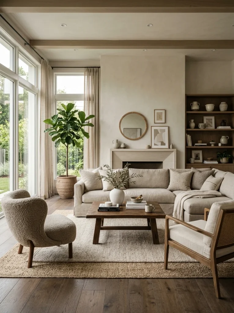
Neutral rooms are supposed to feel serene and sophisticated. Most of them feel flat. Here’s exactly what’s missing and how to fix it without abandoning the palette.Neutral rooms are supposed to be calming, flexible, and quietly sophisticated — the kind of room that works with any accent color, photographs beautifully, and never feels dated. What they often are, in practice, is beige. Not bad beige, not failed beige, just beige: a room where every surface is some variation of the same soft warm nothing, and the effect is less serene than simply absent. You’re not uncomfortable in the room. You’re not engaged by it either.
The flat neutral room is one of the most common design outcomes in homes precisely because neutrals seem safe. They’re the obvious hedge against commitment, the choice made to avoid choosing. And when the avoidance of choice becomes the organizing principle of a room, the room has no organizing principle — just an undifferentiated field of non-color that the eye passes over without landing anywhere.
The fix isn’t to add color. That’s the obvious answer and usually the wrong one for people who chose neutral for a reason. The fix is to understand what neutrals require to work — what the serene, sophisticated neutral rooms in design photography have that most real neutral rooms don’t — and supply those specific missing elements within the neutral palette.
What Makes Neutrals Go Flat
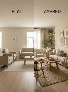
A neutral palette is not a design. It’s a constraint within which design must still happen. The rooms that read as beautifully neutral — calm, layered, considered — are rooms where significant design work has been done within the neutral range. The rooms that read as flat are rooms where “neutral” was understood as a final decision rather than a starting point.
The specific variables that neutrals remove from a room are color contrast and color interest — the variation that gives the eye movement and points of arrival. Without those variables, a room must generate visual interest through three other mechanisms: value variation (light to dark), texture variety, and material diversity. A neutral room that has all three reads as rich and intentional. A neutral room that has none of them reads as a single unvaried surface, regardless of how many different objects are in it.
Most flat neutral rooms are missing at least two of the three.
Value Variation: The Most Important Variable Nobody Names
Value refers to the lightness or darkness of a tone — and it’s the variable that does the most work in distinguishing a flat neutral room from a layered one.
A room where everything is the same value — all mid-tone warm cream, all mid-tone greige, all the same light warmth — has no depth. The eye processes it as a single plane because there’s no contrast to create the perception of depth. This is what produces the “flat” quality: not the absence of color, but the absence of value variation within the colors that are there.
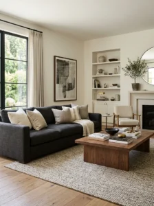
A neutral room with deliberate value variation reads completely differently. Pale walls that recede. A mid-tone rug that grounds the space. A darker sofa or chair that anchors it. Cushions and throws that range from light to dark within the neutral range. The value range gives the room a foreground, middle ground, and background — it creates the perception of depth that color would otherwise provide.
The practical application: when assessing a flat neutral room, identify what value range currently exists. If everything is within a narrow band — all light, all mid, or all one shade — introduce elements at the opposite end of the value range. A pale room needs some darker elements. A consistently mid-tone room needs something lighter and something darker. A room with a very dark sofa and dark rug might need lighter elements at wall and ceiling height to prevent the room from feeling heavy.
The neutral color family stays intact; the value range expands within it.
Texture: The Variable That Does What Color Usually Does
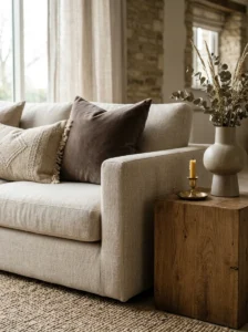
In a room with strong color, texture is secondary — the color itself provides visual interest and the texture is an enhancement. In a neutral room, texture takes over the primary role. It provides the variation the eye needs to find the room interesting, and without it, the room’s neutrality reads as emptiness rather than serenity.
The texture problem in flat neutral rooms is almost always a combination of too few distinct textures and textures that are too similar in character. A room with a linen sofa, a cotton rug, and linen cushions is technically three different textiles — but they’re all soft, all matte, all loosely woven, and they read as one undifferentiated fabric surface with different item shapes.
A neutrally colored room with genuine texture variety is entirely different. The goal is contrast within the texture family, not just variety:
Soft against hard. A plush velvet cushion against a smooth linen sofa. A wooden side table against a soft upholstered chair. The contrast between a tactile and a rigid surface is readable even at a distance and gives the eye a pause point.
Rough against smooth. A jute rug beneath a glass coffee table. A rough terracotta vessel beside a smooth ceramic lamp base. The material contrast reads as interesting without requiring any color involvement.
Matte against reflective. A matte plaster wall behind a polished brass lamp. A flat-woven rug beneath a glass tabletop. The reflective surface catches light while the matte surface absorbs it, creating variation in how light behaves across the room.
A neutral room that consistently contrasts soft/hard, rough/smooth, and matte/reflective within its palette reads as rich regardless of whether any color is present.
Warm and Cool Neutrals: A Contrast Most People Skip
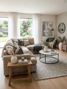
This is the insight most consistently absent from flat neutral rooms. All neutrals have an undertone — warm or cool — and a room entirely in warm neutrals has a different flatness problem than a room entirely in cool neutrals. Both can go flat. The solution for both is introducing some element from the other direction.
A room of warm creams, warm beiges, and warm taupes reads as undifferentiated warmth — comforting but monotonous. Introducing one cool element — a soft gray cushion, a cool white candle, a plant with bluish-green leaves, a slightly cooler white in the ceiling paint — creates a temperature contrast within the neutral palette that reads as variation without introducing color.
A room of cool grays and cool whites has the same problem in reverse: introducing one warm element — a wooden side table, a warm linen throw, a candle in a terracotta holder — breaks the monotony while staying within the neutral range.
The warm/cool interplay within a neutral palette produces the “layered” quality that makes sophisticated neutral rooms read as interesting. The complete absence of temperature contrast produces the flat quality that makes neutral rooms read as empty.
The Material Layer: Where Flat Neutral Rooms Most Often Fail
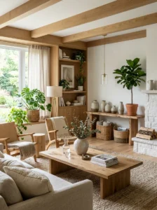
Most flat neutral rooms are furniture-only rooms. The walls are painted. The furniture is upholstered. The surfaces are wood or glass. But beyond these standard material categories, there’s little else — no natural material, no handmade element, no material with visual texture at the object level.
The material layer is the category of objects and accessories in the room that bring specific material qualities: the woven basket, the ceramic bowl, the rattan side chair, the terracotta vase, the stack of linen-covered books. These objects are neutral in color but materially diverse — and their material diversity is what adds the “something you can’t quite name but makes the room feel rich” quality.
The neutral rooms that photograph well — the rooms that read as intentionally calm rather than accidentally empty — almost always contain objects from at least four or five distinct material families:
- Wood — furniture, frames, accessories
- Natural fiber — jute, rattan, linen, cotton, wool
- Ceramic or stone — vessels, lamp bases, sculpture
- Metal — lamp fixtures, trays, frames, hardware
- Glass — vases, candle holders, tabletops
- Living plant material — the one category that no manufactured material fully replaces
A room with objects from several of these families, all in neutral or muted tones, reads as layered and interesting. A room with objects from only one or two of these families reads as furnished but not decorated.
Pattern in a Neutral Room
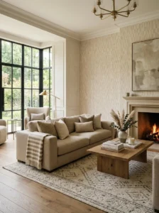
Pattern is the design element most commonly abandoned in neutral rooms out of fear that it will introduce too much visual activity. This is a reasonable concern with the wrong solution.
The solution is not to eliminate pattern but to use pattern with neutral tones — specifically, patterns where the contrast within the pattern is low rather than high. A stripe where both colors are within the neutral range. A geometric where the two tones are close in value. A botanical print in shades of cream and sand. These patterns add movement and interest without asserting a color that competes with the room’s palette.
High contrast pattern — black-and-white stripe, bold geometric in contrasting colors — functions differently in a neutral room than low-contrast pattern. One bold-contrast element can work as a statement in an otherwise neutral room. Two or more creates the busy quality neutral rooms are trying to avoid.
A natural-fiber rug with a subtle woven pattern — a herringbone in two tones of jute, a flatweave in ivory and cream — adds visual texture at the floor level without any color involvement, which is one of the highest-return pattern additions available in a neutral room.
Lighting as the Fix for the Wrong Kind of Neutral Flat
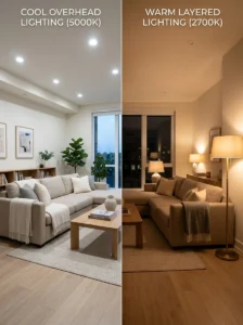
Some neutral rooms feel flat not because of their palette but because of their lighting. A room in warm cream that’s lit with cool-white overhead light loses all its warmth — the light strips the undertone away and the room reads as cold and flat rather than warm and neutral.
This specific problem is solved by the lighting change described in the bathroom and kitchen articles, not by adding texture or material: replacing cool overhead light with warm-toned light sources at multiple heights restores the palette’s warmth and depth. A warm neutral room under warm layered light reads completely differently from the same room under cool overhead light.
If a neutral room feels flat despite adequate texture, material variety, and value range, assess the light source color temperature before making any other changes. The flat quality may be a lighting problem wearing the disguise of a palette problem.
The One Bold Element in a Neutral Room
This is the option that stays within the spirit of a neutral room while providing the focal point the room needs: one element that’s decisively different in color, value, or material from everything else.
This element doesn’t have to be colorful. It can be:
- A very dark piece in a light room — a near-black side table, a charcoal cushion against cream upholstery
- A very light piece in a mid-tone room — an off-white ceramic lamp against a warm gray background
- A highly textured piece in a smooth room — a shaggy throw, a rough stone vessel
- A distinctively shaped piece in a simple room — a sculptural floor lamp, an organically shaped vase
- A single piece in an accent color — terracotta, deep green, slate blue — in a quantity controlled enough (one cushion, one vase) that it reads as an accent rather than a commitment
The one-bold-element principle gives the flat neutral room a focal point without changing its fundamental palette. The eye now has something to go to first, which creates the sense of composition that reads as designed rather than default.
Key Takeaways
- Neutral is a palette constraint, not a design — a neutral room still requires deliberate design work within that constraint to avoid reading as flat
- The three variables neutrals eliminate (color contrast, color interest) must be replaced by value variation, texture variety, and material diversity
- Value variation — light to dark within the neutral range — creates depth and dimensionality that color would otherwise provide
- A room entirely in warm neutrals or entirely in cool neutrals reads as monotonous; introducing some temperature contrast within the neutral range adds the variation that makes sophisticated neutral rooms read as layered
- Material diversity — wood, natural fiber, ceramic, metal, glass, living plants — provides the “something you can’t name but makes the room feel rich” quality
- Low-contrast pattern within the neutral palette adds movement without asserting color
- Flat neutrals are sometimes lighting problems — cool overhead light strips warm undertone from warm neutrals; warm layered lighting restores it
- One decisively different element — in value, texture, or material rather than necessarily color — gives a flat neutral room the focal point it needs without changing its palette
Frequently Asked Questions
How many accent colors can a neutral room have before it stops being neutral? Typically one or two accent colors, in controlled quantities, is the ceiling before a “neutral” room starts reading as colored. One accent color applied consistently — terracotta in one or two cushions, a vase, and a throw — reads as a neutral room with a warm accent. Two accent colors in similar quantities can work if they’re closely related in temperature and value. More than two, or even one in too many positions, shifts the room’s character from neutral-with-accents to an actual color palette.
Is it possible to make a neutral room interesting without buying anything new? Often yes — through rearrangement and redistribution. Assess whether the room’s value range is being used effectively. Move a darker piece from a corner to a more prominent position. Reposition a lighter element to create balance. Redistribute textiles so different textures appear in contrast rather than grouped together. Change the lighting temperature by replacing a single bulb. These zero-cost adjustments can produce a meaningful improvement in a flat neutral room before any new purchase is considered.
Does adding plants really help a flat neutral room? More than people expect. A plant in a neutral room introduces a specific material category — living organic material — that manufactured objects can’t fully replicate. The green of a thriving plant provides a soft color note that reads as natural rather than as an intentional color choice, and the irregularity of organic form adds visual variety that geometric furniture doesn’t provide. One well-placed, appropriately sized plant in a neutral room does visible work. Several plants establish a specific character for the room that can become its own design direction.
My neutral room has texture but it still feels flat. What am I missing? Check the lighting first — cool-toned overhead light flattens warm neutrals regardless of texture. Then assess value range — if all textures are in the same value (all mid-tone, all similarly light or dark), the texture variety isn’t producing enough visual contrast. Finally, check the material categories represented: if all textures are fabric-based (linen sofa, cotton rug, woven cushions) without hard surfaces, natural materials, or reflective elements, the room has texture variety within one category rather than true material diversity.
Is a neutral room appropriate for all home styles, or does it work better for some than others? Neutral palettes work across most residential styles but require different execution. In contemporary and minimalist settings, neutral palettes suit the design language and the texture/material approach described in this article applies directly. In traditional or eclectic settings, neutral palettes often benefit from more pattern (in a muted range) and more material variety to prevent the room from reading as sterile rather than refined. In maximalist settings, neutrals work as a backdrop for significant collections of objects and art, where the neutrality of the base makes the collected elements more prominent. The approach varies; the principle that neutrals require active design work within the palette applies in all cases.