

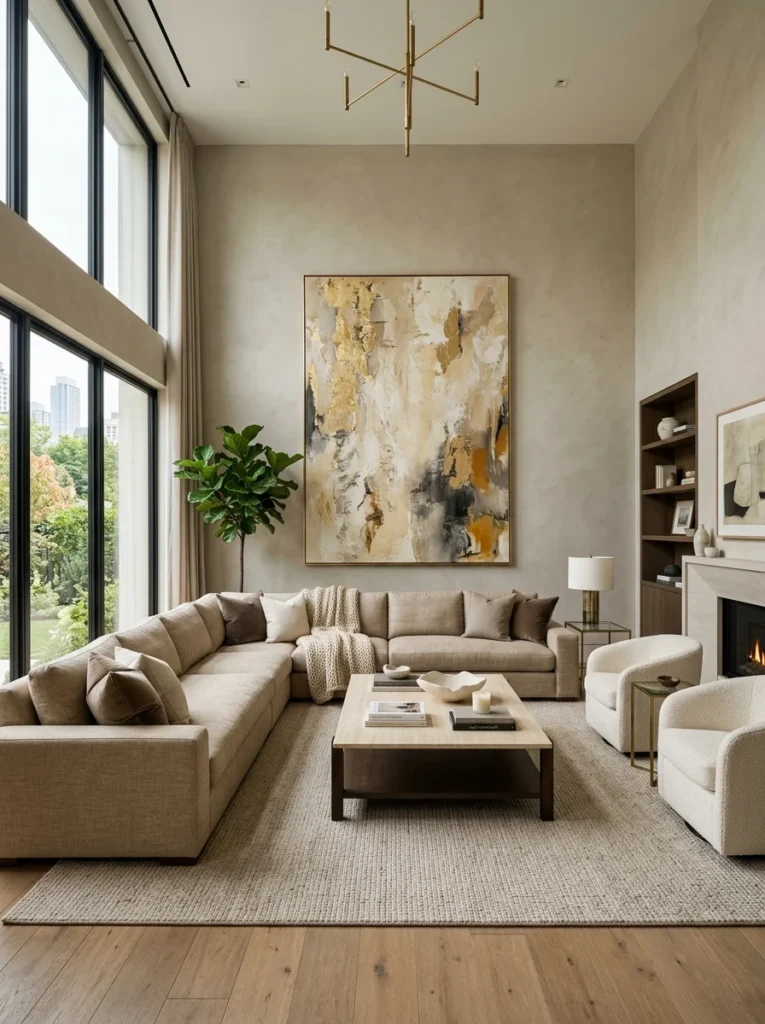
A large blank wall is one of the most common unsolved problems in a living room — too big for a single piece, too visible to ignore. Here’s how to fill it in a way that actually holds up.A large wall is a specific kind of design problem that a smaller wall doesn’t create. A modest wall can be resolved with a single piece of art, hung at the right height, and the proportions work themselves out. A genuinely large wall — the two-story great room wall, the long unbroken expanse behind a sectional, the wall opposite a wall of windows — swallows a single modest piece of art the way a large empty parking lot swallows a single parked car. The scale mismatch is the entire problem, and it’s why so many large walls in otherwise finished living rooms sit blank for years: the household knows something needs to go there, and every individual option that’s been considered feels too small once it’s actually on the wall.
Solving this is almost entirely a matter of understanding scale and grouping, not a matter of finding the perfect single object.
The Core Principle: Scale to the Wall, Not to a Comfortable Budget
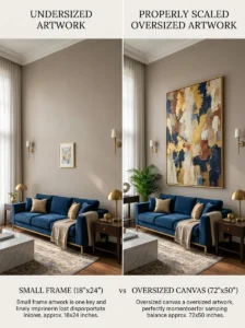
The most common mistake on a large wall is choosing art or objects sized appropriately for a smaller wall, then hanging that same scale of piece on a wall several times larger. A piece of art that would anchor a modest hallway or a bedroom wall perfectly well reads as a small, floating, slightly apologetic gesture on a genuinely large living room wall, regardless of how good the piece itself is.
The general guideline for a single large-scale piece is that it should occupy roughly two-thirds to three-quarters of the available wall width above the furniture beneath it — a sofa or console — rather than a modest fraction of it. This often means the art needs to be considerably larger, and considerably more expensive, than a household initially budgets for, which is precisely why grouping strategies, covered below, are often the more practical solution.
Scale applies to grouped arrangements just as much as single pieces. A gallery wall of small frames, if the frames themselves are too small and too sparsely arranged, can read as scattered and thin on a large wall in the same way a single undersized piece does. The total footprint of whatever’s on the wall — whether it’s one piece or many — needs to relate to the actual size of the wall, not just to what feels proportionate up close.
Large-Scale Single Statement Pieces
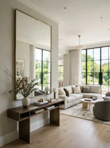
A single oversized piece of art or a large mirror is the most direct solution to a large wall, when the budget allows for it. This doesn’t require an expensive original — large-format prints, commissioned or licensed at scale, and large abstract canvases are available at a wide range of price points, and the key variable is size relative to the wall, not the piece’s cost or prestige.
An oversized mirror does double duty on a large wall, filling the visual space while also reflecting light back into the room — a genuine functional benefit covered elsewhere in this series in the context of light-starved rooms. A large mirror is often a more accessible price point than a comparably sized piece of art, which makes it a practical option for households prioritizing scale over a specific artistic statement.
Tapestries and large textiles are an underused option for genuinely large walls, offering scale at a lower cost than large framed art while adding texture that a flat print or canvas doesn’t, and they work particularly well in rooms that could use some acoustic softening from a large hard wall surface.
Gallery Walls: Grouping to Achieve Scale Without a Single Large Piece
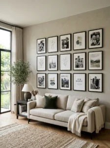
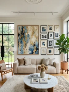
A gallery wall solves the scale problem by using the total footprint of many smaller pieces to achieve the visual weight of one large piece, which is often the more affordable and more personally meaningful route to filling a large wall, since it can incorporate existing art, photography, and objects rather than requiring a single significant purchase.
The arrangement needs a unifying element to avoid reading as scattered rather than intentional. This can be consistent frame color, consistent matting, a shared color palette across the pieces, or a consistent theme (all photography, all botanical prints, all black-and-white) — without at least one of these unifying threads, a collection of varied pieces tends to read as accumulated rather than curated, regardless of how good the individual pieces are.
Planning the layout before hanging anything avoids the most common gallery wall mistake: an arrangement that grows piece by piece with no overall plan, which tends to drift toward uneven spacing and an unclear overall shape. Laying the full arrangement out on the floor first, or using paper templates taped to the wall to test the layout before committing to nail holes, produces a considerably more resolved result than hanging pieces individually as they’re acquired.
A gallery wall on a large wall should still occupy a similarly large overall footprint to what a single statement piece would — the same two-thirds-of-the-width guideline applies to the outer boundary of the whole grouped arrangement, not just to individual pieces within it.
Architectural and Dimensional Solutions
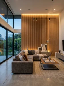
Where art and mirrors aren’t the right direction, dimensional wall treatments fill a large wall’s visual volume differently. Wood slat paneling, a stone or brick veneer feature wall, or a textured plaster treatment applied to the wall itself removes the need to hang anything at all, since the wall’s own surface becomes the visual interest.
Built-in or freestanding shelving across a large wall combines function with scale, particularly in a living room that also needs storage or display space for books and objects. A well-styled large shelving unit — following the volume and containment principles covered elsewhere in this series for smaller-scale shelving — fills a large wall’s footprint while solving a genuine storage need at the same time.
A large wall can also be addressed with a bold paint color or wallpaper treatment, distinguishing it from the surrounding walls as a deliberate accent rather than leaving it the same color as every other wall in the room and then needing to fill it with objects to compensate. This is a lower-cost solution than most art or shelving options, and it works particularly well as a complement to a smaller piece of art or a modest gallery arrangement that would otherwise look undersized on an unaccented wall.
Furniture and Architectural Objects as an Alternative to Wall-Hung Solutions
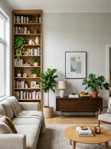
Not every large wall needs to be filled with something hung on it. A large piece of furniture placed against the wall — a substantial bookshelf, a large console with objects displayed on top, a piece of furniture the household would want regardless of the wall-filling problem — can address the scale issue from the floor up rather than from the wall down, particularly in combination with a modest piece of art above it rather than requiring the art alone to fill the entire vertical space.
Large plants, positioned near but not necessarily against the wall, add scale and softness that a purely flat wall treatment doesn’t. A large plant doesn’t solve the wall’s blankness in a strict sense, but it changes the overall visual balance of the space enough that a wall which felt oppressively empty with nothing in front of it can feel resolved with a large plant positioned nearby, even if the wall itself remains relatively simple.
Matching the Solution to the Room’s Actual Use
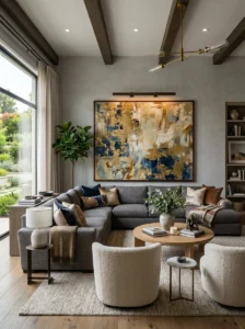
A large wall behind a sofa in the primary sightline of the room — the wall most visible from the entry, or the wall behind the main seating group — generally warrants the most deliberate, highest-investment solution, since it’s the wall doing the most visual work in the room.
A large wall in a less prominent location — beside a staircase, in a stairwell, along a hallway leading into the living room — can often be addressed more modestly, since it’s seen more often in passing than as a focal point, and a gallery wall or a simpler treatment is proportionate to the amount of attention that wall actually receives.
Key Takeaways
- The core mistake on a large wall is choosing art scaled for a smaller wall — a single statement piece should generally occupy roughly two-thirds to three-quarters of the wall width above the furniture beneath it
- Oversized mirrors fill a large wall’s visual space while also reflecting light back into the room, often at a more accessible price point than comparably sized art
- Gallery walls solve the scale problem through total footprint rather than one large piece, but need a unifying element — frame color, palette, or theme — to read as intentional rather than accumulated
- Planning a gallery wall’s full layout before hanging anything produces a more resolved result than growing the arrangement piece by piece over time
- Dimensional treatments — wood paneling, textured plaster, a bold paint or wallpaper choice — can fill a large wall’s visual volume without requiring anything to be hung at all
- Large furniture, shelving, or a substantial plant placed near the wall can resolve the scale problem from the floor up, working alongside a more modest piece of art rather than requiring the art alone to fill the space
Frequently Asked Questions
Is it better to buy one large piece of art or create a gallery wall for a big blank wall? Both work, and the choice usually comes down to budget and personal preference rather than one being objectively better. A single large piece is more straightforward to plan and hang, while a gallery wall is often more affordable and can incorporate meaningful existing pieces, but it requires more careful planning to avoid looking scattered. Either approach needs to achieve a total footprint proportionate to the wall’s actual size.
How do I know what size art to buy for a specific wall? A useful starting guideline is roughly two-thirds to three-quarters of the width of the furniture or wall section beneath where the art will hang, rather than a fraction that feels comfortable in isolation. Measuring the actual wall width and the furniture beneath it, then shopping with that number in mind, prevents the common outcome of falling in love with a piece in a gallery or online that turns out to be considerably too small once it’s hung.
Can a mirror really work as the main feature on a large wall instead of art? Yes, and it’s a practical option worth considering seriously rather than as a fallback. An oversized mirror fills the same visual scale role a large art piece would while adding the functional benefit of bouncing light back into the room, and mirrors at large sizes are often more affordable than comparably scaled original or high-quality reproduction art.
What’s the biggest mistake people make with gallery walls specifically? Growing the arrangement piece by piece over time without an overall plan, which tends to produce uneven spacing and an unclear overall boundary rather than a cohesive grouping. Laying out the full intended arrangement — on the floor, or using paper templates on the wall — before hanging anything produces a considerably more intentional-looking result than adding pieces individually as they’re acquired.
Is it acceptable to leave a large wall completely blank if nothing feels right yet? It’s a reasonable temporary state, though a large blank wall in a prominent sightline tends to read as unfinished rather than intentionally minimal, which is different from a genuinely considered empty-wall design choice. A bold paint color or a textured treatment on the wall itself is a lower-commitment way to resolve the “unfinished” feeling while deciding on art or a gallery arrangement over a longer timeline.