


2026 Kitchen Cabinet Color Trends Worth Trying
Cabinet colour is the fastest way to change how a kitchen feels, and the most expensive to get wrong. Paint covers more surface than anything else in the room, so a shade that looks calm on a swatch can feel heavy across twenty doors. These kitchen cabinet colors 2026 trends are the ones showing up again and again in new kitchens this year: warmer whites, deeper greens, softer blues, and wood tones that look like wood again. None of them need a full remodel. Most of them work best when you test first, paint second, and let the rest of the kitchen stay quiet. I repainted my own cabinets two years ago, and the single best decision was living with painted sample boards on the doors for a full week before committing.
1. Kitchen Cabinet Colors 2026: Warm White Cabinets That Stay Put
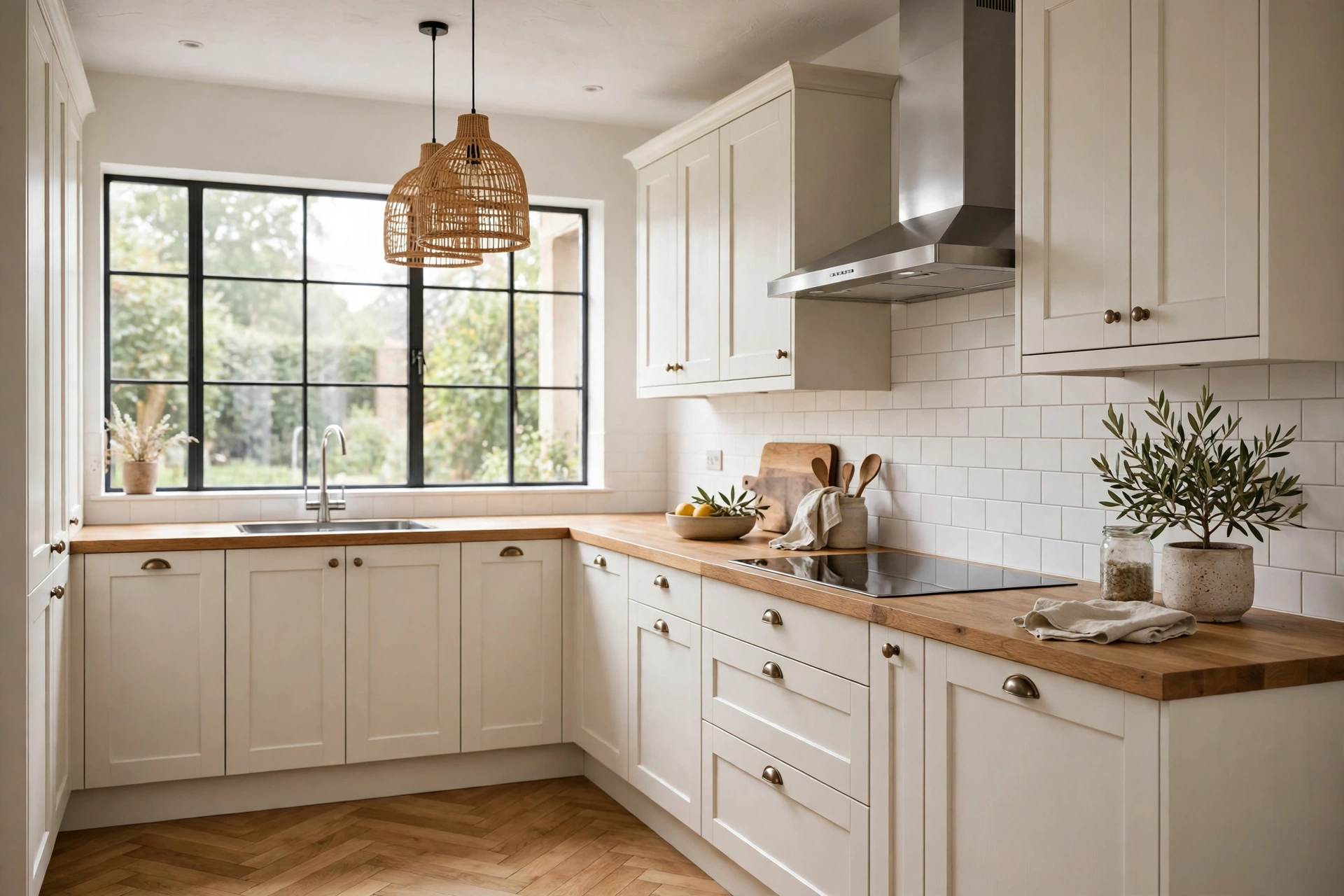
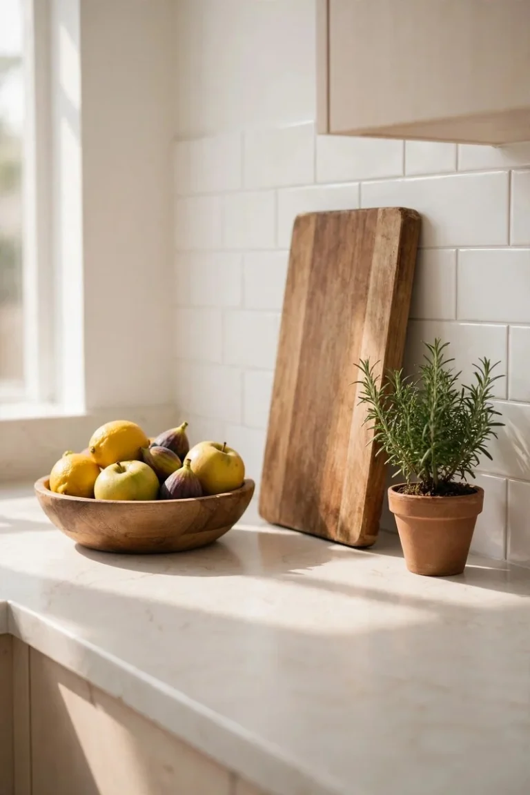
White cabinets are not going anywhere, but the white itself has changed. Stark, blue-white cabinets can look cold under LED lighting, especially in a kitchen with grey floors. The 2026 version leans warm: a creamy white with a hint of yellow or beige underneath. It pairs well with oak worktops, brass handles, and the kind of morning light that makes a kitchen feel lived in rather than staged. Warm white also forgives a lot. It hides small scuffs better than pure white, and it sits comfortably next to both wooden floors and stone worktops. If you are nervous about colour, this is the safe place to start, and it is safe in a good way, not a boring way.
2. Deep Forest Green Takes the Spotlight
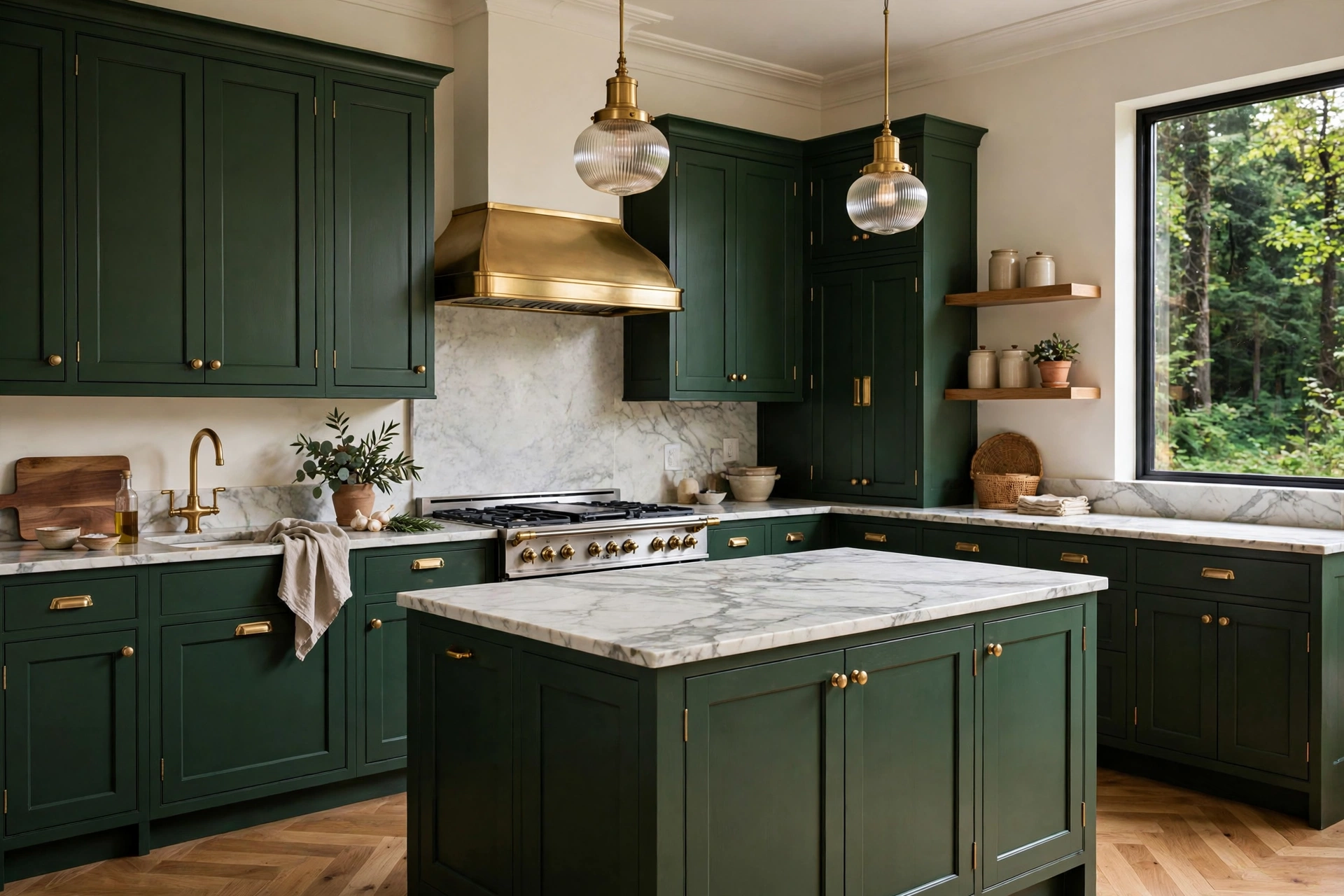
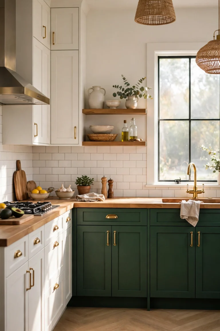
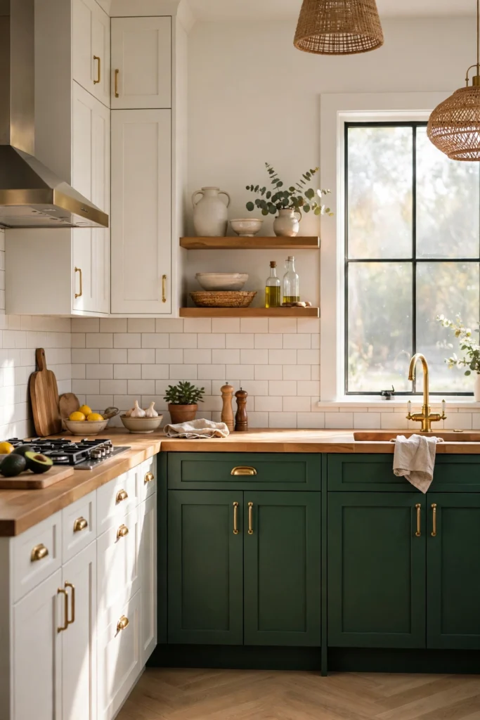
Deep green is the colour I see most in kitchens people photograph and actually cook in. It is rich without being dark in a gloomy sense, and it works with marble, butcher block, and plain white tile alike. The trick is balance. Pair deep green lowers with a pale worktop and light walls, and keep the hardware warm: brass or unlacquered bronze suits it far better than chrome. Green also hides everyday wear well, which matters in a room where doors get opened with wet hands. Test it on the darkest wall of your kitchen first. If it still looks welcoming at 7pm with the lights on, you have a winner.
3. Navy, but Softer Than Before
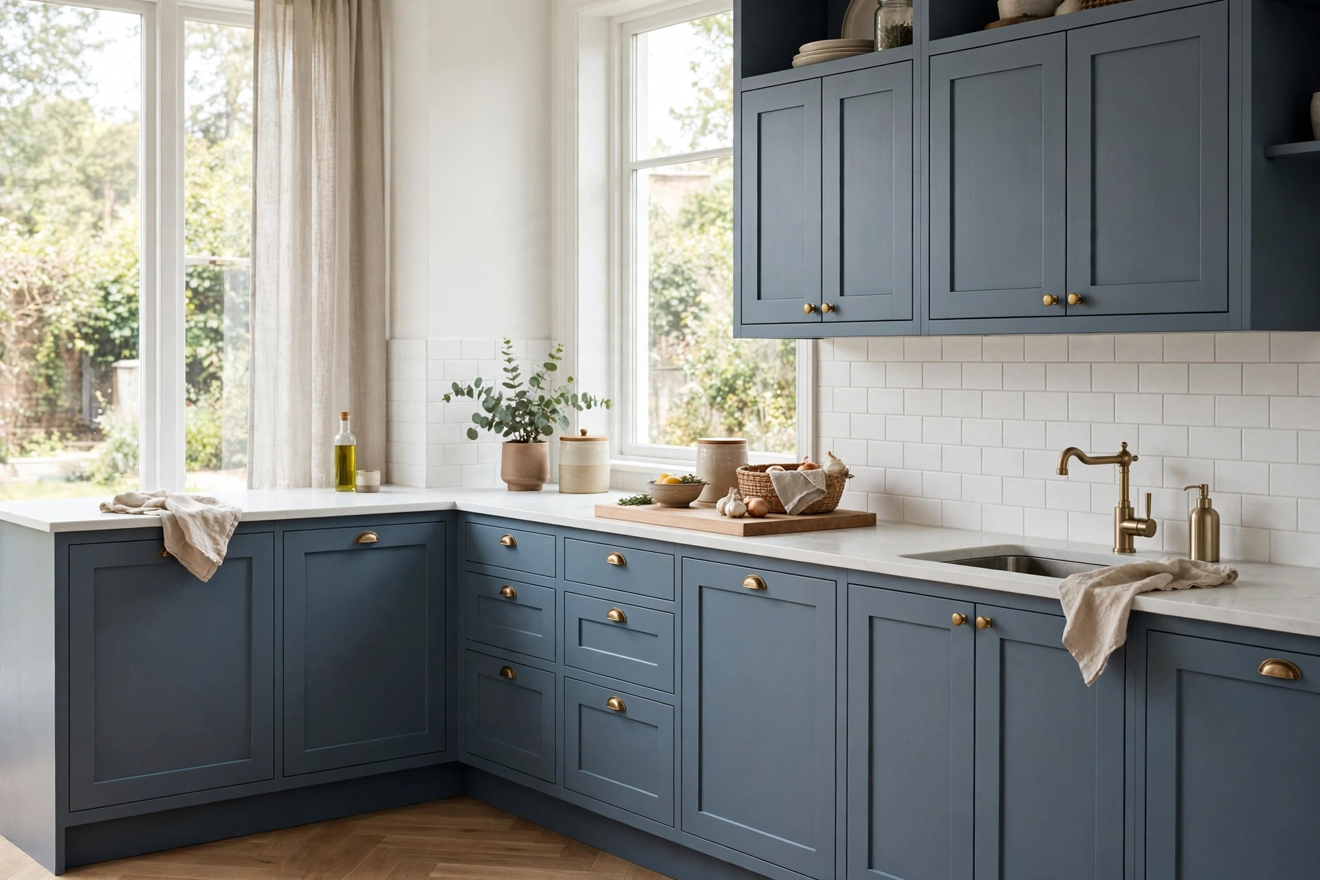
Navy cabinets had a bold moment a few years back, and the 2026 version is a step gentler. Think dusty navy, a blue with grey in it, rather than the inky navy that could swallow a small kitchen whole. Soft navy works beautifully as an island colour, or on lower cabinets with white uppers, because it gives the room depth without closing it in. It suits homes with cooler light, north-facing kitchens especially, and it pairs with both silver and brass hardware. One caution from experience: navy shows dust and fingerprints more than green does, so keep a soft cloth in a drawer and wipe the doors near the handles once a week.
4. Warm Wood Tones Come Back Into View
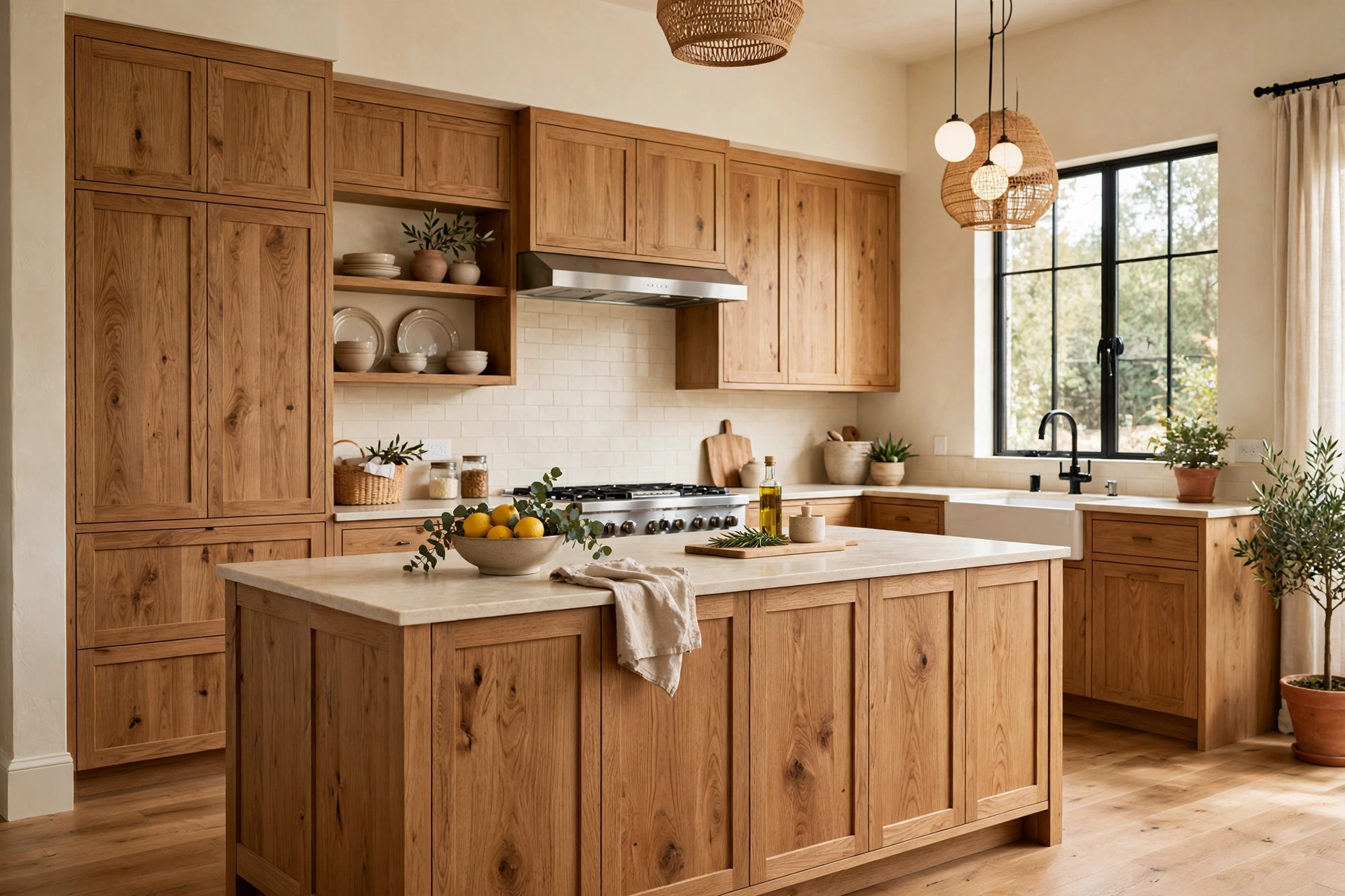
After years of everything painted, natural wood is back, and it looks better for the break. Warm oak, walnut, and ash cabinets bring grain and texture that paint simply cannot fake. The current approach is not the orange-toned oak of the 1990s. It is a muted, honey or mid-brown finish, often with flat fronts and minimal hardware, so the wood itself does the talking. Wood cabinets suit kitchens with plenty of natural light, and they age gracefully: small scratches blend into the grain instead of standing out. If your kitchen already has wooden floors, match the undertone, warm with warm, rather than trying to match the exact shade.
5. Greige, the Colour for People Who Cannot Decide
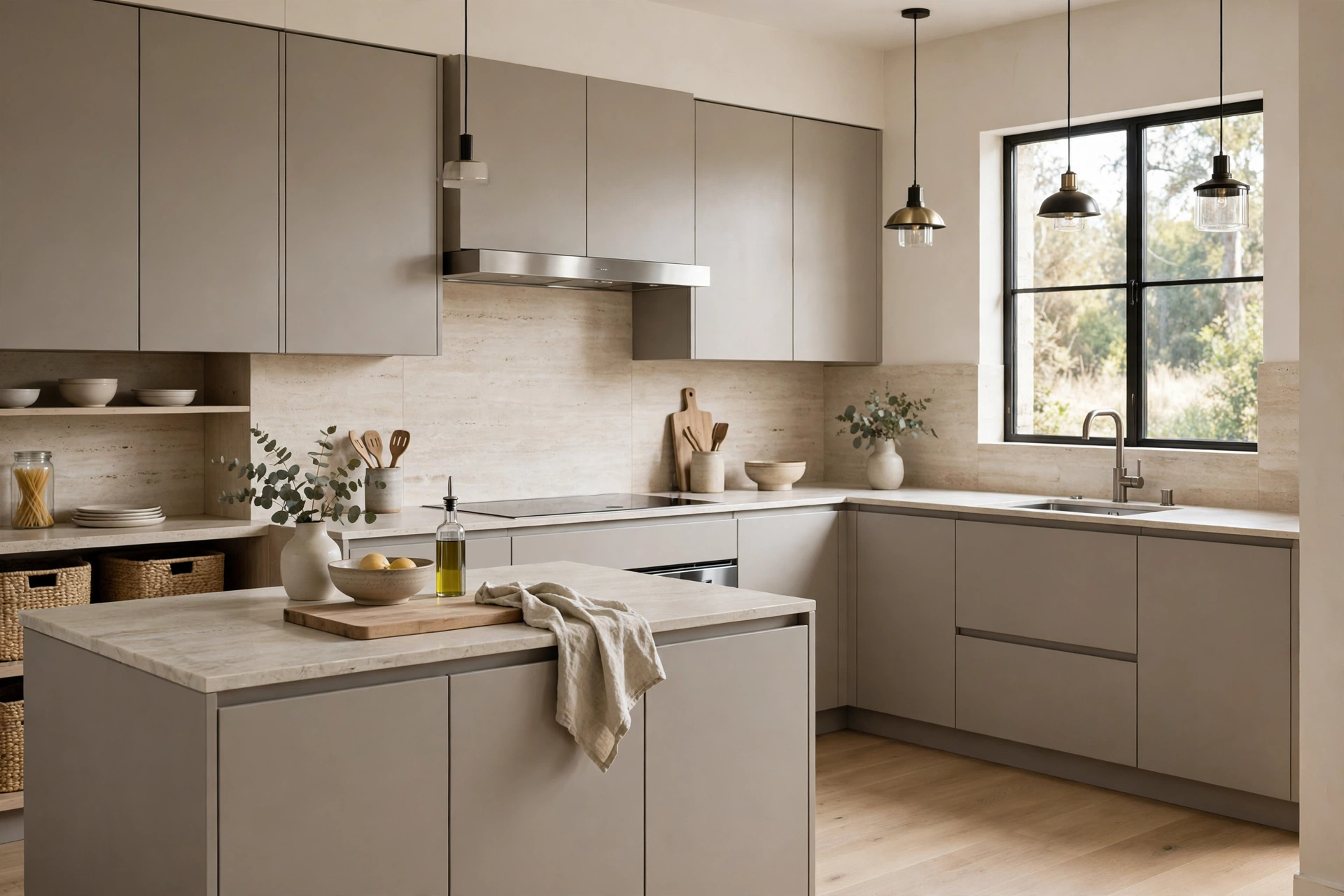
Greige, the mix of grey and beige, earns its place because it refuses to pick a side. In a warm kitchen it reads beige; in a cool one it reads grey. That flexibility is genuinely useful when your floors, tiles, and worktops do not all share one undertone. Greige cabinets pair with almost any worktop, from white quartz to dark granite, and they make a good base if you like changing wall colour or accessories with the seasons. The risk is flatness. Choose a greige with visible warmth, test it next to your floor, and add texture elsewhere, wood boards, linen towels, a stone worktop, so the room does not turn into one soft blur.
6. Two-Tone Kitchens: Dark Below, Light Above
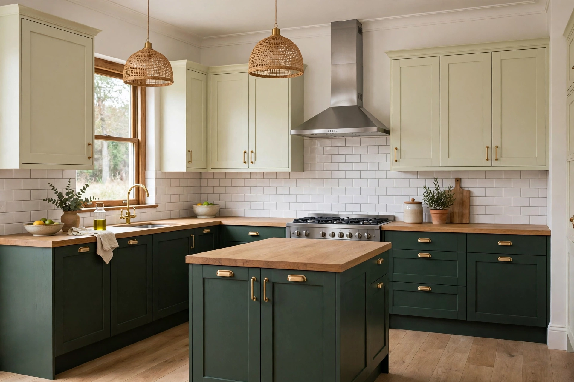
Two-tone kitchens solve the most common cabinet dilemma: you love a dark colour but fear it will shrink the room. Paint the base cabinets dark, green, navy, or charcoal, and keep the uppers pale, cream or warm white. The eye reads the light uppers as air and the dark lowers as grounding, so the room feels both interesting and open. This approach also lets you try a bold colour at half the commitment, and repainting just the lowers later is a weekend job rather than a full project. Keep the two colours in the same family of warmth, and use one hardware finish across both, so the split looks deliberate rather than unfinished. For more on testing paint before you commit, our guide to picking paint colours you will love for years covers swatches, light, and undertones in detail.
7. Black Cabinets, Done With Restraint
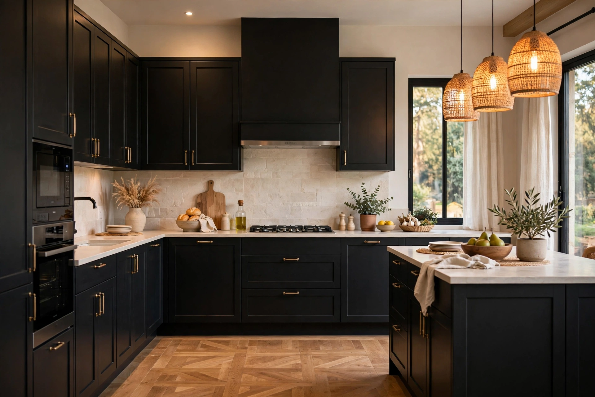
Black cabinets look dramatic in photos and demanding in real life, and both things are true. Done well, matte black with warm lighting, light walls, and a wooden floor looks like a restaurant kitchen in the best sense. Done carelessly, it looks like a cave. The difference is light and contrast. Black needs generous daylight or good layered lighting, pale worktops, and something warm to break it up, wood, brass, or a tiled backsplash with texture. It also shows every fingerprint and water splash, so it suits households that do not mind wiping doors down. If you love the look but not the upkeep, try black on the island only and keep the perimeter cabinets pale.
8. Muted Blue-Grey for a Calm Kitchen
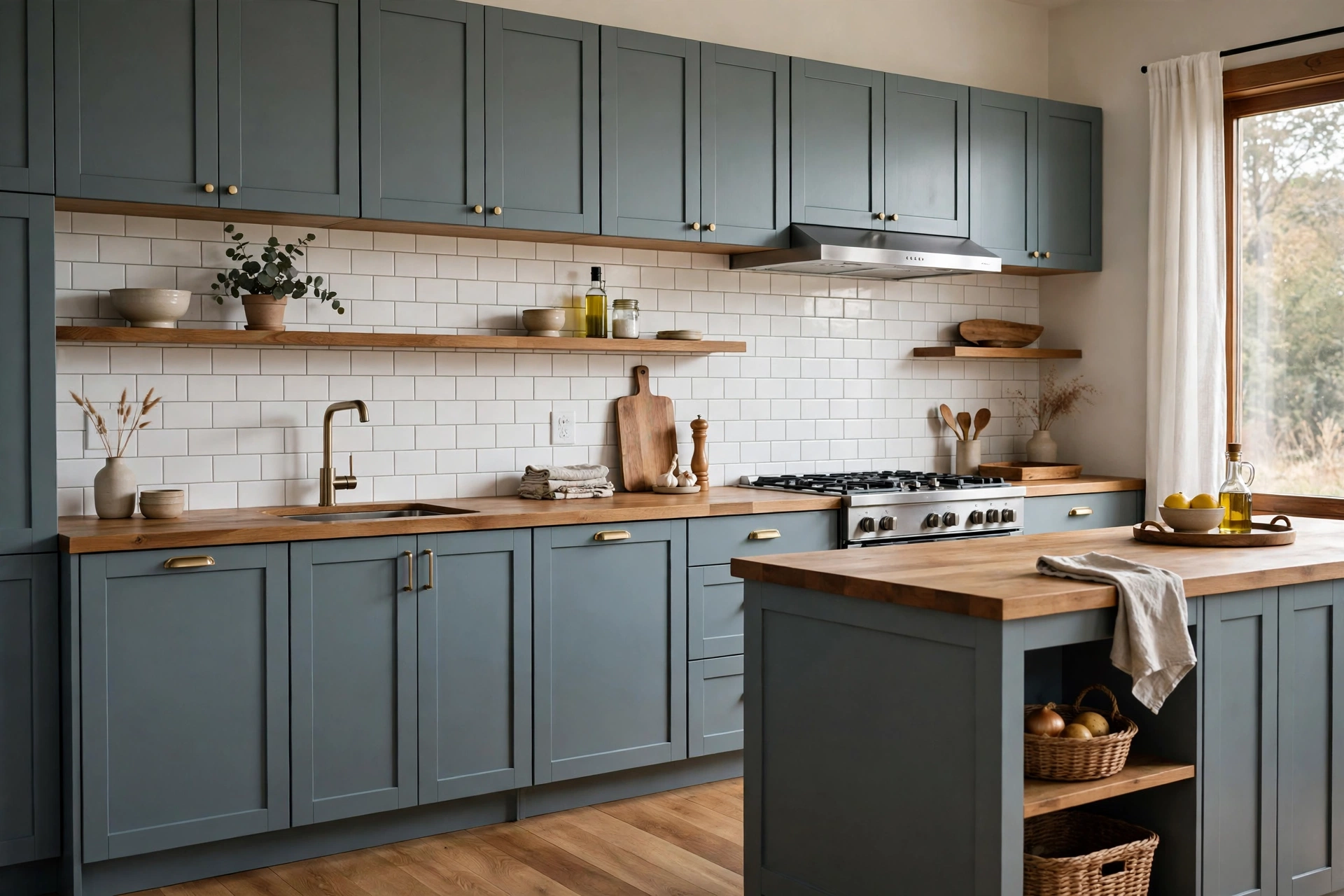
Blue-grey is the quiet colour on this list, and quiet is underrated in a kitchen. It is softer than navy, cooler than sage, and it makes white tiles and wooden accents look better just by sitting next to them. Blue-grey works well in kitchens that open into living spaces, because it reads as a colour without shouting across the room. It pairs with brushed nickel or pewter hardware and with pale stone worktops. One thing to check before you commit: blue-grey can turn cold in a north-facing room with grey floors, so test a large sample on the wall that gets the least light. If it still feels calm there, it will feel calm everywhere.
9. Cream and Butter Tones Warm Things Up
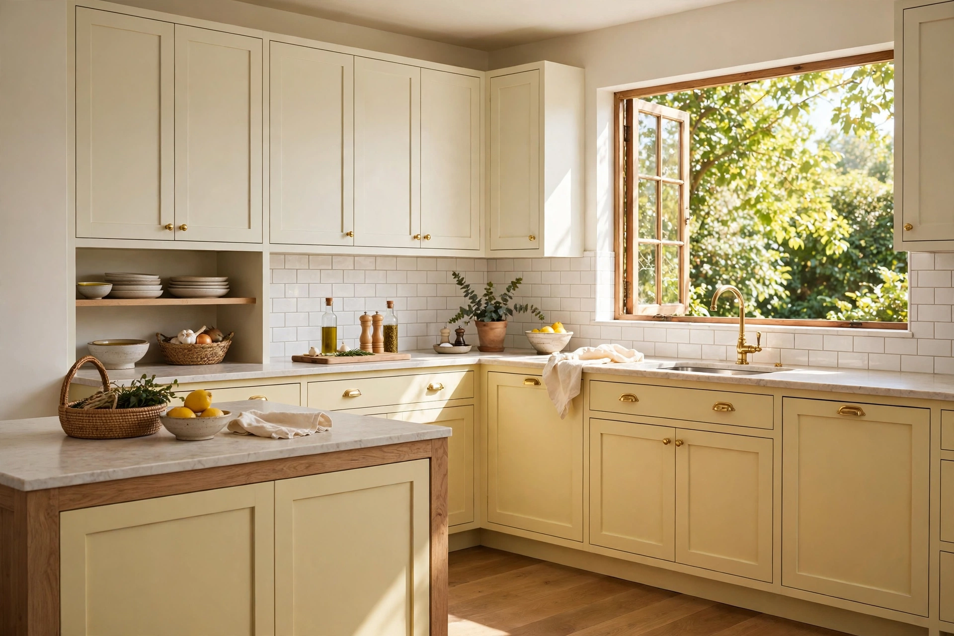
Cream cabinets have always been around, but the 2026 versions lean a touch warmer, toward butter and soft custard, rather than the pinkish creams of a decade ago. Butter tones make a kitchen feel sunny even on a dull day, and they are forgiving with older features like cream tiles or warm wooden floors that a stark white would fight. They suit traditional kitchens, farmhouse styles, and small kitchens that need all the visual warmth they can get. Pair butter cabinets with warm metals, brass or copper, and avoid pairing them with cool grey walls, which can make the yellow undertone look stronger than you planned. A warm white wall keeps the whole room in the same family.
10. Terracotta and Clay Accents
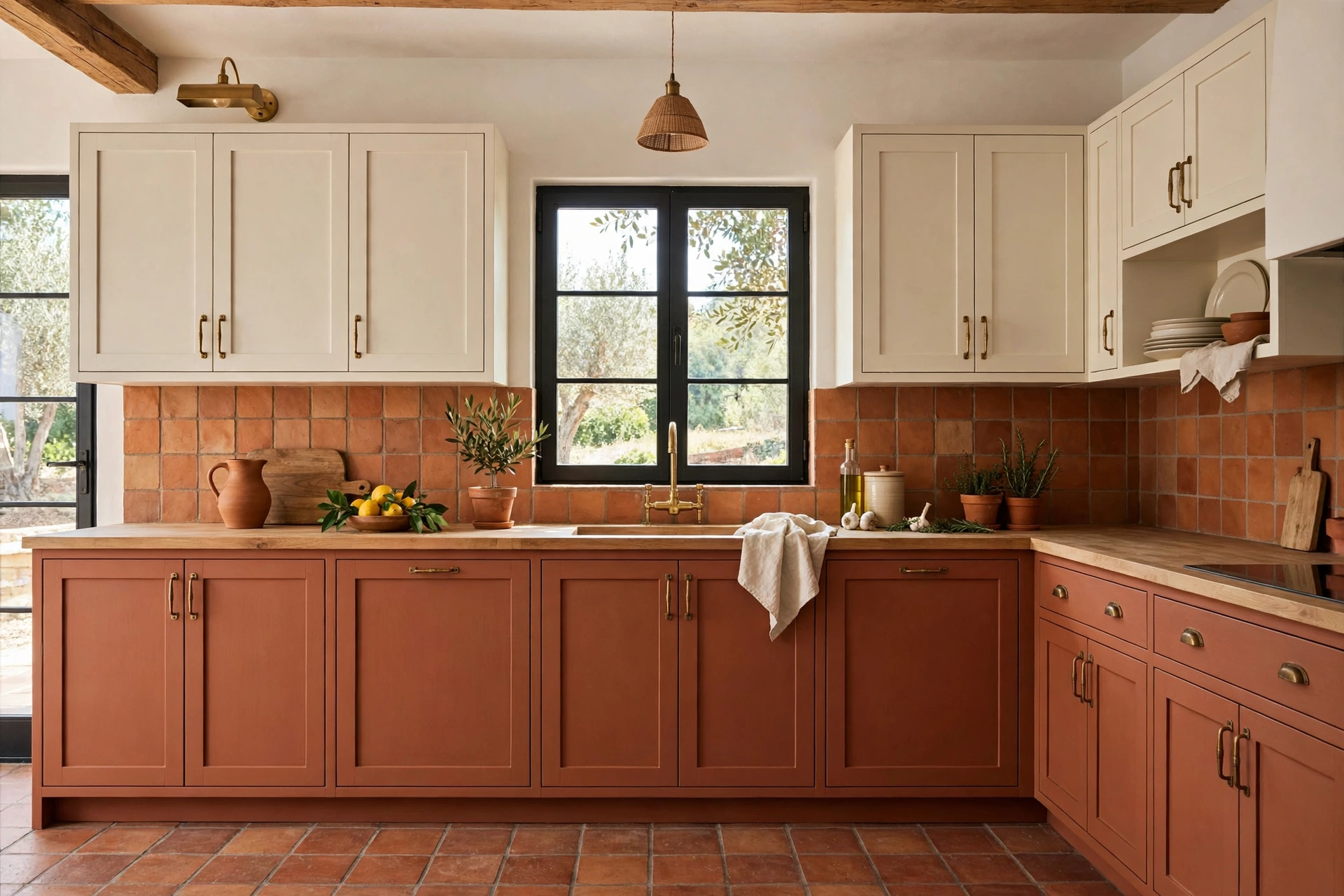
Terracotta is the boldest colour here, and the easiest to overdo, so use it as an accent rather than a whole-kitchen statement. Clay-toned lower cabinets with cream uppers, or a terracotta island in an otherwise neutral kitchen, bring warmth that feels earthy rather than loud. It suits kitchens with natural materials already in them: terracotta floor tiles, wooden beams, handmade-look backsplash tiles. The colour pairs well with cream, sage, and warm wood, and poorly with cool greys, so check your fixed elements before you fall in love. A terracotta island is also the cheapest way to try the trend, since repainting one island is a fraction of the work of a full kitchen.
11. The Painted Island as a Low-Risk Test
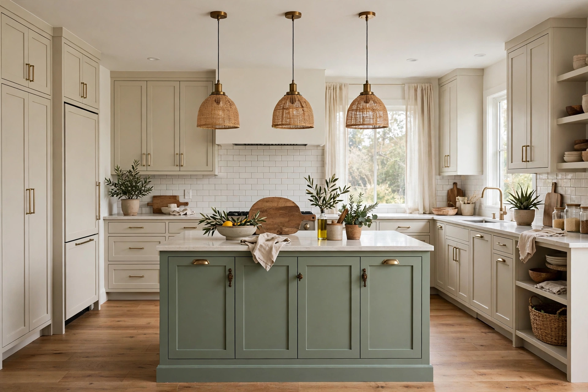
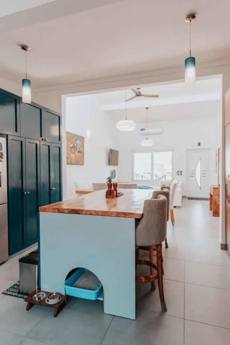
If repainting the whole kitchen feels like too much, paint the island. It is the single best low-risk test of a cabinet colour trend, and it is a trend in its own right: a sage, navy, or green island surrounded by neutral perimeter cabinets. The island is also the piece guests gather around, so a colour there reads as intentional design rather than a leftover. When I helped a friend repaint hers, we chose sage for the island and left the rest warm white, and the kitchen looked finished in a way it never had before. If you tire of the colour in a few years, repainting one island is a weekend job. If you love it, you have proof the colour works in your light before you take it further.
12. Mixed Finishes: Painted Cabinets Plus Natural Wood
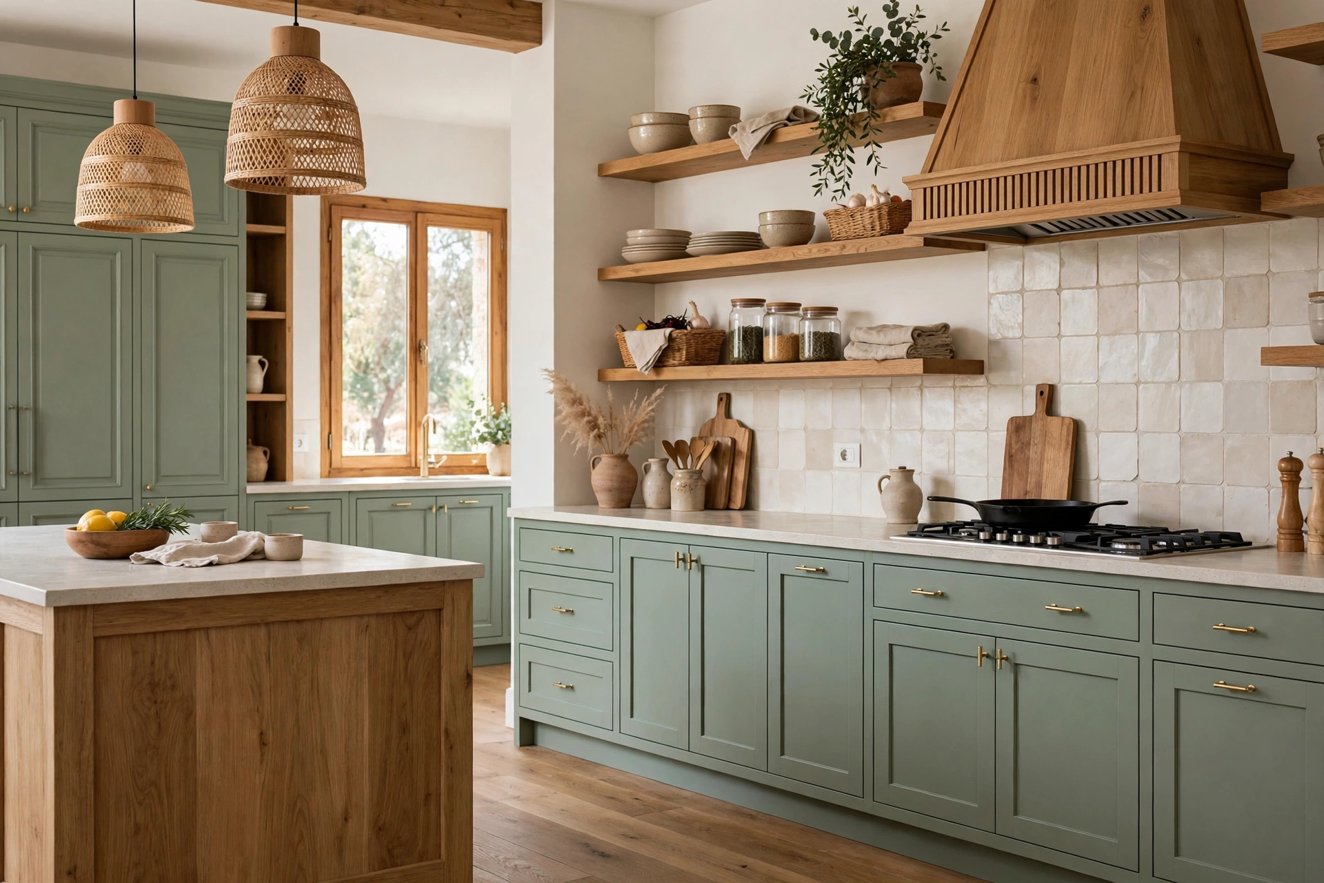
The most interesting kitchens this year are not one finish from floor to ceiling. They mix painted cabinets with natural wood, often wood open shelving, a wooden range hood surround, or a butcher-block section of worktop. The mix stops a painted kitchen feeling flat and stops a wood kitchen feeling heavy. Keep the mix to two finishes, not three, and repeat each one at least twice in the room, so it reads as a pattern rather than an accident. A wood shelf above painted cabinets and a wooden chopping board on the worktop is enough repetition to tie it together. If you are considering open shelving as part of the mix, it is worth reading about styling open shelves first, since shelves change how a kitchen works, not just how it looks.
Before you pick a colour, test it the boring way: paint a large board, lean it against the cabinets, and live with it for a week in morning light, evening light, and lamplight. Check it against your floor, your worktop, and your tiles, because a cabinet colour has to get along with all three. And remember that trends are observations, not orders. The best cabinet colour for your kitchen is the one that still looks right to you after that week of testing, in your light, with your furniture. For ideas on keeping the rest of the room calm around a new colour, see our neutral room ideas, and for a kitchen that still has to work through the holidays, our Christmas kitchen decor ideas keep counters clear. Paint brands publish their own trend palettes each year too; Benjamin Moore’s colour collections are a useful place to compare shades side by side before you buy samples.
Frequently Asked Questions
What is the most popular kitchen cabinet colour for 2026?
Warm whites and deep greens are the two colours appearing most often in new kitchens this year, with soft navy and warm wood tones close behind. Popularity is a guide, not a rule; your kitchen’s light and fixed elements matter more than any trend list.
Should kitchen cabinets be lighter or darker than the walls?
There is no fixed rule. Lighter cabinets than the walls open up a small kitchen, while darker cabinets ground a large one. Two-tone kitchens split the difference, with dark lowers and light uppers, which works in most room sizes.
Do dark cabinets make a kitchen look smaller?
They can, especially in a kitchen with little natural light. Pale worktops, light walls, and good lighting offset the effect. If your kitchen is small and dark, try the dark colour on the island only.
How do I test a cabinet colour before painting?
Paint a large board, not a tiny swatch, and lean it against your cabinets for a week. Check it in morning light, evening light, and lamplight, and against your floor and worktop. A colour that works in all three lights is a safe choice.
Can I mix painted and wood cabinets?
Yes, and it is one of the strongest looks this year. Keep the mix to two finishes, repeat each one at least twice, and make sure the undertones agree, warm wood with warm paint, cool wood with cool paint.