

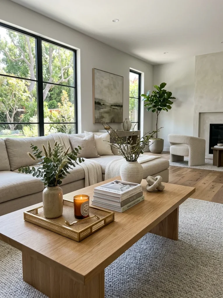
A perfectly staged coffee table looks untouched by actual life, which is exactly the problem. Here’s how to style one that looks considered but still gets used.A coffee table styled directly from a design photo has a specific, recognizable look: a tray, a stack of books arranged by color or size, a small object placed at a careful angle, everything symmetrical or deliberately asymmetrical in a way that reads as calculated. It looks good in the photo it was styled for, and it looks slightly wrong in an actual living room, for a reason that’s easy to sense and harder to name: it doesn’t look like anyone’s table. There’s no book someone is actually partway through, no remote within reach, no coaster where a drink might actually land. It looks staged because, functionally, it is — arranged for a single photograph rather than for a room where people put their feet up and set down a glass of water.
The goal for a coffee table that actually works in a lived-in living room isn’t to copy the photo-ready arrangement exactly. It’s to borrow its underlying structure — restraint, grouping, height variation — while leaving genuine room for the table to do its actual job.
Start With What the Table Actually Needs to Do
Before any styling begins, it’s worth being honest about what the table is used for in daily life — a spot for drinks, a landing place for a remote, a surface for feet, a place books and magazines actually get read rather than displayed. A coffee table styled without accounting for this ends up in a constant, quietly frustrating tension between how it’s supposed to look and how it’s actually used, which usually resolves in favor of function within the first week and the styling gets pushed to one side or abandoned entirely.
The practical fix is designating a portion of the table for genuine daily use and a smaller portion for styled objects, rather than treating the whole surface as a display. On a rectangular table, this often means one end kept clear or holding only functional items — coasters, remote, whatever’s genuinely in rotation — while the other end or the center holds a smaller, more considered arrangement. On a round or square table, this might mean one tray or corner reserved for use and the remainder styled.
Books Are the Most Reliable Coffee Table Object, and the Easiest to Get Wrong
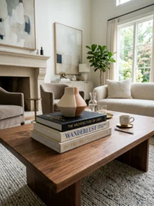
A small stack of books does more to make a coffee table look considered than almost any other single object, but the common styling mistake is choosing books entirely for their spine color or cover design rather than books anyone would actually want on the table. A stack of oversized, glossy coffee table books — on photography, design, travel, art — genuinely works both as a display object and as something a guest might actually pick up and flip through, which is different from a stack of books chosen purely because their covers matched the room’s palette.
Two to four books, stacked rather than displayed spine-out, is generally the right scale for a coffee table stack — enough to have visual weight and to feel intentional, not so many that the stack starts to look like storage. Stacking flat, rather than upright on a shelf, is specifically a coffee table convention that reads as more casual and more usable than a bookshelf-style vertical arrangement would on a horizontal surface.
A small object placed on top of the book stack — a small dish, a piece of stone or crystal, a small plant — adds height variation and prevents the stack from reading as purely functional storage rather than a styled element.
A Tray Contains the Practical Items Without Hiding Them
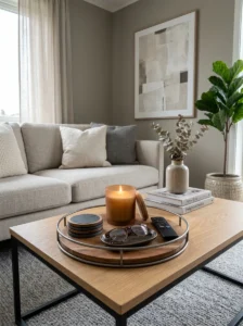
A tray does the same containment work on a coffee table that it does on a bathroom shelf: it converts several small, potentially cluttered items into a single visual unit. A tray holding a candle, a small dish for odds and ends, and perhaps a small stack of coasters looks considerably more intentional than the same items placed loose directly on the table surface, even though the actual objects and their arrangement are nearly identical.
The tray is also where genuine daily-use items can live without disrupting the styled portion of the table. Coasters that actually get used, a remote, reading glasses — items with real daily utility — are more at home within a tray’s contained boundary than scattered loose across the table, and keeping them within the tray means the rest of the table’s surface can remain more considered without needing to hide these functional items in a drawer between uses.
Height Variation Prevents the Flat, Lined-Up Look

As with open shelving, covered elsewhere in this series, a coffee table styled entirely with objects of similar height reads as flat and slightly sparse, regardless of how nice the individual objects are. A stack of books at one height, a taller vase or small sculptural object at another, and the low horizontal plane of a tray at a third height together create visual interest that a table of uniformly low objects doesn’t achieve.
A single taller element — a vase, a small plant, a candle in a tall holder — anchors the arrangement and gives the eye a natural stopping point, the same role a taller item plays in an open shelf arrangement. This doesn’t need to be dramatic; even a modest height difference between the shortest and tallest objects on the table is enough to avoid the flat effect.
Leave Genuine Negative Space, Not Just Styled Negative Space
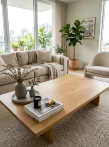
Real negative space on a coffee table serves two purposes at once: it looks intentional, the same way breathing room does on a shelf, and it provides the actual functional space a coffee table needs for drinks, plates, and whatever else gets set down during daily use. This is one of the rare cases where the aesthetic principle and the functional need point in exactly the same direction — a table that isn’t filled edge to edge looks better and works better.
A common mistake is treating negative space as purely photographic — leaving it empty for the photo, then filling it in daily practice with whatever accumulates. The more durable approach is planning which portion of the table is genuinely reserved for use from the outset, so the negative space in the “styled” version of the table and the negative space in daily use are the same space, not two different plans that conflict.
What to Avoid
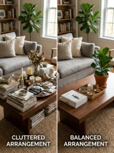
Symmetrical, perfectly centered arrangements tend to look the most obviously staged, since real daily use rarely produces perfect symmetry, and a table styled this way visually announces that it was arranged for a photo rather than for use. A slightly asymmetrical grouping — off to one side or end of the table, with negative space on the other — tends to look more natural and also leaves more of the table genuinely available for use.
Fresh flowers or plants that aren’t actually maintained are a common styling choice that works well for the first week and then quietly signals neglect once they wilt and aren’t replaced. A low-maintenance plant, a well-made faux arrangement, or simply accepting that fresh flowers are a periodic refresh rather than a permanent styling element avoids this specific failure mode.
Overly precious or fragile objects on a table that’s actually used by kids, pets, or anyone with their feet up regularly create an ongoing low-level tension between the styling and the household’s actual life. Choosing genuinely durable objects for a coffee table that gets real daily use is a more sustainable version of styling than choosing delicate objects that need to be protected or that create anxiety about damage.
Key Takeaways
- Decide what portion of the table is for genuine daily use and what portion is for styling before arranging anything — trying to style the whole surface as display leads to the styling being abandoned within a week
- A small stack of two to four books people would actually want to read, stacked flat rather than displayed spine-out, is the most reliable single coffee table object
- A tray contains genuinely useful items — coasters, remote, odds and ends — as a single visual unit, keeping them accessible without cluttering the rest of the table
- Height variation between a low tray, a mid-height book stack, and one taller object prevents the flat, sparse look that uniform-height styling produces
- Leaving real negative space serves both the look of the table and its actual function, since a coffee table needs open surface for drinks and daily use regardless of styling
- Slight asymmetry, low-maintenance greenery, and genuinely durable objects hold up to real use better than perfectly symmetrical, fragile, or high-maintenance styling choices
Frequently Asked Questions
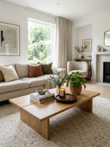
How many objects should actually be on a coffee table? There’s no fixed number, but a table styled around two or three groupings — a book stack, a tray, and perhaps one additional object like a vase or plant — generally reads as considered without tipping into cluttered. The right number also depends on the table’s actual size and how much of it needs to remain open for daily use.
Is it okay to leave a remote control or reading glasses visible on a styled coffee table? Yes, particularly within a tray that contains them alongside other objects — a completely styling-only table with no evidence of genuine use tends to look more staged, not less. The goal isn’t to hide every functional item, but to contain the ones that would otherwise look scattered.
Should coffee table books actually be read, or are they purely decorative? Ideally both — oversized coffee table books on photography, design, art, or travel work as display objects because of their scale and cover design, but choosing titles that genuinely interest the household means they occasionally get picked up and used, which is part of what keeps a coffee table from feeling like a photo set. Books chosen purely for spine color, with no real interest in the content, tend to be the ones that make a table feel the most staged.
What’s the fastest way to fix a coffee table that already looks cluttered? Remove everything, then add back a smaller, intentional set of groupings — a contained tray, a modest book stack, one taller object — while relocating anything that doesn’t fit that structure elsewhere in the room. As with open shelving, rearranging an already-overloaded surface without first reducing what’s on it rarely produces a lasting result.
Do coffee table styling principles change for a table in a household with young children? Somewhat — durability and safety become higher priorities than in an adult-only household, which generally means fewer fragile objects, sturdier materials, and more tolerance for the table’s function-first, styling-second reality during the years that heavy daily use is the norm. The underlying principles of containment, height variation, and reserved negative space still apply, just with more forgiving material choices.