


Staring at enough paint chips eventually makes every color look identical, which isn’t a sign of indecision — it’s a known perceptual effect with a specific, practical fix. Here’s how to actually choose.
Standing in a paint aisle or scrolling through color chips long enough, every option starts to blur together — the warm whites all look the same, the grays all look the same, and the specific differences that seemed obvious at first become impossible to distinguish. This isn’t a personal failure of decisiveness. It’s a well-documented perceptual effect: the eye adapts to repeated color exposure and loses sensitivity to small differences the longer and more directly it’s compared against similar options, particularly under the flat, artificial lighting of most retail environments. Fixing this isn’t about looking harder or longer at more chips — it’s about changing the testing method entirely.
Small Chips Are the Wrong Tool for the Job
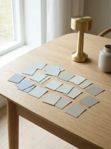
A standard 2-by-3-inch paint chip is genuinely inadequate for evaluating how a color will actually look on a wall, both because of its small size relative to an entire room’s surface and because a small chip is disproportionately affected by whatever’s immediately surrounding it — a chip viewed against a white store display card reads differently than the same color will read against a room’s actual trim, flooring, and furnishings. This is part of why staring at small chips tends to produce the “everything looks the same” effect: the differences between colors are real, but a small chip doesn’t provide enough visual context for those differences to register clearly.
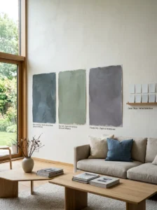
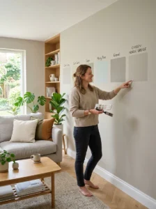
Large-format paint samples — poster-sized peel-and-stick samples, or a pint of actual paint applied to a large poster board or directly to the wall — solve this by providing enough visual area for a color’s actual character, including its undertone, to become clearly visible. This is a worthwhile investment even at modest additional cost, since it directly addresses the core problem that makes small-chip comparison so unreliable in the first place.
Undertone Is What Makes Colors Look “The Same” Until It Isn’t
Nearly every seemingly neutral paint color — white, gray, beige — has an underlying undertone, a secondary color influence that isn’t obvious at a glance but that becomes the dominant factor in how the color actually reads once it’s on a wall in real light. A “white” with a yellow undertone and a “white” with a blue undertone can look nearly identical on a small chip under store lighting, and then read as dramatically different once applied to an actual wall — one warm and creamy, the other cool and slightly clinical.
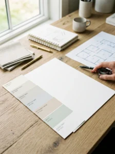
Identifying undertone before testing further is one of the most useful diagnostic steps available: holding a candidate color chip next to a true white sheet of paper reveals the undertone clearly, since the true white provides a neutral reference point that makes even a subtle yellow, pink, green, or blue undertone become visible by comparison, in a way it wasn’t when compared only against other similarly-toned paint chips.
Test Against the Room’s Actual Fixed Elements, Not in Isolation
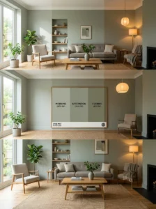
A paint color needs to work with everything in the room that isn’t changing — flooring, countertops, existing trim, any built-in cabinetry — and evaluating a color swatch in isolation, disconnected from these fixed elements, misses the comparison that actually matters. Holding a large sample directly against the room’s actual flooring, countertop, or trim reveals undertone conflicts or harmonies that aren’t visible when the swatch is evaluated purely on its own merits.
This is a more reliable diagnostic than comparing several candidate colors against each other, since the real test isn’t which candidate looks best in the abstract — it’s which candidate works best with the specific fixed elements the room already has, which is a fundamentally different comparison than the candidate colors’ relationship to each other.
Lighting Changes Everything, and Testing Needs to Account for It

As covered throughout this series in room-specific contexts, a paint color’s actual appearance shifts considerably across a day’s natural light and a room’s specific artificial lighting, and evaluating a color only under one lighting condition — the bright, even lighting of a paint or hardware store, for instance — provides an incomplete and often misleading picture.
A large sample taped or painted directly onto the actual wall, observed across morning, midday, and evening light, and under the room’s actual artificial lighting after dark, reveals how the color will genuinely behave in the space it’s intended for, which is meaningfully different information than a single viewing under retail lighting provides. This is worth doing even when it feels like an unnecessary extra step, since it’s precisely the step that resolves the “everything looks the same” confusion — colors that seemed indistinguishable in the store often separate clearly once seen in the room’s actual, varied lighting conditions.
A Light Reflectance Value Gives an Objective Anchor Point

Beyond the subjective visual comparison, most paint manufacturers provide a Light Reflectance Value (LRV) for each color — a numeric measure, generally on a scale from 0 (absolute black) to 100 (pure white), of how much light a color reflects versus absorbs. This is a genuinely objective data point that cuts through the perceptual fatigue of comparing similar-looking chips visually, since two colors that look nearly identical on a small chip can have meaningfully different LRV numbers, which predicts real differences in how bright or dark they’ll actually read on a wall.
A general reference point: colors with an LRV above roughly 70 read as light and airy, colors in the 40-60 range read as a true, balanced mid-tone, and colors below 30 read as genuinely dark. Comparing the LRV numbers of several candidate colors that look confusingly similar in person can clarify a real, meaningful difference between them that visual comparison alone, especially after extended chip-viewing, has stopped being able to detect reliably.
The 60-30-10 Framework Simplifies the Decision Beyond a Single Wall Color
Part of why paint selection feels overwhelming is that it’s often approached as a single, isolated decision — “what color should this room be” — rather than as part of a broader color plan for the space. The 60-30-10 principle, a long-standing design guideline, suggests allocating roughly 60 percent of a room’s visible color to a dominant tone (typically walls), 30 percent to a secondary tone (major furniture, larger textiles), and 10 percent to an accent (smaller decor, art, accessories) — a structure covered in more detail elsewhere in this series regarding accent color specifically.
Approaching wall color as one piece of this broader structure, rather than as a decision that has to work in total isolation, often reduces decision paralysis, since the wall color’s job becomes clearer: providing a dominant, supportive backdrop for the room’s other 40 percent of color, rather than needing to be the single perfect, standalone choice.
A Practical Testing Sequence
Narrow the field first using undertone identification — comparing candidates against true white paper to filter out any options with an undertone that clearly conflicts with the room’s fixed elements — before moving to full-scale testing, since this step alone often eliminates several options quickly and reduces the number of colors that need the more time-intensive large-sample testing.
Apply large samples of the remaining two or three candidates directly to the actual wall, in more than one location if the room has meaningfully different lighting in different areas, and observe them across a full day and into the evening under the room’s actual artificial lighting, rather than making a decision based on a single viewing.
Use LRV numbers as a tiebreaker specifically when visual comparison has become unreliable due to extended viewing fatigue, since the numeric value provides an objective data point that doesn’t degrade with repeated comparison the way visual perception does.
Key Takeaways

- Small paint chips are genuinely inadequate for real color evaluation — large-format samples, applied directly to the actual wall, provide enough visual context for a color’s true character to become clear
- Nearly every seemingly neutral color has an undertone, and comparing a candidate against a sheet of true white paper is a fast, reliable way to reveal it before further testing
- A paint color needs to be tested against the room’s actual fixed elements — flooring, countertops, existing trim — not evaluated in isolation or only against other paint candidates
- Testing a large sample across a full day’s natural light and the room’s actual evening artificial lighting reveals real differences that a single viewing under retail lighting cannot
- Light Reflectance Value (LRV) provides an objective numeric anchor that can distinguish between colors that look confusingly similar after extended visual comparison
- Approaching wall color as part of a broader 60-30-10 color structure, rather than as an isolated decision that must be perfect on its own, reduces the decision paralysis that drives the “everything looks the same” effect in the first place

Frequently Asked Questions
Why do all my paint chip options start to look identical after a while? This is a documented perceptual effect — the eye adapts to repeated, similar color exposure and loses sensitivity to small differences the longer and more directly similar options are compared, particularly under flat retail lighting. It’s not a sign of indecision; it’s a predictable outcome of the comparison method, and switching to large-format samples tested in the actual room resolves it more reliably than continuing to compare small chips.
What’s the fastest way to identify a color’s undertone? Hold the candidate swatch directly against a sheet of true white paper. The comparison reveals even a subtle yellow, pink, green, or blue undertone that isn’t visible when the swatch is compared only against other similarly-toned paint chips, since the true white provides a neutral reference point the other chips don’t.
Is it worth buying large paint samples instead of just using the free small chips? Generally yes, given how much more reliable the resulting decision tends to be — small chips are disproportionately affected by their immediate surroundings and don’t provide enough visual area for a color’s true character and undertone to register clearly. The modest additional cost of a large sample is usually worth it relative to the cost and disruption of repainting an entire room in the wrong color.
What is LRV and why does it matter for choosing paint? Light Reflectance Value is a numeric measure of how much light a color reflects versus absorbs, generally on a 0 to 100 scale. It provides an objective data point that can distinguish between colors that look nearly identical in person, especially after extended comparison has made visual judgment less reliable, and it’s a useful tiebreaker between final candidates.
Should I test paint samples in just one spot on the wall, or multiple spots? Testing in more than one location is worth doing if the room has meaningfully different lighting in different areas — near a window versus a darker interior wall, for instance — since a color can read differently in each location. This is especially useful in a room with mixed natural and artificial light sources, where a single test spot might not represent how the color will look throughout the whole space.