

Mixing prints doesn’t have to be risky. Here’s a practical, no-guesswork system for pairing patterns so they complement instead of compete.
Prints have a reputation for being high-risk, and most of that reputation is earned by accident rather than actual bad taste. Two patterns worn together can look effortlessly curated or completely chaotic, and the difference usually comes down to two or three technical choices most people never learned. Once you know them, pattern mixing stops feeling like gambling.
I avoided prints almost entirely for years, sticking to solids because it felt safer. What changed my mind wasn’t a sudden burst of confidence — it was realizing there’s an actual system behind pattern mixing that stylists use, and it’s far more learnable than it looks from the outside.
Why Pattern Clashing Happens in the First Place

Clashing isn’t really about “too many patterns.” It’s almost always a scale problem, a color problem, or both happening at once. When two patterns compete for the same visual attention at the same intensity, the eye doesn’t know where to land.
- Patterns of similar scale and similar boldness fight for dominance instead of complementing each other.
- Unrelated color palettes between two patterns create visual noise rather than harmony.
- Too many focal points in one outfit overwhelm the eye before it can process any single piece.
The Scale Rule: Big and Small, Never Big and Big
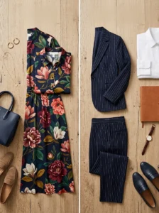
The single most reliable rule in pattern mixing is pairing a large-scale print with a small-scale print, never two prints of similar size.
Why Scale Contrast Works So Well
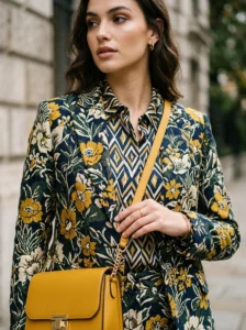
When one pattern is clearly larger and the other clearly smaller, the eye reads them as separate, intentional layers rather than a single confusing mass. This contrast does most of the visual organizing work automatically.
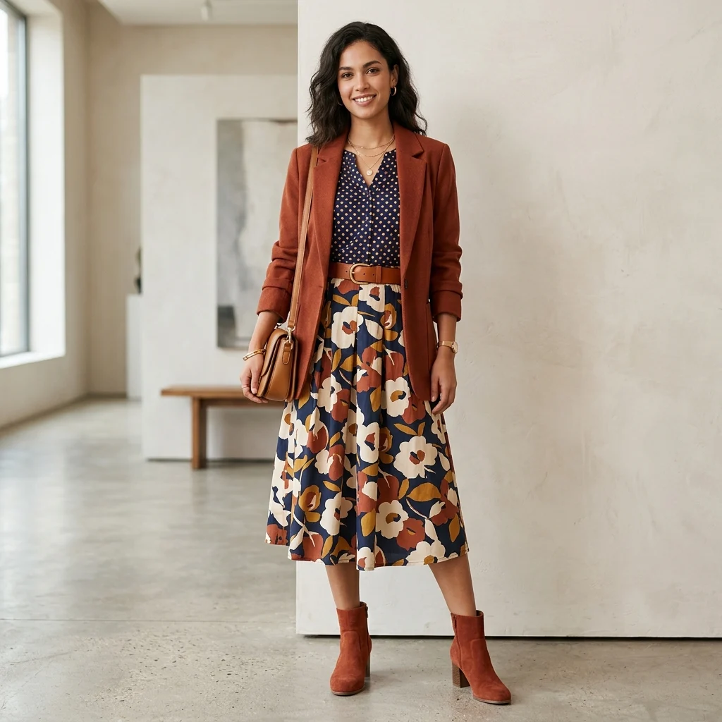
- A bold floral pairs well with a fine pinstripe or small polka dot, but poorly with another large floral.
- Chunky stripes pair well with a subtle micro-print, but clash when paired with equally wide stripes in a different pattern.
- Animal prints, being visually loud on their own, pair best with very small, understated secondary patterns.
The Color Anchor Rule
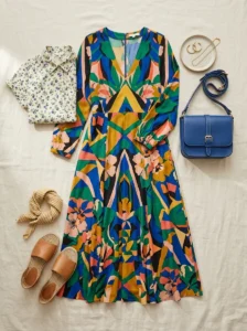
Beyond scale, patterns need a shared color to feel connected rather than randomly thrown together. At least one color should repeat across both prints, ideally a color that also appears in a solid piece somewhere in the outfit.
How to Find the Anchor Color

Look for the least dominant color in a busy print — that’s usually the easiest one to repeat elsewhere, since it won’t compete for attention twice.
- Pick the background or secondary color from the boldest print as your anchor.
- Choose a second pattern that includes that same anchor color in some form.
- Tie it together with a solid piece — shoes, a bag, or a belt — in that same anchor color.
Texture as a Pattern-Mixing Shortcut
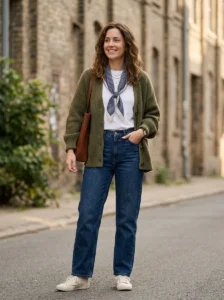
Texture is one of the most underused tools in pattern mixing, and it works almost like a built-in safety net when color and scale rules feel too complicated to calculate on the spot.
- Knit patterns naturally read as softer and less bold than printed patterns, making them easier to combine with louder prints.
- Textured solids (like corduroy, tweed, or waffle knit) can stand in for a “pattern” without adding actual print complexity.
- Mixing pattern with texture instead of pattern with pattern is a lower-risk way to build confidence before combining two true prints.
Building Confidence with Low-Risk Combinations First
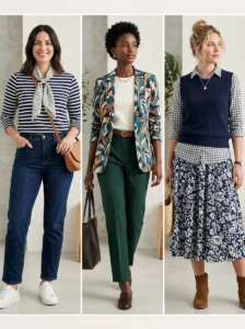
Jumping straight into bold pattern mixing can feel overwhelming, so easing in with lower-stakes combinations helps build an instinct for what works before attempting anything more advanced.
Starter Combinations That Rarely Fail
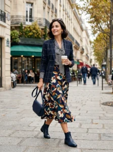
- A striped top with a small floral scarf or accessory, sharing one color between them.
- A solid-colored outfit with a single printed statement piece, like a patterned blazer or skirt.
- Two tonal patterns in the same color family but different scales, such as a light and dark version of the same print family.
Advancing to Bolder Pattern Mixing
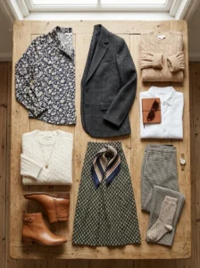
Once the basics feel comfortable, layering three patterns becomes possible using the same underlying logic, just applied more carefully.
- Vary scale across all three: large, medium, and small, rather than repeating any size twice.
- Keep one consistent anchor color running through all three patterns.
- Balance the boldest pattern with two more subdued ones rather than three equally loud pieces.
Common Pattern-Mixing Mistakes to Avoid
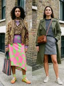
Even with the right rules in mind, a few specific missteps tend to undo an otherwise well-planned pattern combination.
- Choosing two patterns with completely unrelated color palettes, even if scale is well balanced.
- Wearing two patterns of nearly identical scale, which creates competition instead of harmony.
- Overloading an outfit with three or more bold patterns without any solid or textured piece to give the eye a rest.
- Ignoring silhouette — pattern mixing works best on relatively simple, well-fitted shapes rather than already-voluminous or complicated cuts.
Key Takeaways
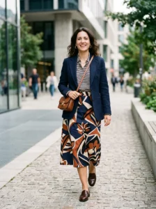
- Pair contrasting scales — big print with small print — rather than two similarly sized patterns.
- Anchor patterns together with at least one shared color, ideally echoed in a solid piece too.
- Texture can substitute for a second pattern, offering a lower-risk way to build visual interest.
- Start with low-stakes combinations before attempting three-pattern outfits.
- Keep silhouettes simple when mixing patterns, since busy cuts and busy prints compete for attention.
Conclusion
Pattern mixing feels risky mostly because nobody explains the mechanics behind it — once scale contrast and color anchoring are in place, clashing becomes far less likely. It’s not about being fearless with prints; it’s about understanding the small technical choices that make two patterns read as intentional instead of accidental. Start small, build the instinct, and the confidence follows naturally.
Frequently Asked Questions
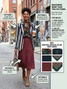
1. Can I mix more than two patterns in one outfit? Yes, once you’re comfortable with the basics. The key is varying scale across all patterns and keeping one consistent anchor color running through the whole combination, so the outfit stays cohesive rather than chaotic.
2. Do patterns need to be from the same color family to work together? Not exactly the same family, but they should share at least one color. That shared color is what visually ties unrelated patterns together, even if the rest of each print’s palette is quite different.
3. Is animal print easier or harder to mix with other patterns? Animal print is visually bold on its own, so it works best paired with very small, subtle secondary patterns rather than another bold print. Treating animal print as a neutral, similar to how you’d treat black or denim, also makes mixing easier.
4. What’s the easiest way to start experimenting with pattern mixing? Start with a mostly solid outfit and add one printed accessory, like a scarf or bag, that shares a color with your top or bottom. This low-risk approach builds confidence before attempting two full printed garments together.
5. Does pattern mixing work for professional or formal settings? It can, but subtlety matters more in those settings. Smaller-scale, tonal pattern combinations — like a fine pinstripe with a subtle check in a similar color family — read as polished, while bold, high-contrast pattern mixing tends to suit more casual or creative environments.