

The wrong kitchen color can make even a beautiful space feel completely off.
You can have great cabinets, nice lighting, and a solid layout—but if the color doesn’t feel right, the whole kitchen feels… uncomfortable. That’s exactly why choosing the right shades matters so much. The latest kitchen paint colors for 2026 aren’t just trendy—they’re designed to feel warm, balanced, and easy to live with.
In this guide, you’ll find kitchen paint colors that actually work in real homes. Whether you love soft neutrals, earthy tones, or subtle color accents, these ideas will help you create a kitchen that feels calm, modern, and effortlessly inviting.
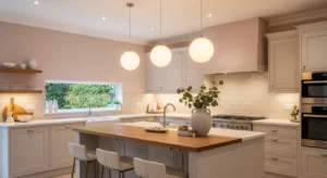
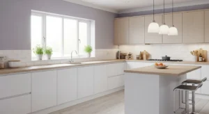
1. Warm White That Feels Soft, Not Stark
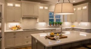
Bright white can feel harsh, but warm white tones bring softness and comfort. They reflect light beautifully while still feeling cozy.
It’s a perfect base for almost any kitchen style.
Tip: Look for whites with creamy or beige undertones.
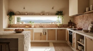
2. Creamy Beige for a Cozy Foundation
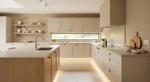
Beige is making a big comeback—but in a softer, more refined way. It creates a warm backdrop without feeling outdated.
It pairs beautifully with wood and natural textures.
Suggestion: Layer different beige tones for depth.
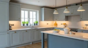
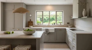
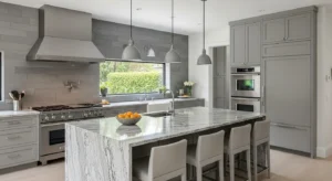
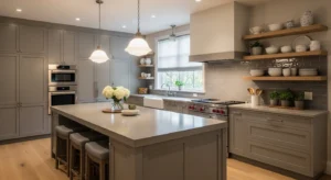
3. Soft Greige for Balance
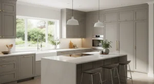
Greige (grey + beige) offers the best of both worlds. It’s neutral, calming, and easy to style.
It works especially well in modern kitchens that need warmth.
Question: Do you prefer warm or cool tones—or something in between?
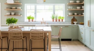
4. Muted Sage Green
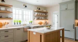
Sage green brings a subtle touch of nature into your kitchen. It feels calming and fresh without being too bold.
It’s perfect for cabinets or accent walls.
Tip: Pair with light wood for a balanced look.
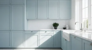
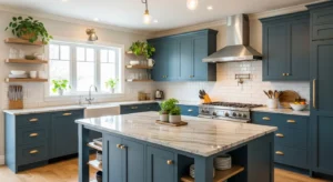
5. Dusty Blue for a Calm Feel
Dusty blue adds color while still feeling soft and understated. It works beautifully in both modern and classic kitchens.
It creates a peaceful, relaxing vibe.
Suggestion: Use it on lower cabinets for a subtle effect.
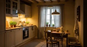
6. Warm Taupe for Depth
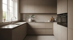
Taupe adds depth without overwhelming the space. It’s slightly richer than beige but still neutral.
It works well in kitchens that need a bit more warmth.
Tip: Combine with soft lighting for a cozy atmosphere.
7. Earthy Terracotta Accents
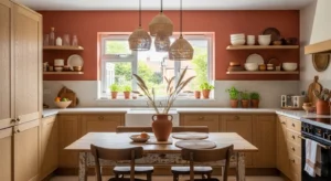
Terracotta tones bring warmth and personality. Even small touches can make a big impact.
They create a grounded, inviting feel.
Question: Would a touch of earthy color make your kitchen feel more alive?
8. Soft Olive Green
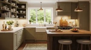
Olive green is deeper than sage but still natural and calming. It adds richness without feeling heavy.
It’s perfect for creating a cozy yet modern space.
Suggestion: Pair with brass or gold accents.
9. Light Mushroom Tones
Mushroom shades are subtle, earthy, and incredibly versatile. They sit between grey and beige with a soft, organic feel.
They work well in both light and dark kitchens.
Tip: Use matte finishes for a more natural look.
10. Pale Blush for Soft Warmth
A barely-there blush tone adds warmth without feeling overly feminine. It softens the space and adds a unique touch.
It’s subtle but impactful.
Suggestion: Use it on walls rather than cabinets for balance.
11. Charcoal Grey for Contrast
Dark charcoal creates a bold contrast, especially in lighter kitchens. It adds depth and a modern edge.
It works best when balanced with lighter elements.
Tip: Use it sparingly to avoid making the space feel heavy.
12. Soft Butter Yellow
Muted yellow tones bring warmth and light into the kitchen. Unlike bright yellow, this feels soft and inviting.
It’s perfect for creating a cheerful yet calm space.
Question: Could your kitchen use a little warmth and brightness?
13. Warm Clay Tones
Clay-inspired colors feel earthy and grounded. They add character without overwhelming the design.
It’s a great choice for accent walls or cabinetry.
Tip: Pair with neutral decor for balance.
14. Classic Off-White Layers
Layering different off-white shades creates depth while keeping the space light.
It’s a subtle way to make a kitchen feel more designed.
Suggestion: Mix cabinet and wall tones slightly.
15. Deep Forest Green
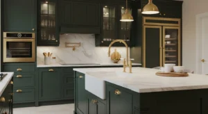
For a richer look, forest green adds drama and elegance. It feels bold yet connected to nature.
Perfect for statement cabinets or islands.
Tip: Balance with lighter countertops.
16. Soft Sky Blue
Sky blue creates a light, airy feeling. It’s perfect for kitchens that need a fresh and open vibe.
It works well in smaller spaces.
Question: Do you want your kitchen to feel brighter and more open?
17. Warm Sand Tones
Sand tones feel natural and effortless. They create a relaxed, beachy vibe without being too themed.
It’s a versatile and timeless option.
Suggestion: Pair with natural textures like wood or stone.
18. Subtle Lavender Grey
A hint of lavender in grey adds uniqueness without being overwhelming. It feels soft and slightly elevated.
Perfect for modern kitchens looking for something different.
Tip: Use it in well-lit spaces for the best effect.
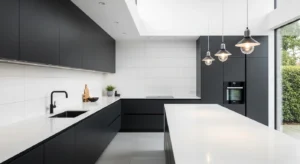
19. Matte Black for Bold Contrast
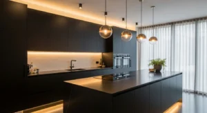
Black can feel dramatic but also incredibly modern. In the right balance, it adds depth and sophistication.
It works best as an accent color.
Suggestion: Pair with warm wood to soften the look.
20. Warm Peach Undertones
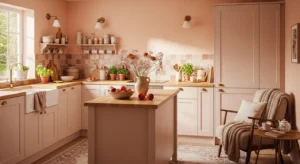
Soft peach tones add warmth and brightness. They create a welcoming, cozy feel.
It’s subtle enough to stay timeless.
Tip: Use in combination with neutrals for balance.
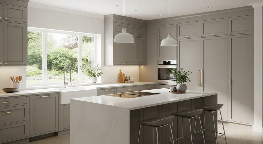
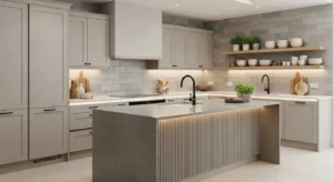
21. Neutral Stone Grey
Stone grey is calm and grounding. It works well as a neutral base without feeling cold.
It’s ideal for modern kitchens.
Suggestion: Add warm accents to keep it inviting.
22. Creamy Soft Green
A lighter version of green adds freshness while staying subtle. It feels airy and natural.
Perfect for creating a relaxed atmosphere.
Tip: Combine with white for a clean look.
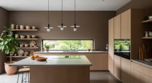
23. Warm Mocha Brown
Mocha tones bring richness and depth. They feel cozy and slightly luxurious.
It’s a great alternative to darker neutrals.
Question: Would a deeper tone make your kitchen feel more grounded?
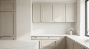
24. Pale Grey with Warm Undertones
Not all greys are cold. Warm greys feel softer and more livable.
They work well in modern spaces that need balance.
Tip: Avoid overly cool greys for a cozy feel.
25. Soft Coastal Blue-Green
A mix of blue and green creates a fresh, calming tone. It feels light yet interesting.
Perfect for a relaxed, modern kitchen.
Suggestion: Pair with natural wood for warmth.
26. Balanced Neutral Layers
Sometimes the best color isn’t just one—it’s a combination. Layering neutrals creates depth and harmony.
It makes the kitchen feel complete and thoughtfully designed.
Question: Could mixing tones make your space feel more balanced?