

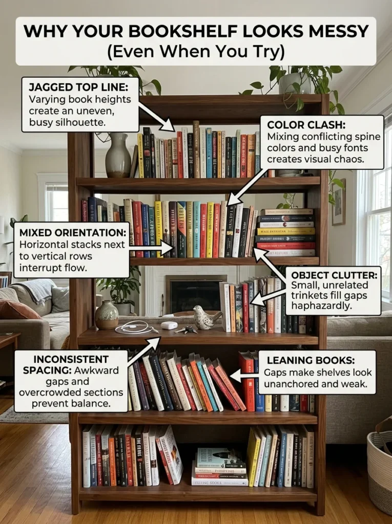
A bookshelf that looks messy despite repeated styling attempts almost always has the same underlying problems. Here’s what they are and how to actually fix them.A bookshelf is the only piece of furniture routinely asked to function as a library, a display cabinet, a storage unit, and a decorative art piece simultaneously. Every other piece of furniture has a clearer primary function. A sofa is for sitting. A dining table is for eating. A bookshelf is for books — and also for the objects that didn’t have anywhere else to go, and also for photographs, and also for the plants you ran out of table space for, and also for the things that should probably be in a cabinet but didn’t fit, and also for the decorative objects you bought specifically to style it.
This accumulated function is the root of most bookshelf styling problems. The shelf doesn’t look bad because you’re bad at styling. It looks bad because it’s being asked to perform an impossible number of jobs simultaneously, and the objects performing each job were chosen at different times by different criteria, and the whole collection was arranged based on whatever was there at the time.
The styling problem on a bookshelf is almost never a styling problem. It’s a curation problem wearing styling’s clothes. No arrangement technique fixes a shelf with too many categories of objects, too many items without a common visual language, and no clear sense of what the shelf is primarily for.
The First Step Nobody Wants to Take: Edit Before Styling
The single most effective bookshelf styling intervention is removing things rather than rearranging them. This is true of most styling problems, but it’s most acutely true of bookshelves because bookshelves are the most commonly overfilled surface in most homes.
The categories of items that reliably make bookshelves look messy regardless of how they’re arranged:
Objects that don’t belong on a bookshelf. The cable that’s been there for eight months. The mail that migrated from the kitchen. The medication someone left there. The charger without a home. These items belong somewhere else or nowhere, and their presence on the shelf overrides any styling that surrounds them.
Books that aren’t being kept. The book read once and never returned to, the gift that isn’t to your taste, the reference book for a skill you no longer practice. These take up shelf space that books you actually use or want to display could occupy, and they contribute to the sense of overfullness that makes shelves read as messy before any specific arrangement problem is noticed.
Duplicates of categories already on the shelf. Three separate small potted plants where one would create the same organic quality with less visual noise. Four similar-sized framed photographs where two would do the same work.
Items whose visual language conflicts with everything else. A brightly colored object in an otherwise neutral palette. A very rustic element in a clean modern shelf. These don’t need to leave the home; they need to leave the shelf.
After editing, measure again how much is left. In most cases, the shelf looks meaningfully better with the edited contents alone, before any rearrangement happens. The edit removes the visual noise that arrangement can’t correct.
The Core Principle: Books and Objects Need Different Treatment

The most common bookshelf styling mistake is treating books and decorative objects as equivalent elements — arranging them in the same way, at the same density, without recognizing that they serve different visual purposes and require different handling.
Books are the shelf’s primary occupants. They have their own visual texture — the spine collection creates pattern, color, and rhythm across the shelf. Too many books packed spine-to-spine across an entire shelf produce a wall of books that reads as a library’s storage section rather than a displayed collection. Too few books produce a shelf that looks like it’s waiting to be filled.
Decorative objects are the shelf’s punctuation — they break the book mass into readable sections and provide variation in height, shape, and material. An object every few books. A larger object at the end of a section. A plant providing organic contrast to the rectangular book spines.
The problem in most bookshelves: the ratio between books and objects is wrong. Too many objects compete with the books for visual attention and make the shelf read as cluttered. Too few objects leave the book mass unbroken and the shelf reads as a utilitarian storage surface.
The functional ratio that reads well: approximately one decorative element per eight to twelve books, positioned at a transition point that breaks the book section into readable chapters.
The Arrangement Methods That Actually Work
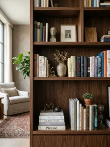
The Zone Method
Divide the bookshelf’s shelves into distinct zones, each with a clear visual character. One shelf is primarily books with minimal objects. One shelf is primarily objects with fewer books. One shelf uses a specific color or material palette distinctly from the others. The different zones give the eye movement through the shelf rather than a uniform surface to scan.
This is the approach used in most styled bookshelves in design photography — not a single consistent arrangement applied equally across all shelves, but a series of distinct moments that create variety and visual interest across the whole.
The Group-and-Space Method
Within each shelf, create groups of books or objects that read as intentional clusters, separated by visible breathing space rather than packed across the full width. A stack of three books vertically. Four books standing upright. A small object beside them. A gap of several inches. Two more books standing. An empty area at the end.
The breathing space — the deliberate absence of objects — is what makes each group readable as a group rather than an undifferentiated mass. Without space between groups, the shelf reads as packed regardless of how carefully each item was placed.
The Height Variation Method
A shelf where all items are the same height — all standing books, all similar-height objects — reads as flat. Height variation gives the eye a path to follow. A stack of horizontal books creates a low platform. Objects at varying heights above this platform. A taller item at one end anchoring the composition.
The specific heights that work together: a very tall element (a tall vase, a taller plant, a stack of books topped by an object), a medium element (standard-height books, medium objects), and a low element (a small bowl, a horizontal book stack, something that sits below the line of standing books). Three distinct heights in a shelf composition produce a visual landscape rather than a flat line.
Horizontal Books as a Tool
Books lying flat rather than standing create one of the most useful structural elements in bookshelf styling: a horizontal platform that breaks the vertical rhythm of standing books, creates a surface for objects to sit on, and visually separates two sections of the shelf from each other.
A stack of three to five horizontally placed books works as a staging platform for a small plant, a bowl, or an object that would look awkward sitting on the shelf floor. The stack also provides height variation and a visual break in what would otherwise be continuous vertical book spines.
The Color Question: Do You Need to Organize Books by Spine Color?
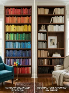
The rainbow bookshelf — books arranged in color order to create a gradient from one end to the other — is the most widely shared bookshelf styling approach in social media design content. It produces beautiful photographs and mixed results in actual living rooms.
The rainbow arrangement works when the book collection is large enough to have genuine color range in each section, the room’s palette is neutral enough that the color display reads as a deliberate rainbow moment rather than a competing palette, and the person in the household is willing to maintain the arrangement rather than returning books wherever they fit.
Where it doesn’t work: small collections where the color gaps are obvious, rooms where the wall color or other elements compete with the rainbow display, and households where books are actually used and therefore returned wherever is convenient rather than by color.
The alternative that works more broadly: grouping books in tone families rather than strict rainbow order — all dark-spined books together, all light-spined books together, mixed within each group by size. This produces the visual coherence of the color approach without requiring the precise arrangement that makes maintenance difficult.
For shelves where the spines are a visual mix the owner doesn’t want to organize by color, turning books spine-in — so the pages face out — is an increasingly common approach that produces a neutral, texture-based effect. All spines hidden, all edges visible, the shelf becomes a uniform texture rather than a collection of competing titles. This approach works in rooms where the shelf is primarily decorative and access to specific books is secondary.
Objects: What Goes On a Bookshelf and What Doesn’t
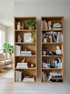
This is the editorial question that most bookshelf advice skips in favor of arrangement guidance. The objects that read well on a bookshelf share specific characteristics; the objects that read badly also share specific characteristics.
Objects that read well: things with interesting form that reads clearly at a distance (a sculptural vessel, a distinctive plant, a well-made ceramic object), things with material variety from the books (ceramics, wood, metal, glass, natural stone — each different in material character from the paper and cardboard of books), and things with a relationship to the other objects in the collection (a consistent palette, a consistent material direction, a consistent aesthetic language).
Objects that read poorly: things whose form isn’t interesting at the scale of a bookshelf (small objects that disappear), things with visual language incompatible with the rest of the shelf, things without a clear relationship to anything else, and things that belong to the “it didn’t have anywhere else to go” category.
The test for any object being considered for bookshelf placement: does it have a genuine aesthetic relationship to the other things on the shelf, or is it being placed there because it’s available and needs a home?
Framed Photos on Bookshelves
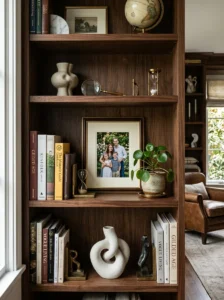
Photographs on bookshelves are a specific category that benefits from its own consideration. A single well-chosen photograph in an appropriate-sized frame can anchor a bookshelf zone and add personal connection to a display. Multiple similarly-sized photographs in different frames create visual clutter because the repetition of format (rectangular, face-forward, frame-bounded) without visual variation reads as a uniform undifferentiated collection.
The approaches that work: one significant photograph per shelf section, positioned as an anchor; multiple photographs grouped together as a gallery cluster with intentional spacing between them and a relationship of some kind (same frame finish, consistent scale, or consistent subject); or photographs removed from the bookshelf entirely and displayed as a gallery wall elsewhere.
The approach that reads as cluttered: one photograph at varying heights across each shelf, each in a different frame, each competing with the books and objects around it for the eye’s arrival.
Shelf Lighting: The Change That Makes Everything Else Work
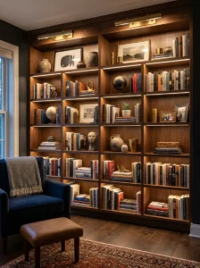
A bookshelf in a dark corner reads as storage regardless of how carefully it’s styled. A bookshelf with directed light — a picture light mounted above it, a small lamp on one of the shelves, LED strip lighting inside the shelf at the back — reads as a displayed collection rather than stored material.
Shelf lighting is one of the most underused bookshelf improvements and one of the most effective. It’s the change that turns a well-styled shelf from nice to compelling — the difference between a shelf that looks good when you’re standing in front of it and a shelf that draws your eye from across the room.
Small battery-operated puck lights or thin LED strip lights at the back of a shelf require no installation and provide directed light that illuminates the shelf’s contents from within rather than from the room’s general overhead source. Even a single adjustable picture light mounted above the bookshelf and directed downward produces this effect without any in-shelf modification.
What the Consistently Well-Styled Bookshelf Has in Common
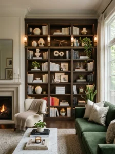
The bookshelves that consistently read as intentional, composed, and visually settled — the ones in design photography, in well-decorated homes, on the social media accounts of people who clearly know what they’re doing — almost always share:
- More space between items than seems necessary (breathing room between groups)
- Fewer categories of objects than the shelf could hold (curation over completeness)
- Clear height variation across each shelf (at least two or three distinct heights per section)
- A consistent material or color language across the decorative objects (so objects read as a collection rather than a random assembly)
- At least some horizontal books (creating platforms and visual breaks in the vertical rhythm)
- Lighting that draws attention to the shelf’s contents from within or above
- Evidence that someone deliberately decided what would be here (no migrated objects, no accidental clutter)
None of these are arrangement techniques. They’re curatorial and structural decisions that precede the arrangement — and they’re what makes the arrangement work.
Key Takeaways
- Bookshelf styling problems are almost always curation problems — too many objects from too many categories with no consistent visual language — that arrangement can’t fix
- Edit first: remove items that don’t belong on a shelf, books being kept without reason, and objects whose visual language conflicts with the rest
- Books and objects require different treatment: objects should punctuate the book mass at intervals, approximately one object per eight to twelve books, rather than competing with them
- The zone method, group-and-space method, and height variation method are the three approaches that consistently produce readable, well-styled bookshelves
- Horizontal books are one of the most useful bookshelf tools: they create platforms, break vertical rhythm, and add height variation with what you already have
- The color-by-spine approach works beautifully in specific conditions and poorly in others; tone-grouping works more broadly
- Shelf lighting — a picture light, a small lamp, LED strips — turns a styled shelf from good to compelling and is consistently underused
- The consistently well-styled bookshelf has more breathing room, fewer categories, and clearer visual language than most people’s shelves — curation, not technique, is the difference
Frequently Asked Questions
How many decorative objects is too many on a bookshelf? The test is whether the objects can be individually read from the room’s normal viewing distance. If the shelf has so many objects that no single one reads clearly — they blur into a collection of things rather than specific, distinguishable pieces — there are too many. A useful starting point is one distinct object cluster per shelf (one plant, one grouping of ceramics, one framed photograph) with books filling the remainder. Adjust based on the shelf size and the object sizes, but start conservative and add if the shelf looks too sparse rather than starting full and editing down.
Should all shelves on one bookcase be styled the same way? No — uniformity across all shelves produces a flat, repetitive reading. The interest in a bookcase comes from variation between shelves: one predominantly books, one predominantly objects and fewer books, one with a plant or larger anchor element. The shelves are the zones; each zone can have a different character while the overall bookcase reads as coherent through a consistent color or material language across all zones.
Can a bookshelf work as a room divider in an open-plan space? Yes, particularly double-sided bookshelves designed for this purpose. A single-sided bookshelf used as a room divider has a finished side (the display face) and an unfinished back. Styling the back of a single-sided shelf requires either a finished backing added to the shelves, or using the back-facing side for functional storage rather than display. The division quality of a bookshelf room divider is primarily visual and acoustic — it defines zones, absorbs some sound, and creates a partial visual barrier without full enclosure.
What’s the best way to handle a bookshelf that’s also used as a media unit with electronics? The electronics and cables are the most difficult elements to incorporate visually — they introduce visual language (plastic, metal, LED indicators, cables) that conflicts with most bookshelf styling directions. The approach that works best: dedicate one shelf entirely to electronics and accept that it will look functional rather than styled; style all other shelves as if the electronics shelf doesn’t exist; and use cable management (gathered cables, a cable box) to minimize the visual noise of the electronics section.
Is it ever okay to have a bookshelf that’s just books — no decorative objects at all? Absolutely — and in some contexts it’s the best approach. A library or study-style wall of books, floor to ceiling and shelf to shelf, reads as a specific intentional aesthetic rather than as an undecorated shelf. The book collection itself becomes the visual element: the variation in spine color, height, and thickness produces texture and interest across the whole wall. This approach works when the collection is large enough to fill the shelves without obvious gaps, the books share some visual coherence (similar tones, similar genres, a consistent collection), and the room’s other elements provide the variety and personality that the bookshelf’s uniform books don’t.