

Bathroom color regret is more common than most design advice acknowledges. Here’s exactly what causes it and how to choose a color that still feels right two years from nowThe color looked beautiful on the paint chip. It looked even better on the mood board, next to the tile sample and the inspiration photograph. The bathroom was painted on a Saturday in March, and by the following winter, something about it had shifted — not dramatically, not in a way that was easy to name immediately, but the room that had felt exciting and intentional when freshly painted now felt like a decision made by someone with slightly different taste.
This is the specific arc of bathroom color regret, and it follows a recognizable pattern in enough homes that understanding what actually causes it is worth significant attention before choosing a color rather than after living with the consequences.
The bathroom is a room where color decisions go wrong in specific, predictable ways. It has unusual light conditions. It’s a small space where color saturates quickly. It’s tiled in a way that limits what the walls can do. And it’s frequently the room where people feel most willing to take a color risk — “it’s just a bathroom” — and therefore most likely to choose something exciting in the short term that reads as dated or overwhelming in the medium term.
Why Bathroom Color Regret Is More Common Than Regret in Other Rooms
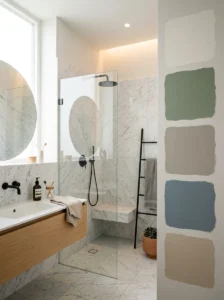
Living rooms and bedrooms develop their final look gradually — furniture, textiles, artwork, and objects accumulate over time and the color on the walls becomes part of a layered whole. If the wall color is slightly wrong, something else in the room usually compensates. The color isn’t reading alone.
A bathroom is a room where paint is one of very few variable elements. The tiles are fixed. The fixtures are fixed. The fittings are fixed. In most bathrooms, the paint on the walls and ceiling is the only element that can be changed without significant cost or disruption. This means the wall color is operating with less support — it has to work alongside fixed elements rather than within a flexible surrounding environment.
This makes bathroom color choice more consequential than color choice in rooms with more flexibility. A color that reads incorrectly in a bathroom is more exposed, more permanent in its wrongness, and harder to compensate for without a renovation.
The Light Problem That Causes Most Bathroom Color Regret
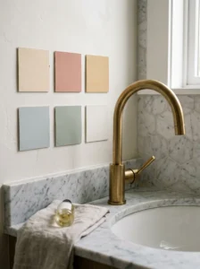
Paint chips are evaluated in natural light or in the lighting at a paint store. Bathrooms are typically lit by artificial light, often overhead, often cool-toned, and often without the natural daylight that would correct whatever the artificial light is doing to the color.
The gap between a color’s appearance in good natural light and its appearance under a bathroom’s specific artificial lighting is the single most common cause of color regret. A warm sage green that looked serene and sophisticated on the chip looks muddy and gray under cool overhead lighting. A pale blue that looked crisp and fresh becomes slightly cold and clinical. A terracotta that looked rich and earthy becomes brownish and heavy.
This happens because paint pigments interact differently with different light sources. A warm-toned pigment under cool-white LED light loses its warmth. A cool-toned pigment under warm incandescent light loses its crispness. The light source in the bathroom during daily use is the light the color needs to work under — not the store light or the daylight on the paint chip.
The Only Reliable Testing Method
The testing step most people skip is the reason most people experience some degree of color regret. A paint chip or even a large painted sample board brought into the bathroom and held against the wall tells you something, but not enough. The reliable test is painting a section of the actual wall — ideally at least two feet square — and observing it across different times of day and under both the bathroom’s artificial light (how you’ll see it every morning) and any natural light available.
Observe the test patch at the time of day you use the bathroom most. For most people, this means early morning under artificial light, which is the harshest and most revealing test condition. If the color reads correctly then, it will read correctly at all other times too. If it reads flat, gray, cool, or muddy under morning artificial light, the color is failing the condition that matters most.
This test costs one paint chip sample and an afternoon. The cost of painting the bathroom in a color that fails this test, and then repainting, is considerably higher in both time and money.
Undertones: The Variable That Creates The Most Silent Regret
This appears in the backsplash article and the two-tone cabinet article for good reason — it’s the single most underestimated factor in any paint decision, and its effects in a bathroom are more acute than anywhere else.
Every paint color has an undertone. A white has an undertone — it might pull green, pink, yellow, or blue in certain light. A gray has an undertone. A sage green has an undertone that might lean blue or lean brown or lean yellow. A beige has an undertone that might be warm or distinctly pink.
The undertone isn’t always visible on the chip itself. It becomes visible when the color is placed in the context of the room — the tile, the fixtures, the fittings — and when the room’s specific light source interacts with it. This is when the “something’s off” quality of an otherwise correct color decision announces itself.
The specific undertone problems that produce bathroom color regret:
Whites that reveal their undertone against the tile. A white wall paint with a slightly pink undertone looks correct on the chip and reveals its pinkness only when placed next to the bright white of sanitaryware or the cool white of certain tiles. This undertone conflict produces a room that reads as “something’s off” without most people being able to articulate what.
Greens and blues that go gray. Cool-toned greens and blues under cool overhead lighting tend to lose their color and go flat gray — a common outcome for sage, dusty blue, and similar “calming” colors that are extremely popular for bathrooms and frequently disappointing in artificial-light conditions.
Greiges that reveal their warm or cool direction. A greige — the gray-beige blend — can pull toward pink, yellow, or gray depending on the specific formula and the light it’s under. What looks perfectly balanced on the chip reveals its actual direction on the wall.
The solution to undertone problems is always the same: test on the actual wall in the actual room under the actual lighting. Undertones cannot be reliably evaluated any other way.
The Saturation Trap
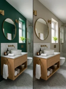
A fully saturated color — a rich emerald green, a deep navy, a vivid terracotta — looks stunning in the first weeks after painting. It’s the version of the room most people photograph. The saturated color is usually also the version of the room that starts to feel like too much within the first year of living with it daily.
This isn’t universal — there are people who live happily with rich, saturated colors and never feel the need to change them. But the statistical distribution of bathroom color regret skews heavily toward higher-saturation choices made with confidence and followed by fatigue within twelve to eighteen months.
The reason is daily exposure. A color that reads as exciting in a room you visit for thirty minutes to an hour a day is still exciting a year later. A color that reads as exciting in a room you use for seven minutes every morning is still exciting until it isn’t — and the “isn’t” often arrives faster than anticipated.
A useful frame: evaluate any color candidate not just in how it looks now, but in how you expect to feel about it after seeing it every morning for two years. A color you’re drawn to but would describe as bold or exciting deserves extra scrutiny under this frame. A color you’d describe as calm, quiet, and pleasant — one that generates a steady positive response rather than an exciting one — tends to have better longevity.
What the Fixed Elements Actually Allow
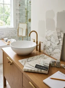
A color decision in a bathroom that ignores the tile, fixtures, and fittings already in the room is a color decision made in a vacuum. The existing elements are not neutral — they have colors, undertones, and material qualities that actively limit what wall colors will agree with them.
White sanitaryware (toilet, basin) is almost always present and is almost never pure white — it typically has an undertone that’s slightly warm, slightly cool, or slightly gray. A wall color that clashes with the undertone of the sanitaryware produces a room that reads as unresolved even when the wall color itself is attractive.
Existing tile in a bathroom is a fixed color element that the wall color must negotiate with. A bathroom tiled in a cool gray requires wall colors that work with cool gray — not because warm colors are inherently wrong, but because the contrast between warm wall and cool tile requires management that most bathrooms can’t easily provide.
Metal fixtures — faucets, towel rails, toilet hardware — have a finish color (chrome, brass, matte black, brushed nickel) that reads as warm or cool. The wall color’s relationship to this finish affects how settled the room reads overall.
Before finalizing a color, hold paint samples against each of these fixed elements in the actual room. The combination that reads as correct — where no element is fighting another — is the combination to choose.
Colors With Proven Bathroom Longevity
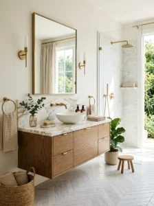
Without prescribing specific brands or specific formulas, certain color families have demonstrated longevity in bathrooms across different aesthetics and time periods.
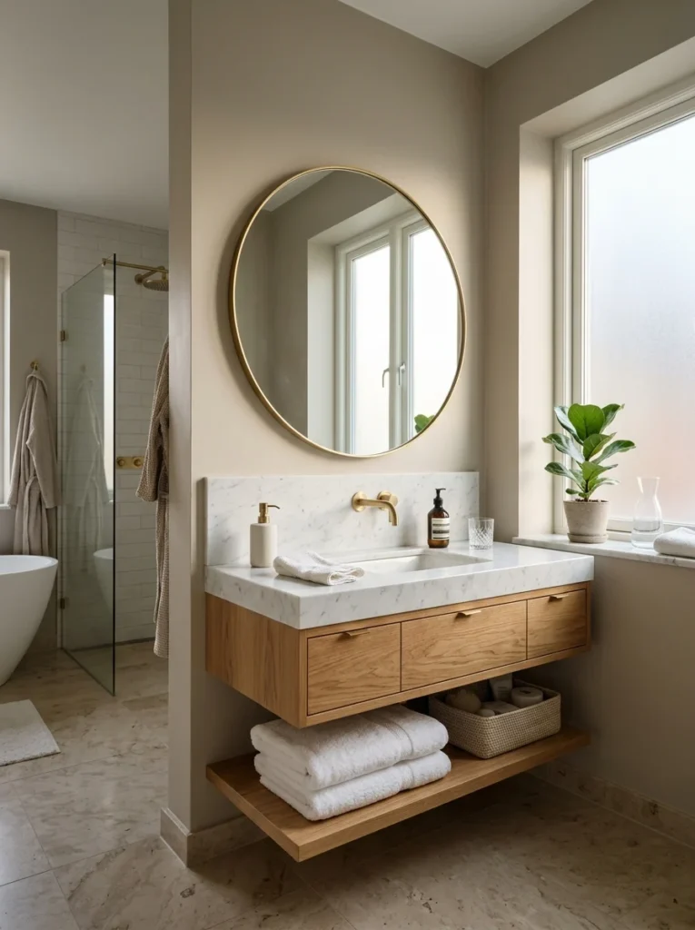
Warm whites and off-whites. The most consistently livable bathroom color is a white with a warm, barely-perceptible undertone that reflects light generously and works with almost any fixture or tile combination. This reads as the “boring” choice and is the choice most likely to still feel correct in ten years.
Warm neutrals with enough presence to read as a color choice. A color clearly in the warm beige, warm stone, or warm greige family — not so close to white that it reads as failed white, but warm enough to feel deliberate — ages well because it stays within the category the eye reads as “calm and considered.”
Deep, inky tones in larger bathrooms. A very dark color — deep charcoal, navy close to black, very deep green — in a bathroom with enough natural light and enough square footage tends to age better than medium-saturation colors in the same space. The darkness is committed enough that it reads as a design choice rather than a bold experiment.
Tones borrowed from the tile or fixtures. A wall color that picks up one of the undertones already present in the tile or fixtures reads as integrated — as though the color decision came from the room itself rather than being imposed on it. These combinations tend to feel settled and last well.
The Ceiling and What It Should Do in a Bathroom
Most bathrooms have their ceiling painted the same color as the walls, or in a bright white regardless of the wall color. Neither of these is wrong, but both are decisions worth making intentionally rather than by default.
Ceiling the same color as the walls creates a cocooning, enveloping effect — the room feels like it’s entirely within the color, which in a small bathroom with a good color can read as intentional and warm. In a bathroom with a color that becomes too much over time, the ceiling color extends that effect.
Bright white ceiling with colored walls is the standard approach that grounds the color on the walls by providing a clear top boundary. This prevents the cocooning effect and keeps the room feeling open overhead.
A ceiling slightly lighter than the walls — the same color family but at lower intensity — is the least-used and often most successful approach. It creates continuity without the full cocooning effect, and it makes the room read as taller than a flat-white ceiling does.
Key Takeaways
- Bathroom color regret follows a specific pattern: exciting at first, fatiguing within twelve to eighteen months, typically caused by high saturation, incorrect undertone, or failure under the room’s actual artificial lighting conditions
- The bathroom’s fixed elements — tile, sanitaryware, fixtures — are not neutral; they actively constrain which wall colors will read as settled rather than conflicted
- Undertones are the silent cause of most “something’s off” bathroom color experiences — they’re only reliably revealed on the actual wall under the actual room’s lighting
- The only reliable color test is a painted section on the actual wall, observed at the time of day the bathroom is most used
- Colors that generate a steady positive response tend to have better longevity than colors that generate excitement — excitement fades faster in a room used for seven minutes every morning than in one occupied for longer
- Warm whites, warm neutrals, and tones borrowed from the room’s existing fixed elements have demonstrated the broadest longevity across different bathrooms and aesthetics
Frequently Asked Questions
Is it safe to use a dark color in a small bathroom? More than most people assume, with specific conditions. A very small bathroom painted in a dark color with good lighting — particularly with natural light from a window — can read as dramatic and intentional rather than cramped. The failure mode for dark colors in small bathrooms is poor lighting that makes the darkness feel oppressive rather than considered. A small bathroom with adequate light and a committed dark color often reads better than the same bathroom in a medium-saturation color that feels neither bold nor calm.
How different can a color look from the chip to the wall? Significantly. A paint chip is a small sample that the eye evaluates in isolation; a painted wall is a large surface the eye evaluates in the context of the entire room. Colors almost always look more intense on the wall than on the chip — a medium-saturation color can read as bold once it occupies four walls. Additionally, the chip is evaluated in whatever light is available when it’s viewed; the wall exists under the specific fixed lighting of the room, which may read very differently.
Should I choose a bathroom color based on the color trends of the year? Trend colors are identified precisely because they’re peaking in popularity — which means by the time they’ve been widely adopted, they’ve also begun their trajectory toward feeling dated. A color in a trend publication in 2024 will begin looking of-its-era by 2026 or 2027 in many cases. Using trend colors as reference for undertone direction, rather than specific color adoption, is a more durable approach: if warm earthy greens are trending, the warm undertone direction may have longevity even when the specific color doesn’t.
What finish should bathroom paint have? A satin or eggshell finish in a bathroom is almost always preferable to flat or matte. Flat paint in a bathroom shows every mark and moisture exposure, doesn’t wipe clean effectively, and reads as flat in a way that satin doesn’t. High gloss is occasionally used for impact but requires very precise surface preparation to look good rather than revealing every imperfection. Satin is the best all-around choice for bathroom walls: wipeable, some sheen without full gloss, and forgiving of minor wall imperfections.
If I paint a bathroom a color I regret, how difficult is it to repaint? Easier than most other renovation correctives, which is the genuine advantage of paint as a medium. A bathroom repaint is typically a weekend project — cleaning and lightly sanding the surface, a coat of primer if moving from a dark color to a light one or changing undertone direction significantly, and two coats of the new color. The cost is materials and time. This is why testing on the actual wall before committing to a full paint is so strongly worth doing — the consequence of getting it wrong is measured in weekend effort rather than renovation cost.