

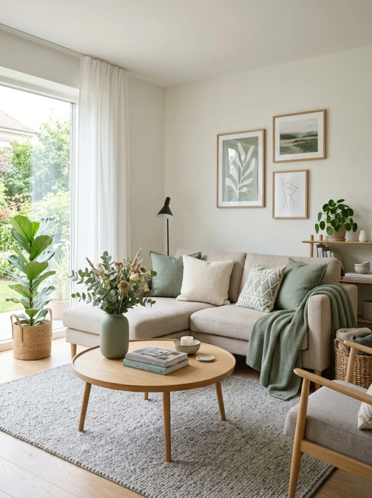
A room with a good neutral base can still feel flat without a color that ties everything together. Here’s how to actually choose one, rather than guessing from a paint chip.A living room with a well-chosen neutral sofa, a decent rug, and reasonable furniture can still feel oddly unfinished — not wrong exactly, just flat, like a sentence missing its punctuation. This is frequently a missing accent color problem rather than a furniture or layout problem. An accent color is the thread that ties a room’s separate elements into a single cohesive statement, and its absence is one of the more common, least obvious reasons a living room with genuinely good individual pieces doesn’t feel fully resolved.
Choosing one well is a more specific process than picking a color that’s personally appealing in isolation, since an accent color’s job is relational — it has to work with everything already in the room, not stand alone the way a piece of art or a paint chip does when evaluated by itself.
An Accent Color’s Job Is to Repeat, Not to Appear Once
The defining feature of a successful accent color is that it shows up multiple times throughout the room, in different objects and materials, rather than appearing in a single standout piece. A single blue pillow doesn’t function as an accent color in the way three or four blue elements — a pillow, a piece of art, a vase, a subtle thread in the rug — function together. Repetition is what makes an eye register a color as an intentional theme rather than a single decorative choice.
This repetition doesn’t need to be identical in shade or material. A deep navy pillow, a lighter blue in a piece of art, and a blue-gray vase can all read as part of the same accent color story even though none of them are an exact match, as long as they’re clearly in the same color family. Exact matching across multiple objects, in fact, often reads as more contrived than a related but varied set of blues does.
Three to five touches of the accent color, distributed across different parts of the room, is a reasonable target — enough to establish the color as a clear theme without tipping into a room that reads as monochromatic or overly color-coordinated in a way that feels rigid rather than considered.
Pull the Color From Something Already in the Room
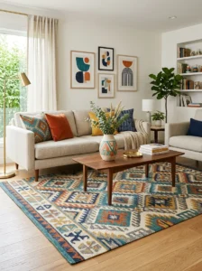
The most reliable source for an accent color is something that already exists in the room — a rug, a piece of art, an upholstery pattern — rather than a color chosen in isolation and then imposed on a room that wasn’t designed around it. A rug with several colors woven through it almost always contains a color that can be pulled out and repeated elsewhere in the room, and using that existing color as the accent avoids the risk of introducing something that clashes with what’s already there.
This is a lower-risk process than starting from a favorite color and building a room around it, because the color is being tested against the room’s actual existing palette from the outset, rather than being chosen first and reconciled with the room later. A household drawn to a specific piece of art, a favorite rug, or even a single beloved object can use that piece as the starting point, extracting one of its colors as the room’s accent rather than trying to match new purchases to a color chosen independently.
Undertone Consistency Matters as Much as the Color Itself
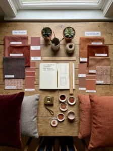
As covered elsewhere in this series regarding sofa color specifically, undertone — whether a color leans warm or cool within its own family — matters as much as the hue itself, and this is especially true for an accent color that needs to repeat across multiple different materials and objects. A warm terracotta and a cooler brick red are both, broadly, “red,” but placed next to each other they can look mismatched in a way that undermines the cohesive effect an accent color is supposed to create.
Checking undertone consistency across the actual objects being considered — not just the color names — before committing to them as a set avoids this specific failure mode. This often means physically gathering swatches, paint chips, or the actual objects together in the room’s lighting before finalizing a set of accent pieces, rather than assuming that objects broadly described with the same color name will actually coordinate.
Where to Introduce the Accent Color, and Where Not To

Smaller, more easily changed items are the right place to introduce an accent color, precisely because they’re low commitment relative to a room’s larger, more expensive pieces. Pillows, throws, a vase, art, a lampshade, and smaller occasional furniture are all reasonable places to carry an accent color, since any one of them can be replaced or refreshed without the disruption or expense that changing a sofa or a large rug involves.
The sofa itself, as covered in more detail elsewhere in this series, is generally a poor place to introduce a strong accent color, given how expensive and disruptive it is to change relative to almost anything else in the room. A neutral sofa that serves as a stable base, with the accent color carried through more changeable elements, gives a household the flexibility to update or shift the accent color over time — seasonally, or as tastes evolve — without needing to replace the room’s largest investment.
One larger-commitment piece carrying the accent color — a substantial piece of art, an accent chair — can work well as a stronger anchor for the color, provided the rest of the room’s larger investments (sofa, rug base tone) remain more neutral around it. This creates a hierarchy where the accent color has one confident, larger expression and several smaller, supporting appearances, rather than either a single isolated touch or an accent color applied so heavily across every surface that it stops functioning as an accent and becomes the room’s primary color instead.
Testing an Accent Color Before Committing

Physically gathering candidate items — fabric swatches, paint chips, an actual pillow or piece of art under consideration — into the room, in the room’s actual lighting, is a meaningfully more reliable test than evaluating the color in a store, online, or in a photo from a different room entirely. Color reads differently under a room’s specific combination of natural and artificial light than it does in a showroom or on a screen, and an accent color that looked perfect in a product photo can look subtly wrong once it’s actually sitting in the intended room.
Living with a single trial piece for a week or two before committing to a full set of accent items around that color is a low-cost way to confirm the choice, particularly for a color the household isn’t already deeply familiar with living alongside. A single pillow or a single piece of art in the candidate color, observed across a few days and different lighting conditions, reveals whether the color genuinely works in the space more reliably than any amount of planning in the abstract.
What Tends to Go Wrong
Choosing an accent color that appears only once in the room doesn’t function as an accent color in the cohesive sense — it reads as a single decorative outlier rather than a unifying theme, regardless of how good that single object is on its own.
Choosing too many accent colors at once, rather than committing to one primary accent color with perhaps one clearly secondary supporting color, tends to produce a busier, less resolved room than a room organized around a single clear accent color repeated confidently throughout.
Ignoring undertone and assuming same-named colors will coordinate is one of the more common technical mistakes, since two colors that are nominally the same hue but differ in warm or cool undertone can look mismatched together in a way that’s easy to sense and hard to diagnose without specifically checking for it.

Key Takeaways
- An accent color needs to repeat three to five times across different objects and materials in the room to read as an intentional theme rather than a single decorative touch
- Pulling an accent color from something already in the room — a rug, a piece of art — is more reliable than choosing a favorite color in isolation and imposing it on an existing space
- Undertone consistency across the actual objects carrying the accent color matters as much as the hue itself, and is worth checking directly rather than assuming from color names alone
- Smaller, easily changed items — pillows, throws, art, lampshades — are the right place to introduce an accent color, keeping the room’s larger, more expensive investments neutral and stable
- One larger-commitment piece, like a substantial artwork or an accent chair, can anchor the color more strongly, provided it’s balanced by neutral larger pieces elsewhere in the room
- Testing a single trial piece in the room’s actual lighting for a week or two before committing to a full accent color scheme catches mismatches that planning in the abstract often misses
Frequently Asked Questions
How many places should an accent color actually appear in a living room? Three to five distinct appearances across different objects and materials is a reasonable target — enough for the eye to register it as a clear, repeated theme without the room tipping into feeling overly color-coordinated or monochromatic. Fewer than that tends to read as a single decorative outlier rather than a unifying color choice.
Is it a mistake to have more than one accent color in a living room? Not necessarily, but it’s worth having a clear hierarchy — one primary accent color repeated confidently, with at most one secondary supporting color — rather than several competing accent colors of roughly equal weight, which tends to produce a busier, less resolved room than a single clear accent color does.
Should I choose my accent color first, or start with what’s already in the room? Starting with what’s already in the room — a rug, a piece of art, an existing upholstery pattern — is generally the more reliable approach, since it tests the color against the room’s actual existing palette from the outset rather than requiring the rest of the room to be reconciled with a color chosen independently.
Is it safe to introduce an accent color through the sofa? Generally not recommended, given how expensive and disruptive sofas are to replace relative to almost anything else in a living room. A neutral sofa as a stable base, with the accent color carried through smaller, more easily changed pieces, gives more flexibility to update the accent color over time without the cost of replacing the room’s largest furniture investment.
How do I know if an accent color will actually look right in my room before buying multiple pieces in that color? Bring a single trial piece — a pillow, a swatch, a small object — into the room and observe it under the room’s actual lighting across a few days, rather than relying on how the color looked in a store or in an online photo. This catches undertone mismatches and lighting-dependent color shifts that are much harder to predict in the abstract than to see directly in the space.