

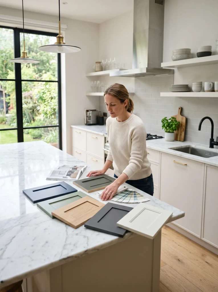
Standing in the paint aisle holding three nearly identical swatches of “greige” is its own special kind of misery. You came in feeling confident. You’re leaving more confused than when you walked in.
If you’re trying to figure out how to choose a kitchen cabinet color and every Pinterest board just makes it worse, you’re not alone. The problem isn’t a lack of options — it’s that there are too many, and none of them come with instructions for your kitchen, your lighting, or your floors. A color that looks dreamy in a photo can look completely wrong once it’s on your actual walls under your actual ceiling lights.
This guide walks through the things that actually matter when picking a kitchen cabinet color: lighting, undertones, contrast, longevity, and how to test a color before you commit a single drop of paint or a deposit on new cabinet fronts. By the end, you’ll have a clear, practical way to narrow down your options instead of staring at 47 paint chips wondering why none of them feel right.
1. Start With Your Light, Not the Color Chart

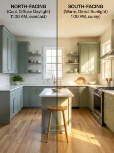
Before you fall in love with any shade, figure out what kind of natural light your kitchen actually gets. North-facing kitchens pull cooler and grayer, south-facing kitchens get warm golden light most of the day, and east or west-facing rooms shift dramatically between morning and evening. The exact same cabinet color can look completely different depending on which way your windows face.
This is the step almost everyone skips, and it’s usually why a “perfect” color from someone else’s kitchen looks flat or muddy in yours. Spend a day just watching how light moves through your space before picking anything.
2. Figure Out Your Undertone Before Anything Else
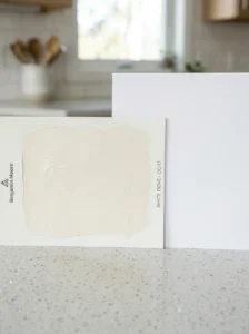
Every “neutral” cabinet color has a hidden undertone — green, blue, pink, or yellow — and it only shows up once it’s actually on the wood. White cabinets are notorious for this; a white that looks crisp in the store can read slightly purple or yellow once it’s installed.
A simple trick: hold your paint sample next to a white piece of paper in your kitchen’s actual lighting. Any tint will become obvious immediately. Skipping this step is how people end up with cabinets that technically match nothing else in the room.
3. Think About Contrast With Your Countertops
Cabinet color doesn’t exist on its own — it’s always reacting to whatever’s on your counters. Busy, veiny stone countertops usually need a calmer, more solid cabinet color to balance them out. Simple, quiet countertops can handle a bolder or richer cabinet shade without the kitchen feeling chaotic.
If your countertops are already the star of the room, let the cabinets support that instead of competing with it. A kitchen with two loud elements rarely feels finished — it feels busy.
4. Consider Your Floor Tone Too
Warm wood floors and cool-toned cabinets can clash in a way that’s hard to pinpoint but easy to feel. If your flooring leans warm (honey, amber, reddish-brown), a cabinet color with at least a little warmth tends to feel more pulled-together than something stark and cool.
This is one of those details that doesn’t show up in inspiration photos because you’re not seeing someone else’s floor. Walk into your kitchen and really look at the floor-to-cabinet relationship before deciding.
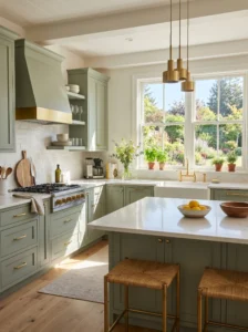
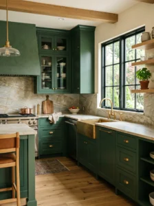
5. Soft Sage Green for a Calm, Grounded Kitchen
Sage has become a kitchen favorite for a reason — it’s green without being loud, and it pairs beautifully with brass, black, or warm wood tones. It reads as fresh and a little vintage at the same time, which is a hard balance to strike.
Rooms with good natural light let sage breathe; in darker kitchens, it can lean a bit murky. Pair it with lighter countertops to keep things feeling open rather than closed in.
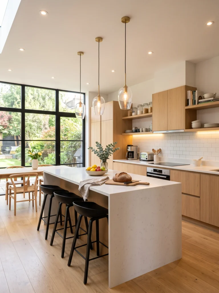
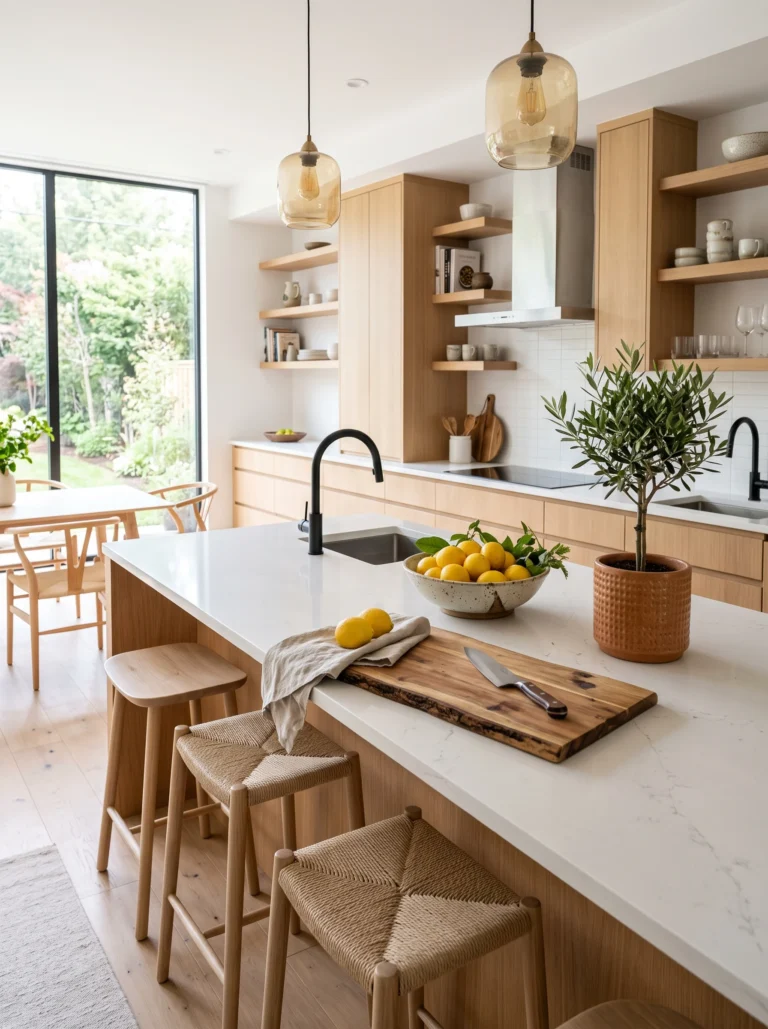
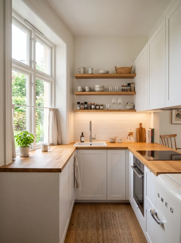
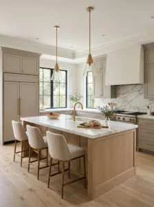
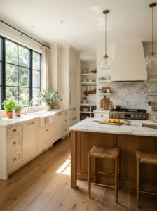
6. Warm White for a Timeless, Airy Look
Not a stark, clinical white — a warm white with a hint of cream that keeps a kitchen feeling soft instead of sterile. This is the color that ages well and rarely looks dated, which matters if you’re not planning to repaint again in three years.
The trick is choosing a warm white that still reads as white in your specific lighting, not one that drifts into beige territory once it’s up. Test a large sample, not a tiny chip.
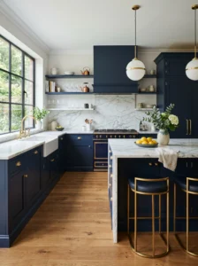
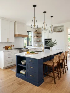
7. Deep Navy for Cabinets With Personality
Navy gives a kitchen a sense of weight and intention without going full black. It photographs beautifully and pairs well with brass hardware, marble, or warm wood open shelving.
Dark cabinets can feel heavy in a small or dim kitchen, so this works best with good lighting or at least one bright element to balance it — a light backsplash, pale countertop, or big window. Used thoughtfully, it turns a kitchen into a room people actually want to sit in.
8. Greige for the Indecisive (No Shame in It)
Greige — that gray-beige hybrid — exists because so many people genuinely can’t decide between warm and cool. It splits the difference and tends to feel safe without being boring.
The risk is picking one that leans too far in either direction once it’s on your walls. Test it against your floors and counters specifically; greige is the shade most likely to surprise you once it’s actually installed.
9. Two-Tone Cabinets for Visual Interest
Pairing a darker lower cabinet with a lighter upper cabinet (or island in a contrasting shade) adds depth without committing to one bold color everywhere. It’s a popular middle ground for people who want personality but aren’t ready for an entire room in one strong hue.
Keep the contrast intentional rather than random — a near-match in two different shades tends to look like a mistake rather than a design choice. Pick colors that clearly belong on the same color wheel.
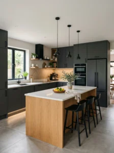
10. Charcoal for Cabinets That Feel Modern Without Trying Too Hard
Charcoal sits in that sweet spot between black and gray — dramatic enough to feel current, soft enough to stay livable long-term. It works particularly well in kitchens with lots of natural light, where it won’t read as cave-like.
Pair it with warm metal hardware to keep things from feeling cold. A small kitchen can absolutely handle charcoal as long as the rest of the room stays light and open.
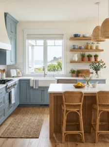
11. Soft Blue for a Coastal, Relaxed Feel
A muted, dusty blue — not bright, not navy — brings a calm, slightly nostalgic feeling into a kitchen. It pairs effortlessly with white countertops and natural wood accents.
The key word here is muted. A blue that’s too saturated can start to feel like a nursery rather than a kitchen. Look for shades described as “dusty” or “weathered” rather than “bright” or “sky.”
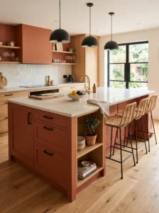
12. Terracotta or Clay Tones for Warmth
A warm, earthy clay color brings an unexpected coziness to a kitchen and pairs surprisingly well with black hardware and natural materials like rattan or wood. It feels lived-in and personal rather than showroom-perfect.
This is a bolder choice that works best as a feature — think island only, or lower cabinets only — rather than wrapping the entire room. Used well, it makes a kitchen feel like it has a story.
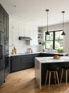
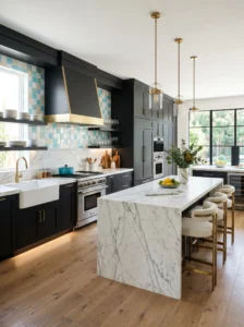
13. Classic Black for Drama and Definition

Black cabinets get a reputation for being intimidating, but in the right kitchen they’re striking rather than heavy. They work especially well paired with light countertops and a bright backsplash that keeps the room from feeling closed in.
Smaller, darker kitchens should approach black carefully — it’s not the easiest starting point if natural light is already limited. In a bright, open layout, though, it can be the single most defining design choice in the room.
14. Olive Green for an Earthy, Grounded Statement
Olive sits between sage and a richer forest green — earthy, a little moody, and unexpectedly versatile. It pairs naturally with brass, wood, and warm neutrals, giving a kitchen a settled, established feeling rather than a trendy one.
It can skew slightly dated if paired with the wrong era of hardware, so lean into simple, current fixtures to keep the overall look feeling fresh rather than retro for the wrong reasons.
15. Two-Color Islands as a Lower-Commitment Bold Choice
If a fully colored kitchen feels like too much, painting just the island a contrasting color is a smaller, more reversible way to add personality. It draws the eye to one focal point instead of spreading bold color across every surface.
This approach also makes it easier to update later — repainting one island is a far smaller project than redoing every cabinet in the kitchen. A good option for renters or anyone who likes to change things up every few years.
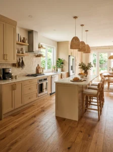
16. Cream or Off-White for a Softer Alternative to Stark White
Cream cabinets bring warmth that pure white sometimes lacks, without going as far as a true beige. They tend to photograph beautifully in both bright and softer lighting, which makes them a fairly safe long-term choice.
The undertone test matters even more here — cream can drift toward yellow in warm lighting, so check it under your actual kitchen bulbs, not store lighting, before deciding.
17. Forest Green for a Bold, Rich Statement

A deeper, more saturated green than sage, forest green makes a serious style statement and pairs beautifully with brass or gold hardware and natural stone. It’s a confident choice for someone who already knows they want color, not someone still on the fence.
Because it’s a strong color, balance it with lighter walls or counters so the kitchen doesn’t feel closed in, especially if natural light is limited.
18. Two-Tone With a Neutral Wall as the Buffer
When choosing between two contrasting cabinet colors, keeping the wall color neutral gives both shades room to stand out without competing with a third strong color. It’s an easy way to look intentional rather than overwhelming.
This works particularly well in open-concept kitchens that flow into a living or dining space, where a busy wall color can make the whole sightline feel cluttered.
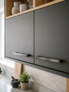
19. Matte Finishes for a Modern, Softer Look

Color matters, but finish changes everything. A matte finish reads as more sophisticated and current than high-gloss, and it tends to hide fingerprints and smudges better — a real consideration in a kitchen that actually gets used.
If you’re torn between two shades of the same color family, sometimes switching the finish from satin to matte solves the dilemma more effectively than switching the color itself.
20. When in Doubt, Sample Big and Sample Real
The single most useful thing you can do before committing to any color on this list is to get a large sample — a poster-board-sized swatch, not a tiny paint chip — and tape it to your actual cabinets for a few days. Look at it in morning light, afternoon light, and under your kitchen’s overhead lighting at night.
Colors shift more than people expect once they’re scaled up and placed in real lighting conditions. This one step prevents more regretted kitchen decisions than anything else on this list.
Final Thoughts
Choosing a kitchen cabinet color comes down to a few things that have nothing to do with what’s trending: your light, your undertones, your countertops, and how much contrast you actually want to live with every day. Once those four things are sorted out, the list of “good” colors for your kitchen gets a lot shorter and a lot less overwhelming.
If there’s one shortcut worth taking from this whole list, it’s the large sample test in step 20 — it solves more decision paralysis than scrolling through another hundred photos ever will. A color that looks right taped to your actual cabinets, in your actual light, is worth more than any trend.
Which color on this list is calling your name? Let us know in the comments — we’d love to hear what you’re leaning toward.