

A room can have good color, good furniture, and good lighting, and still feel strangely flat — usually because texture, not color or arrangement, is the missing ingredient. Here’s how to actually add it.
A room can have a well-chosen color palette, reasonably good furniture, and adequate lighting, and still feel flat and slightly lifeless in a way that’s hard to immediately diagnose. This is frequently a texture problem rather than a color, furniture, or lighting problem, and it’s worth understanding on its own terms, since texture is briefly touched on throughout this series — as what separates a calm bedroom from a cold one, as part of what a photograph can’t capture — without a dedicated, practical explanation of how to actually add it to a room that’s missing it.
Why Flatness Happens Even When Every Other Element Is Handled Well
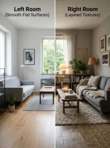
A room built entirely from smooth, uniform materials — smooth painted walls, flat-weave or hard flooring, furniture with clean, unadorned surfaces, minimal soft furnishing — can be well-designed in every other respect and still register as visually and physically flat, because texture is what gives a room dimensional depth and tactile interest independent of color or layout. Texture affects how light interacts with a surface — a textured material catches and scatters light differently than a smooth one, creating subtle shadow and highlight variation that a uniformly smooth surface simply doesn’t produce, regardless of how good the room’s actual lighting setup is.
This is why two rooms with identical color palettes and similar furniture arrangements can feel meaningfully different to be in — the one with genuine textural variation reads as rich and considered, while the one built from uniformly smooth materials, even in an identical color scheme, reads as comparatively flat and sterile.
Layering Multiple Textures Within a Consistent Palette
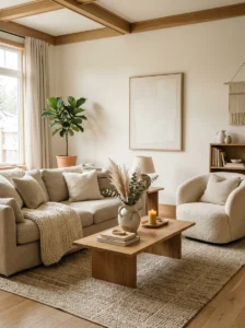
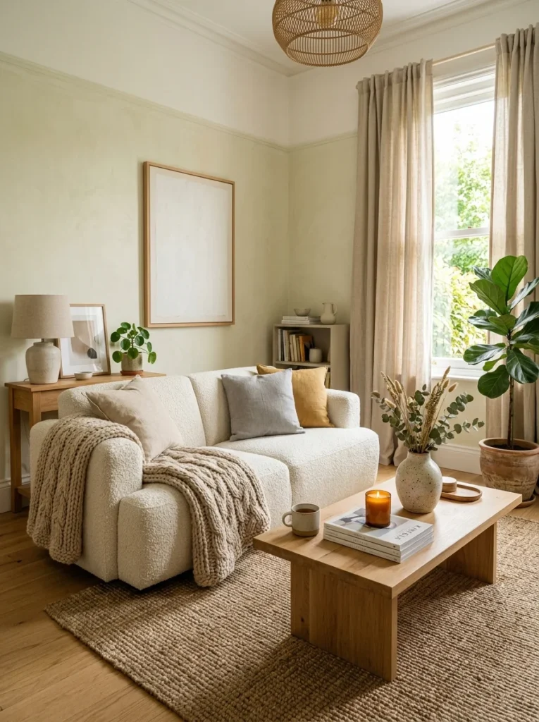
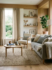
The most effective way to add texture without adding visual busyness is layering multiple different textures within a single, consistent color family, rather than treating texture and color as competing considerations that both need to vary simultaneously. A room in a muted neutral palette can incorporate a nubby wool rug, a smooth linen sofa, a rough-hewn wood coffee table, and a soft knit throw — four genuinely different textures — while remaining visually calm and cohesive, since the color consistency across all four elements prevents the textural variety from reading as chaotic or overly busy.
This is the key distinction that makes texture additive rather than cluttering: pattern and strong color variation add visual complexity that competes for attention, while texture variation within a consistent palette adds depth that doesn’t compete for attention in the same way — it’s felt and noticed more subtly, contributing richness without demanding the same visual processing a busy pattern or clashing color combination requires.
Textiles Are the Fastest, Lowest-Cost Way to Add Texture
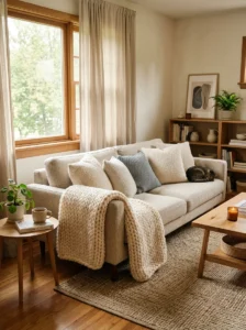
Throw pillows, covered in more detail elsewhere in this series, are one of the most accessible texture sources — a boucle or nubby-weave pillow alongside a smooth linen one introduces genuine textural contrast without requiring any furniture-level investment. A substantial knit or woven throw draped over a sofa or the foot of a bed adds both visual and literal tactile texture, and is one of the highest-impact, lowest-cost single additions available for a room reading as flat.
Rugs are a particularly significant texture source given their scale — a flat, low-pile rug contributes comparatively little textural interest, while a higher-pile, woven, or textured flat-weave rug adds meaningful depth across a large portion of the room’s visual field, given how much floor area a rug typically covers relative to smaller textile elements.
Curtains, covered in more detail elsewhere in this series regarding luxurious bedroom curtains specifically, contribute texture at a large scale as well — a heavier, more textured fabric like linen or velvet adds considerably more textural interest than a thin, flat, synthetic panel, independent of the specific color chosen.
Natural Materials Bring Inherent Texture That Manufactured Materials Often Lack
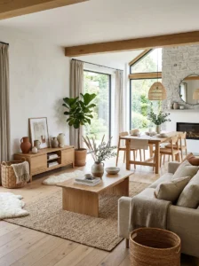
Wood grain, natural stone, woven rattan or wicker, unglazed ceramic, and other natural materials carry inherent textural variation as a direct result of their material origin — no two pieces of natural wood grain or natural stone are perfectly identical, which produces a subtle, organic texture that manufactured, uniform materials generally can’t replicate. Incorporating natural materials into furniture, decor, and finishes is a reliable way to introduce genuine textural richness, since the texture is inherent to the material rather than requiring a separate, deliberate textural treatment layered on top.
This is part of why natural materials tend to read as warmer and more grounding than heavily manufactured, uniform alternatives, even when both are used in an identical color palette — the visual and tactile variation within the natural material itself is doing real textural work that a flatter, more uniform manufactured surface isn’t providing.
Wall and Surface Treatments Add Texture at an Architectural Scale
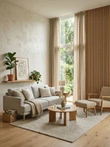
Beyond furniture and textiles, texture can be introduced directly into a room’s architecture — a textured plaster wall finish, wood slat paneling covered elsewhere in this series regarding bedroom accent walls, a grasscloth or textured wallpaper, exposed or faux brick — any of which adds dimensional depth at the scale of an entire wall, which is a meaningfully larger textural contribution than furniture or textiles alone can provide.
This is a higher-commitment, generally higher-cost category of texture addition than textiles, but it produces a correspondingly larger visual impact, and it’s often the right choice for a room that’s already reasonably well-furnished with adequate textile texture but still feels flat at the level of its actual walls and architecture.
Balancing Texture Without Tipping Into Visual Clutter
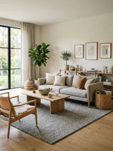
As with color and pattern throughout this series, texture benefits from restraint and intentional variation rather than maximalist accumulation — a room with too many competing, unrelated textures (a shag rug, a heavily tufted sofa, a rough stone wall, and a textured ceiling treatment all in the same space) can tip from richly layered into visually overwhelming, particularly if the textures themselves vary widely in scale and character rather than relating to each other in some coordinated way.
A useful practical guideline: choosing textures that vary in type (smooth, nubby, woven, grainy) while staying within a similar overall weight or intensity — pairing a few substantial, prominent textures with several more subtle, supporting ones, rather than making every single element in the room equally bold and textured — produces a result that reads as rich rather than chaotic.
Texture Matters More in Rooms With a Restrained Color Palette
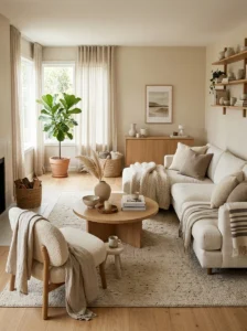
A room built around a muted, neutral, or restrained color palette relies more heavily on texture to provide visual interest than a room with bold, varied color already doing significant visual work, which is why texture becomes especially important — and its absence especially noticeable — in exactly the kind of calm, neutral-toned rooms covered throughout this series as the generally more timeless, sustainable design direction. A minimal color palette without adequate textural variation is the most common recipe for a room reading as flat, since there’s neither color contrast nor textural contrast providing visual interest, while the same restrained palette with genuine textural layering reads as calm and considered rather than simply empty.
Key Takeaways
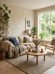
- Texture affects how light interacts with a surface, creating shadow and highlight variation that a uniformly smooth room lacks regardless of how well its color and lighting are otherwise handled
- Layering multiple different textures within a single, consistent color palette adds depth without adding the visual busyness that pattern or clashing color variation would
- Textiles — pillows, throws, rugs, and curtains — are the fastest, lowest-cost way to introduce meaningful texture, and rugs in particular contribute significant textural impact given their scale
- Natural materials carry inherent textural variation that manufactured, uniform materials generally can’t replicate, contributing warmth and richness independent of color choice
- Wall and architectural treatments — textured plaster, wood paneling, textured wallpaper — add texture at a larger scale than furniture and textiles alone, at a correspondingly higher cost and commitment
- A restrained, neutral color palette relies more heavily on texture for visual interest, which is why texture’s absence is especially noticeable, and its presence especially valuable, in exactly this kind of calm, timeless room
Frequently Asked Questions
What’s the fastest, cheapest way to add texture to a room that feels flat? Textiles — a textured throw pillow, a substantial knit throw, or a higher-pile or woven rug — are the most accessible and lowest-cost texture sources, since they don’t require furniture-level investment and can be added or swapped easily. A rug is particularly high-impact given how much of the room’s visual field it typically covers.
Can a room have too much texture? Yes — too many widely varying, unrelated textures in the same space can tip from richly layered into visually overwhelming, particularly if they vary widely in scale and intensity without relating to each other. Choosing a few substantial, prominent textures alongside several more subtle supporting ones, within a consistent overall palette, produces a more successful result than making every element equally bold.
Why does texture matter more in a neutral, minimal color scheme? A restrained color palette doesn’t provide the visual interest that bold color and pattern variation would, which means texture becomes the primary source of visual richness in that kind of room. A minimal color palette without adequate textural variation is one of the most common causes of a room reading as flat, since neither color nor texture is providing contrast or depth.
Do natural materials really add more texture than manufactured ones? Generally yes — natural materials like wood grain, stone, and woven natural fibers carry inherent variation as a result of their material origin, producing subtle, organic texture that uniform, manufactured surfaces typically can’t replicate. This is part of why natural materials tend to read as warmer and more grounding even within an identical color palette.
Is it worth adding a textured wall treatment, or is textile layering usually enough? Textile layering resolves flatness in many rooms on its own, and it’s the lower-cost, lower-commitment option worth trying first. A textured wall treatment — plaster, paneling, textured wallpaper — is worth considering specifically when a room is already reasonably well-furnished with textile texture and still feels flat at the level of its actual walls and architecture, since it adds texture at a larger, more architectural scale than furniture and textiles alone can provide.