


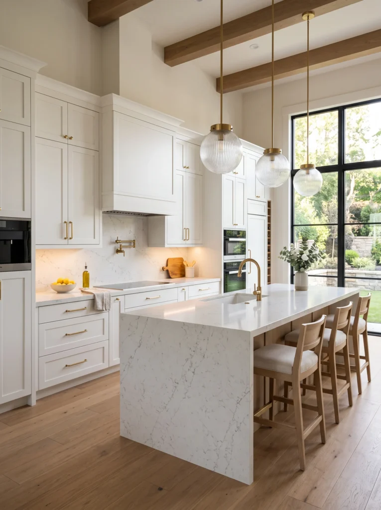
What makes a kitchen look expensive has less to do with what was spent and more to do with specific visual signals. Here’s exactly what they are and how to replicate them.Expensive is not what it costs. Expensive is a set of signals the eye reads in the first few seconds of entering a room — signals about precision, consistency, and restraint that the brain interprets as quality before any individual element is consciously examined.
This distinction matters because it means the expensive feeling is replicable without the expensive price tag, if you understand which signals are actually doing the work. A kitchen that cost a hundred thousand dollars can look ordinary if those signals are absent. A kitchen that cost a fraction of that can read as genuinely elevated if the same signals are present.
Most of the changes involved in sending these signals cost very little money. What they cost is attention — a willingness to look carefully at the specific details that register as quality to a first-time eye, and to address the ones that are currently working against the room.
The Signal the Eye Reads First: Precision of Installation
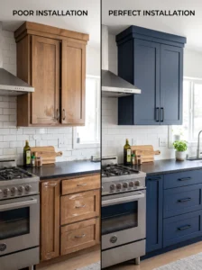
Before any styling decision registers, before hardware or color or material, the eye reads the precision of the installation itself. The gaps. The alignment. The caulk lines. The way surfaces meet each other.
A kitchen where cabinet doors hang at fractionally different heights, where the caulk line between the counter and the wall is uneven, where trim meets tile slightly off-square — all of this reads as lower quality than the specific materials being read would suggest. Conversely, tight, consistent gaps between cabinet doors, clean caulk lines that disappear into the joint, and surfaces that meet each other exactly register as expensive before anyone has consciously looked at what anything is made of.
This is why a kitchen with mid-range materials installed with genuine precision can read as higher-end than a kitchen with premium materials installed carelessly. The material communicates quality. The installation confirms or contradicts it.
The practical implication: Before any aesthetic change, fix the precision of what already exists. Re-caulk any joint that has yellowed, cracked, or pulled away. Adjust any cabinet door that hangs visibly off from its neighbors. Touch up any paint where the line has gone ragged. These are low-cost corrections that produce signal-level changes in how the room reads.
Paint: The Finish Matters More Than the Color
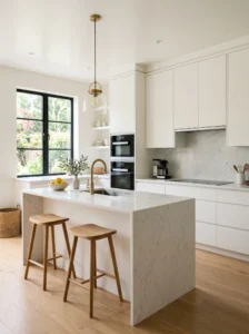
A kitchen painted in a beautiful color with a flat or low-sheen finish reads as flat. The same color in a satin or semi-gloss finish reads as clean, crisp, and intentional — surfaces that reflect light slightly and wipe clean, rather than absorbing both.
Kitchen walls and especially cabinet paint should virtually never be flat finish. Flat paint in a kitchen shows every grease mark, every fingerprint, every scuff in a way that makes surfaces look immediately tired. A satin or eggshell finish hides routine kitchen marks and maintains the fresh appearance that reads as expensive for considerably longer.
The second paint variable that most people miss is cut quality — the precision of the line where paint meets trim, where wall meets ceiling, where painted surface meets unpainted. A room where these lines are clean and sharp reads as professionally finished. A room where these lines wobble, show undercutting, or have small bleeds onto the adjacent surface reads as a rush job regardless of the paint color chosen.
A professional-quality cut at every paint edge costs time, not money, and the visual signal it produces is significant.
Consistency: The Single Variable That Separates Designed From Accumulated
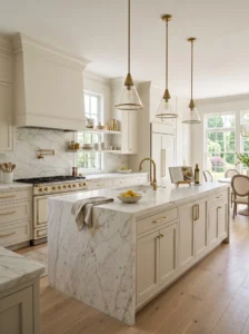
A kitchen that looks expensive reads as consistent. Not identical — but consistent in its logic, its material family, its finish direction.
The opposite of this is a kitchen that reads as accumulated — where different elements were chosen at different times, for different reasons, without reference to each other, and their visual inconsistency reveals that history. Different metals. Different wood tones. Different white tones that don’t quite agree. Different hardware styles on different cabinets. Each individual choice might have been fine in isolation. Together, they broadcast the absence of a through-line.
The signals of inconsistency that read most visibly as “not expensive”:
- Mixed metal finishes that weren’t chosen deliberately (chrome faucet, brushed nickel pulls, brass light fixture, stainless appliances — not because contrast was desired, but because things were replaced one at a time)
- Multiple white tones that clash — warm white cabinets against a cool white wall, or a cream countertop edge against a stark white tile
- Cabinet hardware that doesn’t match between sections — a different pull on the island than on the perimeter, or knobs in one area and pulls in another without a clear reason
The fix for most of these is cheaper than it appears. Hardware replacement is affordable. Paint can correct mismatched white tones on walls. A consistent decision about metals, applied going forward, gradually brings the room into alignment as individual items are replaced.
Restraint: Why Less Reads as More Expensive
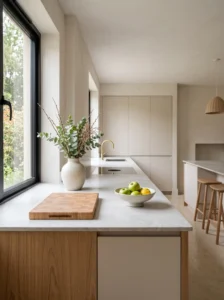
This is the principle most interior designers know and most homeowners resist, because it runs counter to the instinct that more — more color, more décor, more variety — is more impressive.
An expensive room is almost always a restrained room. Not empty, but deliberate — where every element has a clear reason to be there and the room as a whole doesn’t feel like it’s trying to achieve too many things at once.
In a kitchen, restraint looks like:
- A counter with three well-chosen objects rather than twelve random ones
- A backsplash in one material rather than two combined awkwardly
- A color palette that uses two or three tones that agree rather than five that coexist uneasily
- Open shelving with deliberate, curated items rather than everything that didn’t fit in a cabinet
The reason restraint reads as expensive is partly psychological and partly visual. Psychologically, we associate restraint with confidence — someone who isn’t trying to fill every space is secure enough to leave space unfilled. Visually, restraint allows each individual element to be seen and read properly, which means quality elements register at their actual quality level rather than being diluted by surrounding noise.
The Lighting Signal Nobody Charges Enough Attention
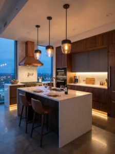
A kitchen with one flat overhead light source looks ordinary regardless of what else is in it. The way high-end kitchens look in photographs — warm, dimensional, inviting — is partly the photography and partly that well-designed kitchens almost always have multiple light sources at different heights.
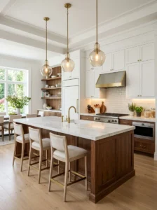
Adding a single pendant light over an island or table, particularly one with a warm-toned shade, does more for the “expensive” reading of a kitchen than most surface-level changes. The pendant is a visible element that contributes to the aesthetic, and it provides a different quality and angle of light than overhead fixtures do.
Under-cabinet lighting — LED strips illuminating the countertop — removes the self-shadow that overhead light creates and makes prep areas look intentionally lit rather than incidentally lit. In a kitchen where the counter is a primary visual element, lighting it from below as well as above changes the entire character of the surface.
Neither of these changes is expensive. A quality pendant light can be found at a reasonable price. Under-cabinet LED strips are inexpensive and in many cases plug-in. The return per dollar on lighting, in terms of how it changes a room’s perceived quality, is among the highest of any kitchen upgrade category.
Hardware and Fixtures: The Details That Communicate Quality at Touch Points
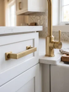
Every time someone touches a cabinet, opens a drawer, or uses a faucet, they’re receiving information about the quality of the kitchen through their hands as well as their eyes. Hardware that feels hollow, turns stiffly, or wiggles in its mount communicates a quality level that contradicts whatever the cabinets themselves suggest.
Replacing builder-grade hardware with solid, properly scaled replacements is one of the most documented high-return kitchen upgrades available — not because the new hardware is dramatically more expensive, but because touch-point quality is felt at every single interaction with the kitchen and registers quickly at both a conscious and unconscious level.
The specific quality signals to look for when replacing hardware:
- Weight: Solid brass or solid stainless feels meaningfully different from hollow chrome at first contact
- Smooth operation: A pull that moves cleanly and returns solidly registers as quality; one with any wobble or resistance does not
- Crisp finish at the ends: Where a pull or knob terminates, the finish should be clean and intentional — not rough, not inconsistent
- Clean mounting: Hardware that sits flush and even against the cabinet face, with no visible daylight or wobble, reads as properly installed regardless of the hardware’s actual cost
What Actively Reads as “Not Expensive”
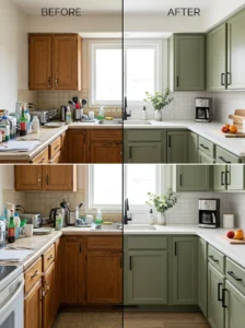
Understanding the positive signals matters. Understanding what actively broadcasts the opposite is equally useful, because removing these often has more impact than adding positive elements.
Visible clutter on any surface: Clutter is the fastest-acting signal against quality. A kitchen that costs almost nothing but is completely clear and precisely arranged will read as higher quality than a kitchen that cost a significant amount with stuff covering every surface.
Yellowed caulk or grout: This single detail ages a kitchen faster than almost anything else and can be fully resolved with a tube of caulk and an afternoon.
Mismatched or missing cabinet hardware: A cabinet with no hardware, or with the wrong hardware (the wrong scale, the wrong style, the wrong finish), reads as incomplete.
Lighting that flickers, hums, or uses visibly different color temperatures across fixtures: A kitchen where some bulbs are warm and some are cool, or where a fluorescent tube hums under overhead lights, broadcasts neglect.
Cheap window treatments or none at all: The window is a significant visual element in any kitchen that has one, and the treatment on it (or its absence) is immediately read. A bare window with builder-grade blinds reads as unfinished. A simple, well-fitted Roman shade or clean linen panel reads as considered and elevated.
The Audit: How to See Your Own Kitchen Like a First-Time Visitor
The problem with evaluating your own kitchen for these signals is familiarity. You stop seeing the yellowed caulk because it’s always been there. You don’t notice the mismatched metals because you added each piece at a different time.
A useful exercise: photograph the kitchen on your phone and look at the photos rather than the kitchen. The camera flattens three-dimensional space and makes certain things — caulk lines, alignment, hardware consistency, counter clutter — read more like they do to a first-time visitor than familiar daily exposure allows.
Then make a list with two columns: things that read as quality, and things that undermine that reading. The second column is where to focus energy first. Removing the signals that work against the room almost always matters more than adding signals that improve it, because a negative signal actively contradicts every positive one around it.
Key Takeaways
- “Expensive” is a set of perceptual signals, not a price level — the signals are learnable and replicable
- Installation precision reads before any material or color does — fix caulk, alignment, and paint edges first
- Paint finish matters as much as paint color in kitchens — satin or semi-gloss rather than flat
- Consistency across metals, whites, and materials reads as designed; inconsistency reads as accumulated
- Restraint — fewer, more deliberate elements — signals confidence and allows quality to register clearly
- A pendant light and under-cabinet lighting change how a kitchen feels more than most expensive surface upgrades
- Touch-point quality — hardware weight and finish — is felt at every interaction and registers quickly
- Removing signals that work against the room is usually higher-impact than adding positive ones
Frequently Asked Questions
What’s the single cheapest change that makes the biggest difference in how expensive a kitchen feels? Re-caulking. Fresh, clean caulk lines at every joint — counter to wall, sink to counter, tile to cabinet — costs very little and removes one of the most persistent signals of a tired, aging kitchen. A kitchen with impeccable caulk reads as better maintained and more considered than the same kitchen with cracked, yellowed joints, regardless of how much anything cost.
Does the brand of appliance matter for the “expensive” feeling, or is it more about the finish? Finish and integration matter more than brand. A mid-range stainless appliance in good condition that matches the finish of adjacent appliances reads better than a premium brand appliance in a finish that doesn’t agree with the rest of the kitchen. The most expensive-reading appliance situations are when everything is the same finish family and in good visual condition — rather than a mix of premium and builder-grade in different finishes.
Can a kitchen with old cabinets look expensive, or do the cabinets have to be replaced? Old cabinets can look expensive with the right approach: a quality repaint in a well-chosen color with a proper finish, new hardware at the correct scale, and attention to alignment and precision of the cabinet doors. The box and the door — the structural parts of the cabinet — are rarely visible when the cabinet is closed. What’s visible is the face, the finish, and the hardware, all of which can be changed without replacing the cabinet itself.
Is open shelving necessary for the expensive look, or can an all-closed-cabinet kitchen read as high-end? Fully closed cabinets can absolutely read as high-end — and in some ways read as more elevated than open shelving because they signal more kitchen storage and a tidier daily operation. The expensive reading of closed-cabinet kitchens comes from the quality of the cabinet faces, the hardware, the paint or finish, and the precision of the installation — not from whether shelves are open or closed.
What’s the most common thing people spend money on that doesn’t actually change how expensive the kitchen feels? Decorative accessories. Small decorative items purchased to “style” the kitchen — figurines, seasonal pieces, specific trendy objects — have a low return on the “expensive” signal because they read as personal taste items rather than quality signals. The money spent on several decorative accessories produces a smaller visible change than the same amount spent on re-caulking, repainting in a quality finish, and replacing mismatched hardware.