

A home that photographs beautifully can still feel subtly wrong to actually live in — and the gap between the two isn’t random. Here’s what a camera captures that a body in a room doesn’t experience, and vice versa.
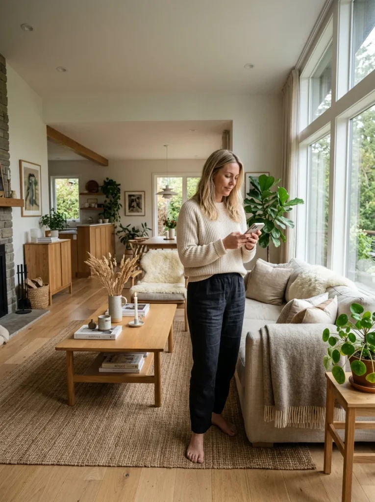
A home that looks genuinely beautiful in photos and feels subtly off in person is a more common experience than most people expect, and it’s disorienting precisely because the photographic evidence seems to contradict the lived feeling — the room looks right, so the unease must be imagined. It isn’t. A camera and a human body in a room are measuring genuinely different things, and a space optimized for the first doesn’t automatically succeed at the second. Several of the articles in this series have touched on specific versions of this gap — a staged coffee table, a freestanding tub, a photogenic but function-poor layout — and it’s worth naming the underlying pattern directly, since it explains why so much design advice, sourced from photography, quietly steers households toward homes that photograph well at some cost to how they actually feel to inhabit.
A Camera Flattens Depth in a Way the Eye Never Does
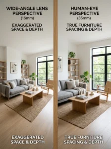
A photograph compresses three-dimensional space into two dimensions, and this compression changes how scale, proportion, and distance read in a way that’s easy to forget when using photos as a primary design reference. A room photographed with a wide-angle lens — standard for real estate and design photography, since it captures more of the room in frame — makes spaces look larger and more expansive than they feel to a body actually standing in them, and furniture arranged to look proportionate in that wide-angle photo can feel cramped or oddly scaled in person, where human vision doesn’t compress the same way.
This is part of why a room styled by closely referencing a design photo can end up with furniture that’s subtly too large, too small, or spaced in a way that looks right in the flattened photographic version but feels off in the dimensional, embodied experience of actually moving through the space. The photo was never lying, exactly — it was measuring something different than what a body in the room measures.
Photography Controls Light in Ways Daily Life Doesn’t
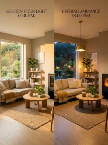
A professionally photographed room is almost always lit deliberately for the shot — natural light at a specific time of day, supplemental lighting positioned to fill shadows, sometimes hours of setup for a single image — and this bears little resemblance to how the same room is actually lit at the various times of day and evening it’s genuinely used. A living room photographed in perfect late-afternoon light looks nothing like the same room at 9pm lit only by whatever fixtures are actually installed, which is a gap covered in more detail elsewhere in this series regarding why a living room can feel dark despite having the lights on — the photograph’s lighting and the room’s daily lighting are simply different conditions.
This means furnishing or color decisions made primarily by referencing how a space looks in a photograph are being made under lighting conditions the room may rarely or never actually experience, which is part of why testing paint, fabric, and finish choices in a room’s actual daily lighting, a principle repeated throughout this series, matters more than it might seem given how much design inspiration comes from professionally lit photography.
A Photo Has No Texture, Temperature, Sound, or Smell
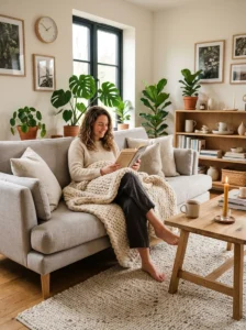
A photograph is a purely visual medium, and a home is experienced through every sense simultaneously — the way a fabric actually feels against skin, whether a room is too warm or too cold, how sound travels or gets absorbed, whether a space smells clean and cared for or simply smells like nothing at all. As covered in more detail elsewhere in this series regarding what makes a bedroom feel calm rather than merely empty, a room can be photographically perfect and still fail on every one of these non-visual dimensions, which a photo simply cannot capture or warn against.
This is a large part of why a room that looks stunning in a photo can feel cold, sterile, or subtly unwelcoming in person — hard, smooth, visually striking surfaces photograph beautifully precisely because they’re clean and uncomplicated for a camera to capture, while the same qualities that make them photogenic (hardness, lack of texture, absence of soft sound-dampening material) work against the tactile and acoustic warmth that a lived-in room needs.
Photos Are Staged for a Single Moment; Homes Are Used Continuously
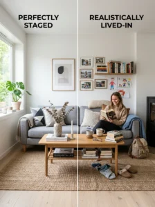
A photographed room is typically styled once, for the specific purpose of being photographed — cleared of daily clutter, arranged with careful intention, captured before anyone actually sits on the furniture or uses the space that day. This is a fundamentally different state than a room in genuine daily use, covered directly elsewhere in this series regarding coffee table styling specifically: a table styled for a single photograph and a table styled to actually hold a drink, a remote, and someone’s feet are, in a real sense, serving two different purposes, and a room designed with only the first in mind will feel subtly wrong the moment it’s actually used the way real life requires.
This same tension shows up at the scale of an entire home, not just a single surface: a freestanding tub, covered in more detail elsewhere in this series, is a clear example of an object that photographs exceptionally well precisely because of the same open, unobstructed styling that makes it less practical for daily bathing, cleaning, and splash containment than a built-in alternative.
Circulation and Movement Are Invisible in a Static Image
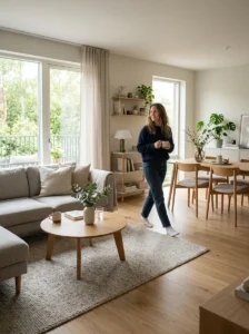
A photograph captures a single fixed viewpoint, which means it can’t convey how a space actually feels to move through — whether the walking path between furniture is comfortable or awkward, whether a doorway swings into a piece of furniture, whether the room’s actual traffic pattern works for how people genuinely enter, cross, and use it. A room can be photographed from an angle specifically chosen because it hides an awkward layout issue that becomes immediately apparent to anyone actually walking through the space, not because the photo was misleading, but because a static image was never capable of representing something that only exists in movement.
This is why floor plans and in-person walkthroughs remain more reliable design tools than photo references alone for anything involving circulation, layout, and the practical experience of using a room — a photograph is a genuinely useful tool for evaluating color, material, and general aesthetic direction, but it has real, structural limits for evaluating whether a layout will actually work to live in.
Using Photographic Inspiration Without Falling Into Its Gaps
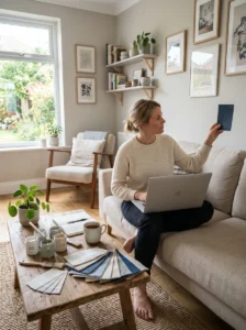
None of this means design photography and inspiration images are the wrong tool — they’re a genuinely useful way to identify color palettes, material combinations, and general aesthetic direction. The gap opens specifically when a photo is used as a literal blueprint for scale, lighting expectations, or daily function, rather than as inspiration to be adapted and tested against the actual room’s real conditions.
A practical approach: use photographic references for direction — a color family, a general style, a material pairing — and then test every specific decision against the actual room’s real lighting, real proportions, real daily use, and real sensory qualities before committing, the same testing principle repeated throughout this series for paint color, fabric undertone, and furniture scale. The photo starts the idea; the room, actually lived in, has to confirm it.
Key Takeaways
- A camera flattens three-dimensional space in a way that changes how scale and proportion read, which is why furniture that looks right in a photo can feel oddly scaled once actually standing in the room
- Professionally photographed rooms are almost always lit deliberately for the shot, under conditions the room may rarely experience during genuine daily use
- A photograph is purely visual and can’t capture texture, temperature, sound, or scent — qualities that matter as much to how a room actually feels as anything visible in an image
- Rooms styled specifically for a photograph are staged for a single moment, not for the continuous daily use a lived-in space actually requires, which is why photo-referenced styling can feel subtly wrong once real life resumes
- A static image can’t convey circulation or movement through a space, which is why layout and traffic-pattern decisions benefit more from in-person walkthroughs than from photo references alone
- Photos work best as a source of directional inspiration — color, material, general style — rather than as a literal blueprint, with every specific decision then tested against the room’s actual conditions before committing
Frequently Asked Questions
Is it a mistake to use design photos and inspiration images at all? Not a mistake, but they’re most useful for directional inspiration — a color palette, a general style, a material combination — rather than as a literal blueprint for scale, lighting, or daily function. The gap between photo and lived experience opens specifically when a photo is followed too literally without testing the specific decision against the actual room’s real conditions.
Why does a room I copied from a photo feel more cramped than it looked? This is usually a lens and compression effect — wide-angle photography, standard in design and real estate photography, makes rooms look larger and more expansive than they feel to a body actually standing in them. Furniture scaled to look proportionate in that flattened image can feel oversized or the room can feel more cramped once experienced dimensionally rather than through a photograph.
How do I test whether a color or material will actually look right, rather than just trusting how it looked in a photo? Bring an actual sample — a paint swatch, a fabric sample — into the specific room and observe it under that room’s real lighting across different times of day, rather than trusting how it appeared in a professionally lit photograph. This principle is repeated throughout this series for exactly this reason: a room’s actual daily lighting conditions are usually quite different from a photograph’s deliberately controlled lighting.
Can a home ever be both photogenic and genuinely comfortable to live in? Yes, and this isn’t necessarily a trade-off — it just requires designing for both goals deliberately rather than optimizing primarily for how the space will photograph. Testing scale, lighting, texture, and daily function directly, rather than relying on photo references alone, is how a room ends up serving both the way it looks in an image and the way it actually feels to inhabit.
What’s the most commonly overlooked gap between a photographed room and a lived-in one? Sensory qualities that a camera simply can’t capture — texture, temperature, sound, and scent — are probably the most overlooked, since a room can be visually perfect in every photographable dimension and still feel cold, sterile, or acoustically harsh in person. This is part of why texture and layered softness, covered in more detail elsewhere in this series, matter more to how a room actually feels than most photo-driven design advice accounts for.