

A shelf with the wrong proportions — too deep, too shallow, or too tall — fights against styling no matter how carefully it’s arranged. Here’s how to actually work with each specific problem.
The general shelving principles covered elsewhere in this series — volume control, containment, height variation — assume a reasonably proportioned shelf to begin with. A shelf with a genuine dimensional problem — too deep for its contents to sit anywhere but lost against the back wall, too shallow to hold anything substantial, or too tall to style evenly from top to bottom — fights against those general principles no matter how carefully they’re applied, and needs a dimension-specific approach instead.
Shelves That Are Too Deep
A shelf significantly deeper than the objects placed on it creates a specific, recognizable problem: items pushed to the back look lost and disconnected from the room, while items pulled to the front leave a large, awkward void of empty shelf behind them that reads as unfinished rather than intentional. This is a common issue in older built-ins, closet conversions repurposed as display shelving, and some modern floating shelf designs that prioritize a substantial visual presence over practical proportion.
Layering front-to-back, rather than treating the shelf as a single row, is the most direct fix — placing a shorter or lower object toward the front and a taller object behind it, so both the front and back depth of the shelf are actually being used, rather than concentrating everything in a single line that leaves half the shelf empty. This mirrors the height-variation principle covered elsewhere in this series, applied along the depth axis instead of purely the vertical one.
Risers, small stands, or a stack of books can lift a front object slightly, which helps visually separate the front and back layers and makes the depth read as intentional layering rather than simply empty space with objects randomly distributed across it.
For a shelf so deep that even layering can’t fully resolve the void, a runner, a piece of fabric, or a low tray that spans the shelf’s full depth provides a unifying visual base that makes the empty back portion read as part of a considered composition rather than an accidental gap. This is a similar principle to how a rug anchors furniture in the room-scale zoning discussion covered elsewhere in this series — a unifying base element makes an oversized surface feel intentional rather than under-filled.
Shelves That Are Too Shallow
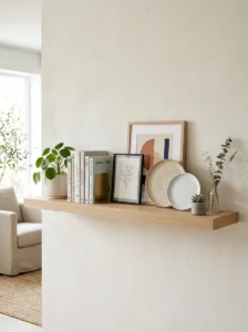
A shallow shelf can’t support the same range of objects a standard-depth shelf handles, and the common mistake is trying to display standard-depth items — a normal book, a substantial decorative object — that end up precariously balanced or visibly overhanging the shelf’s front edge, which reads as an ongoing minor hazard as much as a styling problem.
Flat, thin objects — framed photos, thin decorative plates, flat art propped rather than hung — are naturally suited to shallow shelf depth, since they don’t require the clearance a rounder or bulkier object needs to sit securely. Building a shallow shelf’s styling primarily around this category of object, rather than fighting the depth constraint with items that don’t actually fit it, produces a more secure and more visually resolved result than forcing standard-depth objects into an inadequate space.
Hooks or small brackets mounted beneath a shallow shelf extend its practical function without requiring additional depth — hanging small items below the shelf itself, using the wall space beneath rather than trying to fit everything onto the shallow surface.
Where a shallow shelf is specifically meant to hold books, spine-out rather than face-out or stacked-flat display is usually the more practical choice, since a shallow depth often can’t accommodate a stack of books lying flat without significant overhang, while a row of books standing upright, spines facing out, fits a shallower depth far more reliably.
Shelves That Are Too Tall
A very tall shelving unit — floor to ceiling, or simply taller than a household can comfortably style with objects at every level — creates a different problem than depth issues: the upper reaches are hard to both style attractively and access practically, while filling every shelf evenly regardless of height often produces a visually monotonous, overly uniform result.
Reserving the most difficult-to-reach upper shelves for larger-scale, less frequently accessed items — baskets, larger decorative objects, out-of-season or occasional-use items — rather than trying to style them with the same small, curated object groupings that work well at eye level, acknowledges the practical reality that upper shelves are harder to interact with regularly, while still giving them a clear and considered purpose rather than either leaving them empty or awkwardly cramming small objects that are difficult to see or reach.
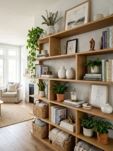
Concentrating the most carefully curated styling — the small groupings, the personal objects, the considered arrangements covered elsewhere in this series regarding shelf styling generally — at eye level and slightly above, where they’re actually seen and appreciated day to day, is a more effective use of styling effort than distributing equal attention across every shelf regardless of height.
Varying what each shelf level holds by category — books concentrated on one or two levels, larger baskets or storage on the highest shelves, a considered small-object display at eye level — creates a sense of intentional zoning within the tall unit itself, rather than a repetitive pattern of similar small groupings stacked identically at every height, which tends to look monotonous specifically because a tall unit has enough visible levels for repetition to become obvious in a way it wouldn’t on a shorter shelf.
A tall, empty-feeling unit can also be addressed by reducing the number of distinct shelves being actively styled — leaving one or two levels intentionally sparse or serving a purely functional, low-visual-priority purpose (extra storage, less-often-used items) rather than attempting to give every single shelf equal styling weight, which is more achievable and more visually resolved than spreading a limited amount of decor thinly across an unusually large number of shelf levels.
Combining Multiple Proportion Issues
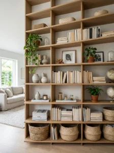
Some shelving units combine more than one of these problems at once — a tall unit with shelves that are also unusually deep, for instance — and the fixes above are generally combinable rather than mutually exclusive. Layering front-to-back on the more accessible lower and middle shelves, while reserving the harder-to-reach top shelves for larger-scale, lower-maintenance storage rather than attempting delicate styled arrangements at a height that’s both hard to see and hard to reach, addresses both the depth and height challenges simultaneously rather than requiring an either-or choice between the two approaches.
Key Takeaways
- A too-deep shelf benefits from front-to-back layering, risers to create depth separation, and a runner or tray to unify an otherwise empty back portion into part of the intended composition
- A too-shallow shelf works best with flat, thin objects — framed photos, spine-out books — rather than standard-depth items that overhang or balance precariously
- A too-tall unit benefits from reserving upper, harder-to-reach shelves for larger, less frequently accessed storage, while concentrating the most careful styling at eye level where it’s actually seen daily
- Varying what each shelf level holds by category, rather than repeating similar small groupings at every height, prevents a tall unit from reading as monotonous
- It’s more effective to intentionally leave some shelf levels sparse or purely functional than to spread limited decor thinly across an unusually large number of shelves in an attempt to style every level equally
- Multiple proportion problems on the same unit — tall and deep together, for instance — are generally addressed by combining the relevant fixes rather than requiring an entirely different approach
Frequently Asked Questions
What’s the best way to fill the empty space at the back of a deep shelf? Layering — placing a shorter object toward the front and a taller one behind it — uses the shelf’s full depth rather than concentrating everything in a single row. A runner, fabric, or low tray spanning the full depth also helps unify the shelf visually, making the back portion read as part of an intentional composition rather than an accidental gap.
Can I still display books on a very shallow shelf? Yes, but spine-out rather than stacked flat or displayed face-out is usually the more practical approach, since a shallow depth often can’t accommodate a flat stack without significant overhang, while upright, spine-facing books fit a shallower depth far more securely.
Do I need to style every shelf on a tall unit the same way? No — and attempting to do so is often what makes a tall unit feel monotonous or overwhelming. Varying what each level holds by category, and concentrating the most careful, curated styling at eye level rather than distributing equal effort across every shelf, generally produces a more resolved and more practical result.
Is it okay to leave some shelves on a tall unit mostly empty or purely functional? Yes, particularly the hardest-to-reach upper shelves, which are well suited to larger-scale, lower-maintenance storage rather than delicate styled arrangements that are difficult to both see and access at that height. This is generally a more effective use of limited decor than spreading it thinly across every available shelf level.
What should I avoid putting on a shelf that’s too shallow for its intended contents? Bulky, rounded, or standard-depth objects that overhang the shelf’s front edge or sit insecurely are worth avoiding, both for styling and practical safety reasons. Flat, thin objects — framed art, photos, spine-out books — are much better suited to a genuinely shallow shelf’s actual available depth.