


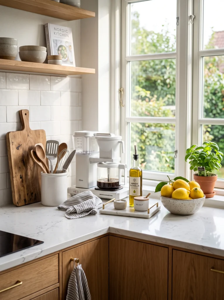
Kitchen counter styling that holds up daily isn’t about decoration — it’s about arrangement logic. Here’s why some counters look intentional and others look like a pile, and how to fix it.
I used to clear my counter completely before anyone came over. Every small appliance moved to a cabinet, every stray item relocated, cutting board tucked away — the full reset. The counter looked better, but it also looked like nobody lived there. Cold. Temporary. Like a hotel room that happened to have a stove.
The problem wasn’t what was on the counter in the first place. The problem was arrangement — the same items in slightly different positions, with slightly different logic behind their placement, would have looked styled rather than accumulated. It took me longer than it should have to figure out that the difference between a counter that looks curated and one that looks messy is almost never about which objects are on it. It’s about the invisible rules governing where they sit.
The Collection vs Arrangement Problem
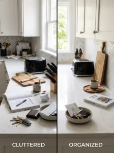
Put six items on a counter without thinking about their relationship to each other and you get a collection. The brain reads it as things that were set down — accumulated, not chosen.
Put the same six items on a counter with attention to grouping, height variation, and breathing room, and the brain reads it as a decision. Something considered happened here. The items didn’t land randomly — they were placed.
This distinction is the entire secret of counter styling, and it’s frustratingly subtle. You cannot always identify which specific arrangement rule was applied by looking at a good counter. You just sense that it works, the same way you sense that a sentence is well-written without being able to identify every grammatical choice that made it so.
The rules are learnable, though. And once they’re internalized, they become nearly automatic.
Rule One: Everything on the Counter Needs a Reason to Be There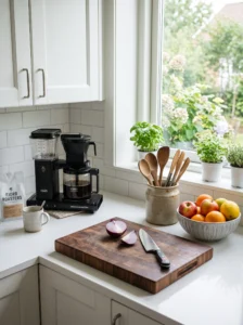
Not a justification — a reason. There’s a difference.A justification is: “I keep the toaster out because I use it.” A reason is: “I keep the toaster out because I use it every morning and retrieving it from a cabinet adds friction I don’t want.” The first is passive. The second is a deliberate choice made by someone who thought about the tradeoff.
Before anything goes back onto a styled counter, it should pass this test: does leaving this out serve me enough to justify the visual space it occupies? Daily items — the coffee maker, a utensil holder, a cutting board — usually pass. Items used twice a week probably pass. Items used occasionally or rarely usually don’t.
This isn’t about minimalism. A counter can have many items and still look styled. It’s about intention — every object that makes the cut should be there because someone decided it belonged, not because it was never moved.
Rule Two: Group, Don’t Scatter
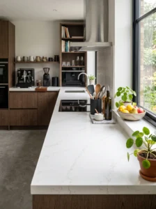
Scattered items read as mess. The same items grouped together read as a zone.
A counter with a coffee maker in one corner, a fruit bowl three feet away, a utensil holder near the stove, and a small plant somewhere in between has four separate things happening across one surface. The eye jumps between them without settling anywhere, which is exhausting in a way the brain registers as “busy.”
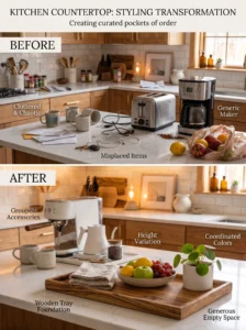
The same items pulled closer together — coffee maker and mugs in one zone, produce and a plant as a second cluster near the window, utensils close to the stove — creates defined moments the eye can read one at a time. Each grouping makes sense. The space between them provides rest.
How Close Is “Grouped”
Items within the same cluster should be close enough that they read as a set when viewed from the room’s entrance — roughly within a foot of each other, with clear space separating each cluster from the next. If items are spread more than eighteen inches apart, the eye starts reading them as separate rather than related.
Rule Three: Height Variation Is What Separates Flat From Finished
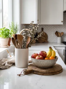
A counter where every item sits at the same height reads as flat, regardless of what the items are. A coffee maker, a fruit bowl, a stack of cookbooks, and a small plant, all approximately the same height, sit on one visual plane and disappear into each other.
Vary the heights within a grouping and suddenly there’s structure. Something tall at the back, something medium in the middle, something low or flat in front — this creates a small, readable composition rather than a horizontal line of objects.
In practice:
- Tall: a bottle of olive oil, a standing utensil holder, a tall plant, a kettle
- Medium: a ceramic bowl, a small appliance, a stack of two or three books
- Low: a cutting board laid flat, a tray, a short succulent
You don’t need all three levels in every cluster. You need enough variation that at least two distinct heights exist within the grouping, so the eye has somewhere to move within it.
Rule Four: The Tray Is the Single Most Useful Counter Tool

A tray does something surprisingly powerful in counter styling: it creates a visual boundary that makes a group of objects read as one intentional unit rather than several separate things sitting near each other.
A tray with olive oil, salt, pepper, and a small herb pot on it reads as one composed element — the “cooking station.” Remove the tray and the same four items read as four things that happened to end up near the stove.
The tray doesn’t need to be beautiful, though a simple wooden, marble, or ceramic one will add more than a basic plastic one. It just needs to define a boundary. Once a group of items has a visual edge around it, the brain interprets the contents as a set rather than an accumulation.
Rule Five: Color Discipline Matters More on Counters Than Anywhere Else

Kitchen items are, as a category, visually chaotic. Appliances come in every finish. Packaging is designed to stand out on store shelves. Produce comes in every color nature produces. Left unmanaged, a counter becomes a random assortment of colors competing for attention simultaneously.
Two approaches solve this, and both work:
Discipline by material: Keep countertop items in a consistent material palette — wood, ceramic, and one metal tone. Three materials, maximum. Everything else goes inside a cabinet. This produces a counter that looks considered regardless of what specific items are on it.
Discipline by tone: Accept the variety of materials but limit the color range. Items in white, cream, warm wood tones, and one or two muted accent colors read as coherent. Items in seven different colors from across the spectrum read as accidental.
The color discipline doesn’t need to be strict to the point of replacing every item that doesn’t match. It needs to be strict enough that no single item is dramatically more visually loud than everything around it.
What Actually Belongs on a Styled Counter
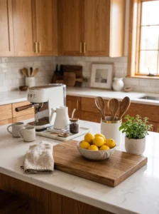
There is no universal list, because it depends on how you cook and what you use daily. But a useful framework:
Strong candidates for counter placement:
- Coffee or tea setup — used daily, involves enough components that cabinet storage creates real friction
- A utensil holder near the stove — daily use, cooking-zone logic
- Cutting board — used at nearly every meal, functional enough that its presence makes visual sense
- Fruit or produce bowl — adds color, organic shape, and is genuinely in use if you’re actually eating the contents
- One or two small plants — living texture that contributes warmth and can’t be hidden anyway without losing the benefit
Weak candidates that often end up on counters for wrong reasons:
- Appliances used fewer than three times a week — the convenience doesn’t justify the space
- Decorative objects with no function — they require wiping around and rarely add as much as they cost in space
- Paper items — mail, notes, school forms — these migrate to counters but belong in a dedicated spot elsewhere
- Duplicate tools — a utensil holder with seven spatulas because they’re all on the counter rather than stored
Breathing Room Is the Variable That Changes Everything
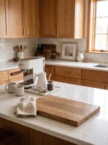
This is the hardest rule to follow because it runs directly against the instinct to fill space.
A counter with items grouped thoughtfully but no empty space between the groups reads as crowded. The same counter with the same items and a six-inch gap of clear surface between each cluster reads as styled. The empty counter space is not wasted — it’s what makes everything else read as intentional.
Think of it as punctuation. Paragraphs need white space around them to be readable. Counter clusters need clear space around them to be readable in the same way.
A practical target: for every zone of active counter items, there should be at least an equivalent stretch of clear counter before the next zone begins. The actual ratio matters less than the principle — some visible clear surface must exist for the occupied areas to register as considered rather than crowded.
Keeping It Styled Without Thinking About It
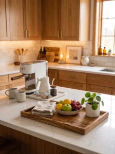
A counter styled this way holds up much better than a counter organized purely by storage logic, because the system itself is simple enough to maintain without deliberate attention.
Two habits that keep it from reverting to a pile:
- Items that come in from outside the kitchen — mail, keys, bags — don’t land on the counter. Ever. One rule, no exceptions. These items need a different landing zone and the counter stops accumulating them immediately.
- New purchases or items that appear on the counter need to pass the “reason, not justification” test from Rule One before staying out permanently. If they can’t pass it, they go in a cabinet.
The rest takes care of itself. A counter with defined zones, appropriate grouping, height variation, and enforced breathing room tends to return to looking styled even after normal use, because the system is working with daily patterns rather than against them.
Key Takeaways
- The difference between a styled counter and a messy one is arrangement logic, not which items are there
- Every item on the counter needs a reason to be there — an active decision, not just inertia
- Grouped items read as intentional; scattered items read as accumulated
- Height variation within clusters is what makes a counter look finished rather than flat
- A simple tray creates visual boundaries that make groupings read as composed sets
- Color and material discipline prevents counter items from competing visually
- Breathing room — clear space between zones — is what makes everything else read as styled
- Mail and keys need a different landing zone; this single rule prevents most counter drift
Frequently Asked Questions
How do I keep a kitchen counter looking styled when other people in the household keep putting things on it? The most effective approach is environmental rather than rule-based. Give every category that typically lands on the counter its own nearby alternative spot — a small hook for keys, a bin near the door for mail, a basket for bags. When the alternative is just as convenient as the counter, most people default to it without thinking. Rules work less reliably than convenient alternatives.
Should a small kitchen have more or fewer items on the counter? Fewer, with the same principles applied — the available surface area is more limited, so each item occupies a larger proportion of the visual space. A small kitchen counter can still be styled effectively with two or three items grouped thoughtfully and clear space maintained around them. The instinct to maximize storage by using the counter runs directly against the goal of making the kitchen feel larger and calmer.
Is it better to keep appliances out or store them for a more styled look? Depends entirely on frequency of use. An appliance used daily — coffee maker, toaster — earns its counter place because the convenience is real and the alternative of cabinet retrieval creates daily friction. An appliance used twice a week or less should be stored, because the visual cost of permanent placement outweighs the convenience benefit for occasional use.
What’s the best type of tray for counter styling? One that suits the material palette already on the counter. A wooden tray works well in kitchens with warm tones and natural materials. A marble or stone tray suits kitchens with a cooler, more polished feel. A simple painted or ceramic tray in a neutral tone works across most styles. The material matters more than the specific style — a tray that clashes with the counter’s existing materials will look like an addition rather than an element of the composition.
How often should a counter be completely reset and re-evaluated? Every few months is usually enough, or whenever it starts to feel like items are there by default rather than by decision. The reset doesn’t need to be elaborate — clear everything, wipe the surface, then return only items that actively pass the “reason, not justification” test. Items that hesitate during that test usually belong in a cabinet.