

Two-tone kitchen cabinets aren’t just a trend — there’s a real visual reason they work better than one uniform color, and understanding it changes how you see kitchen design entirely.
The case for two-tone cabinets isn’t really about trend or personal taste. It’s about how the eye reads a room — and that’s a more useful conversation than most design articles give it credit for.
When every cabinet surface in a kitchen shares the same color and finish, something predictable happens. The room flattens. Not dramatically, not in a way most people could immediately name, but the eye has nothing to anchor to, no variation to find interesting, no sense of where the upper half of the room ends and the lower half begins. Everything blurs into one plane and the kitchen reads as smaller and less resolved than its actual dimensions suggest.
Two-tone cabinets solve this by doing something the eye responds to instinctively — they create visual layers. A kitchen with two distinct cabinet tones has depth. It has a ground and a lift. And that contrast, even when the two colors are subtle and close in value, changes how the entire room reads in a way that’s easier to feel than to explain.
What the Eye Is Actually Looking For
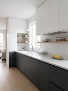
Vision is, in a simplified sense, a constant search for contrast and boundary. The eye moves toward edges — where one thing ends and another begins. In a room with strong horizontal color contrast at a specific height, the eye lands on that line, uses it as a reference, and understands the room’s vertical dimension more clearly.
In a kitchen, the natural break between upper and lower cabinets sits at roughly the same height as the countertop — somewhere between three and four feet from the floor. This is already the most visually important horizontal line in the room. A two-tone color split that echoes and reinforces this line amplifies the room’s sense of structure without adding a single architectural element.
All-one-color cabinets, on the other hand, erase this line. Upper and lower read as one continuous surface, the countertop becomes a less distinct element within that surface, and the room’s visual logic softens in a way that often reads as “something’s off” without the cause being obvious.
Why the Upper-Light, Lower-Dark Split Became the Standard
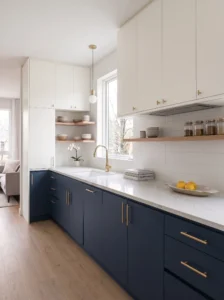
The most common two-tone kitchen — lighter upper cabinets, darker lower cabinets — is so prevalent for good reason. It follows the natural logic of how rooms are lit and how visual weight distributes in space.
Light rises. Heavy things sit low. These aren’t aesthetic opinions — they’re deeply embedded perceptual instincts that shape how every room feels before any conscious thought. Placing darker, heavier-reading cabinet color at lower heights and lighter, airier color above aligns with these instincts so naturally that the room feels settled immediately, even to someone who couldn’t articulate why.
The reverse — dark uppers, light lowers — works against this logic and tends to produce a kitchen that feels slightly top-heavy and closed-in, as though the ceiling is pressing down. It can be done successfully with enough other compensating design choices, but it requires more deliberate management to land well.
What “Darker Lower” Actually Looks Like in Practice
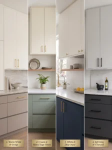
The darker lower doesn’t need to be dramatically different from the uppers to do its job. Some of the most effective two-tone kitchens use tonal variations that seem subtle when described — white uppers with a warm greige lower, for example, or soft cream above and a muted sage below. The distinction doesn’t have to be high-contrast to read clearly.
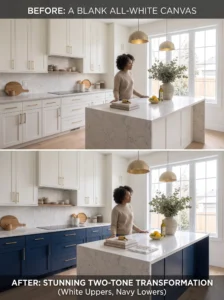
Conversely, some two-tone kitchens go fully dramatic — true white against deep navy, soft gray above against nearly black below — and these work beautifully when the room is large enough and bright enough to handle the weight of the darker lower color without feeling oppressive.
The Island as a Second Accent — A Different Two-Tone Logic
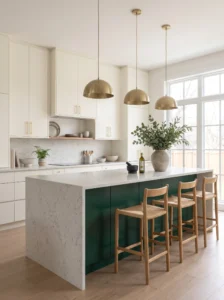
Not every two-tone kitchen follows the upper/lower split. An increasingly common approach uses a unified cabinet color throughout the perimeter and reserves the second tone for the island alone.
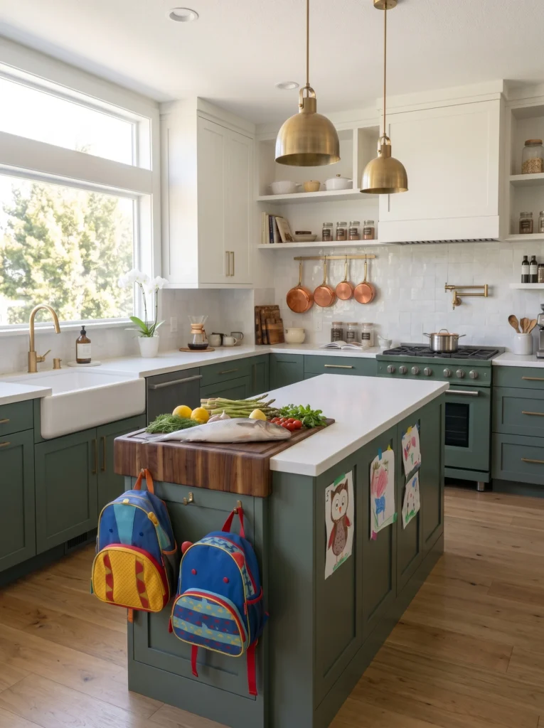
This version of two-tone works through a different visual mechanism. Rather than creating a horizontal layer, it creates a focal point — a single element in the room that anchors the eye and signals: this is where the action is. An island in a contrasting color, particularly when paired with different hardware or a different countertop material, reads as the kitchen’s centerpiece in a way a matching island simply doesn’t.
The island-accent approach also carries lower risk than a full perimeter two-tone decision, because the island is a smaller, more contained surface. A color that might feel overpowering across all lower cabinets can feel perfectly calibrated when limited to an island. This makes it a useful testing ground for people unsure about committing to a bolder color across a larger surface.
The Combinations That Work and Why
Not all two-tone pairings are equal. Some combinations have a quiet logic that makes them work almost automatically. Others require careful management.
White or cream upper + warm-toned lower (navy, forest green, terracotta, warm gray): The most reliable category. White uppers keep the room from feeling heavy and maintain brightness, while the deeper lower color adds character and grounds the space. The contrast is clear without being harsh.
Two neutrals in different values (light warm white + greige, or soft gray + charcoal): Subtler, more sophisticated, and often underestimated. The variation is tonal rather than color-based, which reads as deliberate rather than cautious. Works particularly well in smaller kitchens where a dramatic contrast might overwhelm the space.
Natural wood lower + painted upper: One of the warmest and most liveable combinations available. The wood lower brings organic texture and warmth to the zone you touch most frequently, while a painted upper keeps the room from feeling too rustic or heavy. Particularly effective at solving the coldness problem that all-painted kitchens sometimes create.
Same color, different finish (matte upper + gloss lower, or vice versa): Technically a two-tone in finish rather than color, but the visual effect is similar — the room reads as layered without any explicit color contrast. A finish variation is the most subtle version of this approach and works well for people who want visual depth without committing to two visible colors.
What Goes Wrong With Two-Tone Cabinets
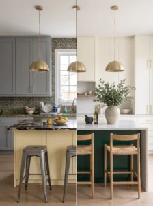
The failures in two-tone kitchens follow predictable patterns, and most of them come from the same source: choosing the pairing before resolving the room’s other fixed elements.
Clashing undertones: A two-tone cabinet pairing with clashing undertones — one warm, one cool — produces a room that looks unresolved regardless of how individually attractive each color is. A warm cream upper paired with a cool blue-gray lower fights itself. Matching the undertone direction across both cabinet colors, or at least ensuring they’re neutral enough to not assert a strong undertone, keeps the pairing coherent.
Ignoring the countertop and backsplash: A two-tone cabinet scheme introduces four surfaces to coordinate with the countertop and backsplash instead of two. The more colors and materials in a room, the harder the coordination, and two-tone cabinets that were chosen without reference to the counter and backsplash already in place often feel busy rather than layered.
High contrast in a small kitchen: A dramatic light-upper, dark-lower split in a very small kitchen can amplify the visual weight of the lower color to the point where the room feels like it’s closing in. Small kitchens with low ceilings generally benefit from a more subtle tonal variation than larger, better-lit kitchens can handle.
Splitting in the wrong place: Occasionally people attempt two-tone cabinets but place the color break mid-cabinet-run rather than at the natural upper-lower divide, or introduce a third color to handle a peninsula or hutch. Each additional color decision multiplies the coordination challenge. Two tones work because the split is clean and reads clearly. The more complex the split, the harder it becomes to read as intentional.
How to Choose Your Two Tones Without Getting It Wrong
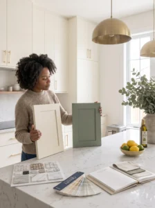
Start not with paint chips but with the fixed elements you’re keeping: countertop, backsplash, flooring, appliances. These define the room’s existing color temperature and undertone direction.
Then identify what the room needs that it doesn’t currently have:
- Does it need grounding? → A deeper lower cabinet color
- Does it need lightening? → Lighter uppers or a more neutral lower
- Does it need warmth? → Wood lower, or a warm-toned lower color
- Does it need more visual interest without a color commitment? → Tonal two-tone or finish variation
Once the need is identified, the color decision becomes narrower and more specific — you’re not choosing from everything, you’re choosing from what solves a specific problem within the constraints of what’s already in the room.
Collect samples of both proposed cabinet colors and hold them against your actual countertop in your actual kitchen light. A pairing that looks perfect in a showroom or online can read completely differently against your specific flooring or under your specific overhead light.
A Note on Resale and Longevity
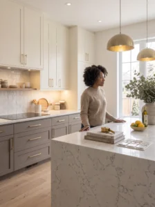
One practical concern with two-tone cabinets: how they age in terms of style. Trend-specific color pairings — whatever the specific “it” combination happens to be in any given year — can date a kitchen faster than a single classic choice.
The two-tone combinations most likely to feel timeless in five to ten years are those built on neutral, classic colors rather than trend colors. White or cream uppers are more durable in this sense than any specific fashion-forward hue. The lower color matters more for longevity — neutrals like warm gray, navy, and forest green have demonstrated longer staying power than colors that spiked quickly in popularity and fell just as fast.
Key Takeaways
- All-one-color cabinets flatten a room visually; two-tone creates layers the eye can anchor to
- Lighter uppers and darker lowers align with natural visual weight logic and almost always succeed
- The island-as-accent approach is a lower-commitment version of two-tone that still adds depth
- Undertone alignment between both cabinet colors is as important as the colors themselves
- High-contrast two-tone in small, dark kitchens requires careful management
- The safest long-term two-tone pairings use classic neutrals rather than trend-specific colors
- Always test both colors together against the actual fixed elements in the room before committing
Frequently Asked Questions
Do two-tone cabinets make a kitchen look smaller or larger? Done correctly — lighter uppers, slightly deeper lowers — they typically make a kitchen feel larger and more articulated. The clear horizontal break gives the room structure and helps the eye understand its vertical dimensions more easily. Done incorrectly, with too much contrast in a small space, they can feel heavy and enclosed.
Is two-tone harder to repaint if I change my mind later? Not significantly more difficult than repainting single-color cabinets, though it does require more careful masking at the color break. Professional cabinet painters handle this routinely. The bigger practical concern is sourcing the same finish and sheen level when doing touch-ups, which applies equally to single-color and two-tone cabinets.
Can two-tone cabinets work in a very small kitchen? Yes, with a more subtle variation than a larger kitchen might use. In a small kitchen, a tonal two-tone — two shades of the same color, or the same color in two finishes — adds the visual depth and layering of a two-tone approach without the visual weight that a high-contrast pairing would bring. Save the dramatic contrast for larger spaces.
Should the hardware be the same on both cabinet tones, or different? Same hardware across both tones is almost always the cleaner choice. Matching hardware unifies the two colors into one coherent system rather than creating a third element competing for attention. The exception is the island-as-accent approach, where different hardware on the island can reinforce its role as a distinct focal element — but even then, the hardware should coordinate rather than contrast sharply.
What countertop material works best with a two-tone cabinet scheme? The countertop needs to read as a bridge between both cabinet tones rather than competing with either. A neutral countertop — warm white quartz, light marble with soft veining, butcher block — tends to work across most two-tone combinations. A countertop with strong color or pattern becomes a third visual element to coordinate, which increases the complexity of the scheme considerably.