

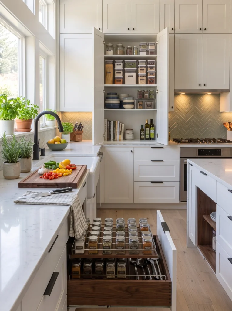
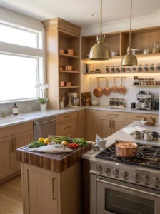
A kitchen that photographs beautifully and a kitchen that works beautifully are built around completely different priorities. Here’s exactly what separates them — and which one to actually choose.Picture two kitchens. The first one has fluted cabinet fronts, a dramatic dark island, book-matched marble counters, and unlacquered brass fixtures that glow under the pendant lights positioned perfectly above. Every surface is clear. The proportions are immaculate. You’ve seen this kitchen — or something close to it — in every design magazine from the last two years.
The second kitchen has white shaker cabinets, a butcher block section near the stove, three small appliances on the counter, and a rug that’s slightly askew. Nothing matches perfectly. There are cookbooks on an open shelf that aren’t arranged by color.
The first kitchen gets photographed. The second kitchen gets cooked in — every single night, without frustration, without searching, without choosing the wrong pan because the right one is buried behind something that photographs better.
Both kitchens are real. Most people renovating or designing a kitchen are, without realizing it, aiming for the first one. The ones who end up happiest are the ones who aimed for the second.
What a Camera Does to a Kitchen That Your Body Doesn’t
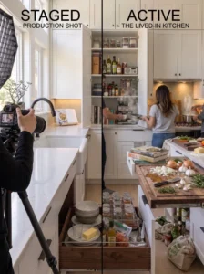
A camera reduces a three-dimensional room to a two-dimensional image viewed from one fixed angle in controlled lighting. In that translation, an enormous amount of information disappears — and what remains is almost entirely visual and surface-level.
The camera cannot show you that the beautiful deep farmhouse sink requires you to lean forward slightly every time you wash dishes, which becomes significant after ten years. It cannot show you that the stunning range hood is so powerful it sounds like a jet during normal use. It doesn’t capture that the gorgeous marble island is the coldest, hardest surface to stand at for an hour of prep, or that the floating shelves displaying perfect ceramics are directly in the path where you naturally want to gesture while talking.
What the camera does capture brilliantly: proportion, color, texture, light quality, material finish, styling choices. These things matter. They just don’t matter more than function, and in photogenic kitchens, they frequently have been prioritized above it.
The Workflow Problem Nobody Photographs
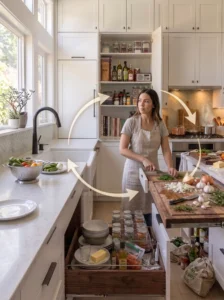
Every kitchen has a sequence of movements that happens dozens of times a day. The fridge to the counter. The counter to the stove. The stove to the sink. Back to the counter. Over to the drawer for a spoon. Back to the stove.
A kitchen designed for photography can arrange these elements for visual balance — the island centered, the fridge positioned for symmetry, the stove placed where it completes the aesthetic composition. A kitchen designed for cooking arranges them to minimize the total distance traveled in that daily sequence, so the cumulative friction of every meal prepared there is as low as possible.
This is the work triangle concept at its simplest, and it gets ignored constantly in favor of layouts that look balanced in a wide-angle photo. I’ve cooked in kitchens where the trash can was positioned so far from the prep area that composting required a walk every time. The kitchen was beautiful. Cooking in it was quietly exhausting.
A Test Worth Running Before Any Renovation Decision
Walk the sequence you’d actually use: fridge open, item to counter, prep, move to stove, stir, move to sink, back to counter. Count the steps. Count the turns. Notice any moment where you’d naturally want something that isn’t there.
Do this in any kitchen you’re considering — including your own before renovating — and you’ll learn more about whether it functions than any amount of looking at it can tell you.
The Staging Layer Nobody Talks About Honestly
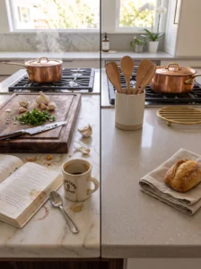
Photo kitchens are staged. This is obvious when you say it out loud, but the implications are easy to underestimate.
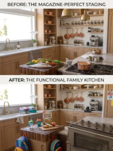
Staged means: every item on the counter was placed there because it photographs well, not because it lives there. The cutting board is propped artfully rather than laid flat where it would actually be used. The herbs in the small pot near the window have been freshened for the shoot. The cookbooks are arranged by spine color rather than by how often they’re opened.
In a real kitchen, the cutting board is horizontal and takes up a quarter of the visible counter. The herbs may or may not be alive. The most-used cookbook is face-down and held open with a mug because there’s no other way to read a recipe while cooking.
Photo kitchens make no allowance for this reality. They’re optimized for the ninety seconds a professional photographer is working, not for the six hours a day the actual inhabitants use the space.
Surfaces: What Holds Up vs What Photographs
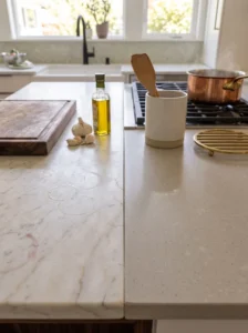
This one has cost many people real money, because material choices made for appearance don’t always perform the same way under daily cooking conditions.
Honed marble photographs with exceptional softness and depth. In a working kitchen, it stains from acidic foods, scratches from daily use, and requires consistent sealing and care that most homeowners don’t anticipate. Whether that tradeoff is worth it depends entirely on how much you cook and how much you’re willing to maintain it — but the tradeoff exists and rarely appears in the caption.
Fluted or reeded cabinet fronts add genuine visual character and photograph beautifully. They also collect crumbs, grease, and moisture in the grooves in a way that flat fronts don’t, and cleaning them is slower and less thorough than wiping a smooth surface.
White grout in a high-traffic kitchen looks crisp and clean in photos taken immediately after installation. It photographs the same way for approximately six to eight weeks of actual cooking before maintenance becomes an ongoing project.
Open shelving creates airy, editorial depth in photographs. As covered elsewhere, it also collects grease and dust on everything stored on it, and requires constant tidying to look anything like the photo version.
None of these are reasons to avoid any particular material or style. They’re reasons to understand what you’re actually choosing when you choose something because it looks good in a photo.
Counter Space: The Metric That Matters Most and Photographs Least
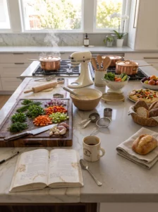
Here is a genuinely strange truth about kitchen photography: counter space — the single most functionally important resource in any kitchen — looks better in photos when there’s less of it, because clear, empty counter reads as “styled” while occupied counter reads as “messy.”
This means photogenic kitchens frequently sacrifice counter space for visual clarity. A large island that appears only as a dramatic centerpiece. A decorative range hood that eats into the space above the stove. Built-in appliances that look seamless but reduce the workable surface area.
A functional kitchen protects counter space ruthlessly. Every inch of horizontal clear surface is a resource. Kitchens where real cooking happens — bread made, meals prepped for the week, multiple dishes running simultaneously — need counter space the way offices need desk space, and no amount of beautiful cabinetry compensates for the absence of somewhere to actually put things down.
Storage That Works for Photos vs Storage That Works for Cooking
Photographed kitchens often feature open shelving, glass-front cabinets, and minimally filled drawers — all of which look composed and intentional in images and all of which require the actual owners to store the majority of their kitchen belongings somewhere the camera can’t see.
Real storage — enough of it, in the right places, properly organized — usually involves more closed cabinetry, deeper drawers, and less visual drama than its photogenic counterpart. Pull-out shelves inside lower cabinets aren’t beautiful in photographs. They’re invaluable when you’re trying to reach the sheet pan at the back without removing everything in front of it first.
The functional storage test is simple: does every item used in this kitchen have a designated, accessible home? Not a theoretical home somewhere in a cabinet, but a home you can reach in one motion without moving something else first? If the answer is no for more than a handful of items, the storage isn’t functional regardless of how beautifully it photographs.
Lighting: Designed for the Photo vs Designed for the Cook
Professional kitchen photography uses supplementary lighting that fills shadows, corrects color temperature, and makes even mediocre lighting design look balanced and warm. The same kitchen photographed by its owners at 7pm on a Tuesday looks completely different — shadows in corners, uneven brightness, the hood light casting a harsh pool over the stove.
Functional kitchen lighting is designed for that Tuesday evening. It layers sources at different heights, covers every work zone with adequate directed light, and uses a color temperature that makes food look appetizing rather than washed out. It’s engineered to work under real conditions rather than to look good in a single image taken under optimal conditions.
How to Actually Tell the Difference When Choosing or Designing
A few questions that separate kitchens built for living from kitchens built for photographing:
Where does the trash go? If it’s not in an immediately obvious, accessible location, the design prioritized appearance over the most frequent non-cooking kitchen task.
Is there landing space beside both the fridge and the oven? Counter space adjacent to both is functionally critical. In photogenic layouts, these spots are sometimes sacrificed for a larger island or a more visually balanced run of cabinetry.
Can two people move comfortably in the kitchen at the same time? Minimum 42 inches of walkway in work zones — 48 for households that actually cook together — is the functional standard. Many open-concept kitchens designed around visual flow fail this test.
Are the most-used items the most accessible ones? Open the cabinet closest to the stove. If the items there are the ones used least, the organization was designed for the reveal moment rather than for cooking in the space daily.
Where does wet stuff go? Dish drying, pot filling, hand washing — these generate water and mess around the sink. A kitchen designed for photography often minimizes this zone for visual cleanliness. A kitchen designed for cooking makes it generous and practical.
Key Takeaways
- Photography reduces a room to two dimensions and controlled lighting — neither of which reflects daily lived experience
- Workflow and movement sequence matter more than any visual element, and they’re invisible in photos
- Materials chosen for appearance carry maintenance implications that captions don’t mention
- Counter space looks better in photos when there’s less of it, which is the opposite of how kitchens actually work
- Functional storage is usually less visually dramatic than photogenic storage
- The best kitchens to live in and the best kitchens to photograph are built around different priorities — knowing which you’re choosing is the real decision
Frequently Asked Questions
Can a kitchen be both beautiful and functional, or is it always a tradeoff? It can absolutely be both — but only when the functional requirements are established first and the aesthetic decisions are made within those constraints, not the other way around. Most kitchens that succeed at both started with the workflow, the storage, and the lighting, and then made beautiful choices within a plan that already worked. The ones that fail usually started with the aesthetic and tried to retrofit the function.
How do I figure out what my actual cooking workflow is before designing a kitchen? Spend a week paying attention to how you move through your current kitchen. Notice where you walk, where you wish things were closer, where you feel the most friction in any given meal preparation. Write it down if that helps. Your cooking habits are the spec sheet for the kitchen you actually need — not the habits shown in cooking videos or design inspiration posts.
Why do so many renovated kitchens end up disappointing their owners within a year? Usually because the design decisions were heavily influenced by inspiration images showing staged, styled kitchens rather than by the specific functional needs of that household. The kitchen looks like the reference images. It just doesn’t work as well as the old one did, because the old one had been organized around actual use even if it looked less impressive.
Is it worth sacrificing some functionality for a kitchen that looks the way you want it to? That depends entirely on how much you cook. Someone who cooks rarely and entertains often may genuinely prefer a kitchen optimized for appearance and atmosphere. Someone who cooks daily will feel every functional compromise every day, and the aesthetic pleasure fades faster than the functional frustration does.
What’s the single biggest functional mistake people make when renovating based on inspiration photos? Undersizing the counter space relative to the island. A large dramatic island that looks incredible in photos frequently leaves inadequate perimeter counter space for actual food preparation — because the wide-angle photo doesn’t reveal that the counter runs along only one short wall. Counter perimeter is where most real cooking prep happens, and an island, however beautiful, is a poor substitute for a continuous, accessible run of counter beside the fridge, beside the stove, and beside the sink.