


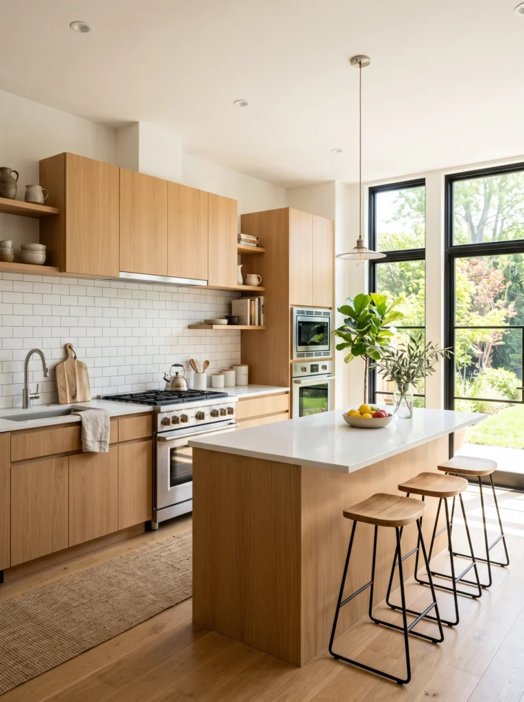
Choosing a kitchen backsplash that won’t clash with cabinets, counters, or flooring is easier than it looks — if you understand a few simple design principles first.Nobody warns you about the tile store paralysis until you’re standing in front of four hundred samples with no idea which one you’ll still like in three years. Everything looks either too safe or too risky. You pick something up, hold it next to your phone photo of the kitchen, and feel precisely nothing useful.
I’ve been through this process twice — once making a choice I regretted quickly, once making one that still looks right four years later. The difference between those two experiences came down to a few principles I didn’t know the first time.
The Reason Most Backsplash Choices Go Wrong
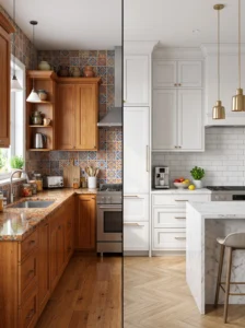
People pick a backsplash in isolation. They fall in love with a tile in a photo, order it, install it, and then discover it argues with the countertop, flattens the cabinet color, or somehow makes the floor look dingy.
The tile itself was never the problem. The problem is that a backsplash doesn’t live in a photo — it lives in a specific room surrounded by specific materials it has to negotiate with every single day. A backsplash that “goes with everything” isn’t one universal tile. It’s any tile chosen correctly for what’s already in the room.
Start With What You’re Keeping, Not What You Want
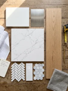
Before looking at a single tile, write down every fixed element in your kitchen — anything you’re not changing along with the backsplash.
- Cabinet color and finish (painted, wood-tone, stained, laminate)
- Countertop material and color
- Flooring material and undertone
- Appliance finish — stainless, matte black, white, panel-fronted
These are your anchors. Your backsplash needs to respond to this list, not compete with it. Once you’re clear on what you’re working with, the field of “could work” tiles narrows dramatically on its own.
Understanding Undertones — The Detail That Trips Everyone Up
This is the single concept that saved my second backsplash decision, and I’d never encountered it before.
Every color — even whites, grays, and beiges — has an undertone. A white cabinet can read slightly warm (creamy, yellowish) or slightly cool (blueish, stark). A gray counter can lean warm (taupe, greige) or cool (true gray, almost silver). These undertones aren’t always obvious when you look at one item alone, but they become very obvious when two items with clashing undertones sit next to each other.
Why This Matters Practically
A warm-toned backsplash next to a cool-toned counter won’t look “eclectic” — it’ll look slightly wrong in a way people can sense but usually can’t name. They’ll say the kitchen feels “off” without being able to explain what specifically clashes.
Matching undertones across backsplash, counter, and cabinets is the single most reliable path to a kitchen that feels visually settled rather than accidentally discordant.
A Simple Way to Find the Undertone
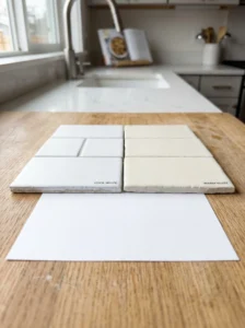
Hold the tile or paint chip next to a clean sheet of white paper in natural light. The color that shifts toward the paper’s stark white is cool. The color that shifts toward cream or ivory is warm. It takes about ten seconds and tells you what you actually need to know.
The Safest Choices — and Why “Safe” Isn’t a Bad Thing
People sometimes talk about safe backsplash choices apologetically, as if choosing something timeless is the failure mode. It isn’t.
Subway tile, zellige, matte white, soft gray — these choices have lasted decades across thousands of kitchens not because nobody had better ideas, but because they genuinely work with a wide range of other materials. If the goal is a backsplash that “goes with everything,” a classic with correct undertone matching is almost always a better bet than a trendy statement tile you’ll be living with in five years.
Safe doesn’t mean boring. It means reliable. A matte cream subway tile installed beautifully is more impressive than a bold pattern installed badly.
When Bold Tiles Work — and When They Don’t
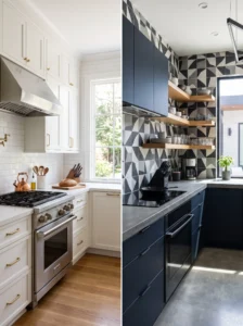
There’s a version of the bold backsplash that genuinely works, and it usually looks like this: everything else in the kitchen is deliberately quiet. Neutral cabinets, simple countertop, no competing pattern anywhere else in the room.
When a bold backsplash works, it’s because the designer made a deliberate choice to give one element all the visual attention. The tile isn’t competing — it’s performing solo while everything else steps back.
Where bold backsplashes fail is almost always the same situation: a busy pattern on the backsplash, a veined or patterned countertop, a multicolored or wood-grain cabinet, and a floor with its own visual interest. Every surface is doing something, and the room ends up feeling like nobody’s in charge of it.
A Useful Rule for Patterned Tiles
If you want a patterned backsplash, choose a counter and cabinet that are solid-toned and fairly neutral. One surface in a room can be the focal point. Two or more competing for that role creates visual noise rather than character.
Grout Color: The Decision People Underestimate
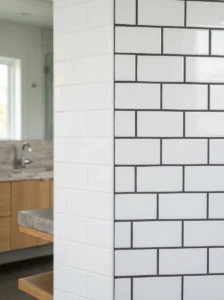
Most people spend real time choosing the tile and almost no time choosing the grout, despite the fact that grout color changes the entire visual effect of a tile.
The same white subway tile looks completely different with white grout versus dark charcoal grout. White grout makes the tile field read as one large surface — clean, seamless, almost disappearing. Dark grout makes each tile read individually — more graphic, more structured, more prominent.
Neither is wrong, but they produce different results, and one of them will suit your kitchen better than the other depending on what else is in the room.
As a starting point: if your kitchen already has a lot of visual detail, lighter grout tends to calm things down. If it’s mostly simple and monochromatic, a slightly contrasting grout can add the depth the room needs without another material.
Sample Testing: The Step Most People Skip
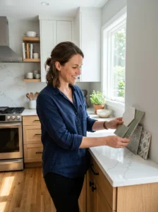
Ordering full tiles based on a small sample chip or a screen photo is the version of this process where most regrets happen.
Tile color, texture, and finish all look meaningfully different at scale and in actual kitchen lighting than they do in a small square under a showroom’s LED spotlight. What looked soft and warm in the store can look flat and lifeless installed across a full wall.
Before committing to a full order, get a sample large enough to hold against your actual counter and cabinet in your actual kitchen at different times of day. Morning light versus evening light will tell you things a showroom never can.
Finishes and How They Behave in Kitchen Light
Glossy tiles reflect light and make a space feel brighter, but they also show every water spot, grease splash, and smudge more clearly than matte finishes do. A high-gloss white tile near the stove needs wiping down more often than people expect before installation.
Matte tiles hide daily marks better but absorb light rather than bouncing it, which can flatten a kitchen that’s already a bit dark.
Textured tiles — zellige, handmade, dimensional — catch and scatter light in a way that adds depth without the maintenance demands of high gloss, which is partly why they’ve become as popular as they have in recent years.
How to Narrow It Down: A Practical Process
- List your fixed elements — cabinets, counter, floor, appliances
- Identify the dominant undertone in the room — warm or cool overall?
- Decide whether you want the backsplash to blend in or stand out
- If blending, match undertone and choose a classic format with grout that reads quiet
- If standing out, simplify everything else before committing to the bold tile
- Get large samples and test at home in real light before ordering
- Choose grout last, not first — it should respond to the finished tile, not the other way around
Before You Decide, Ask Yourself This
What’s the one thing I actually want this kitchen to feel like — warm, calm, bright, bold? Not what looks good in photos, but what serves the way I actually use and live in this room? A backsplash that answers that question honestly will go with everything, because “everything” in your kitchen was chosen to serve the same goal.
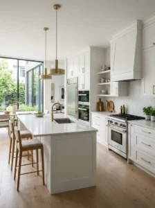
Quick Recap
- Pick based on what’s already fixed in the room, not based on tiles in isolation
- Undertone matching between tile, counter, and cabinets prevents the “something’s off” feeling
- Classic choices with correct undertones outperform bold choices with poor planning
- Bold tile works when everything else in the room is deliberately quiet
- Grout color changes the final look as much as tile choice does
- Always sample in your actual kitchen light before ordering full quantities
- Finish type affects both maintenance and how much light the backsplash bounces
Frequently Asked Questions
Is white subway tile actually timeless, or is it going out of style? It keeps cycling in and out of trend conversations, but in practice, white subway tile has been a dependable kitchen choice for over a century. The specific variation shifts — smaller grout lines, handmade edges, different formats — but the underlying choice remains broadly livable and resaleable in a way most trend-forward tiles aren’t.
How do I know if my kitchen leans warm or cool overall? Look at your most dominant fixed element — usually the cabinets or counter — in natural daylight. If the color reads creamy, golden, or slightly brown-toned, the room is warm. If it reads gray, bright white, or slightly blue-toned, it’s cool. The floor often confirms which direction the room is heading overall.
Can I mix a warm backsplash with cool counters or vice versa? Occasionally it works, usually when one of the elements is so neutral it doesn’t assert an undertone strongly. In most cases though, a mismatch in undertones creates a subtle visual tension that’s hard to name but easy to sense. Matching undertones is almost always the more reliable path.
How large should my backsplash sample be before I commit? Ideally a minimum of six inches square, larger if possible. A chip the size of a business card tells you color only. A larger sample tells you how the texture, finish, and scale will actually feel on the wall, which is equally important for making a confident decision.
Does backsplash grout need to be sealed, and how often? Standard cement-based grout does benefit from sealing, especially in kitchens where splatter and oil exposure are regular. A quality sealer applied once after installation and refreshed every one to two years significantly reduces staining and makes routine cleaning much easier. Epoxy grout is stain-resistant without sealing but harder to install and regrout later if needed.